Figures & data
Fig. 1 Observations of throughput data recorded at 1 min intervals over 100 days at a point on a telecommunications network and represented as a functional time series. Each curve denotes a single day of data (a). An instance of an anomalous day is overlaid in red in (b).
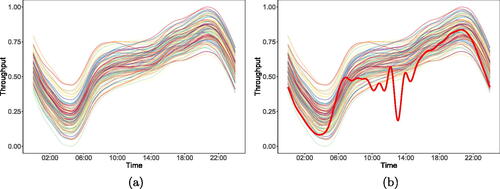
Fig. 2 Example showing the emergence of an anomaly (bolded line) within the functional data from . The solid vertical line indicates the time by which the anomaly can be said to have emerged, and it is desirable to detect this event as quickly as possible.
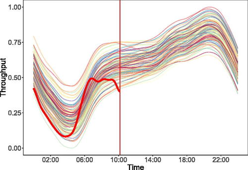
Fig. 3 Figure showing the values of (a) and
(b) for the anomaly in .
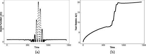
Fig. 4 This figure overlays a single instance of an anomaly from each of models 3 (red line), 5 (blue line), 6 (green line), 7 (purple line), and 8 (orange line) over 100 non-anomalous observations from model 1 (in gray). These five anomalies represent the different types of anomaly included in our simulation study, with models 4 and 9 omitted as they use the same anomaly function as models 3 and 5, respectively.
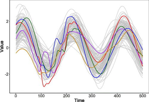
Table 1 Detection power and average detection delay of FAST for the nine models used in the simulation studies.
Table 2 Detection power and average detection delay of FAST for the nine models used in the simulation studies when the anomaly is either on the interval (at start) or on the interval
(at end).
Table 3 Table showing detection power for models 3–9 when the training data has been contaminated by 1%, 5%, and 10% anomaly functions.
Table 4 Detection power for FAST for each of the nine models when the ODE order is specified as m = 1 (underfitting), or m = 3, and m = 4 (overfitting).
Table 5 Table showing accuracy of BIC model selection for different models.
Table 6 Comparison of the performance of FAST testing only at the end of the day and the competitor methods when the underlying profile is order 2. The best performing method in each scenario is highlighted in bold.
Fig. 5 (a) shows the training dataset which contains first 30 days of throughput normalized onto a 0–1 scale and represented as functional data. (b) shows the test data represented as functional data and with the axis scaled to highlight the similarities with the profile of the training data. shows the test data without axis scaling.
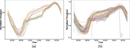
Fig. 6 Test dataset consisting of 63 days of normalized throughput data.
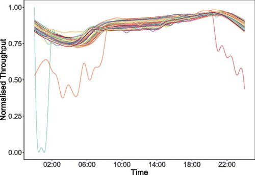
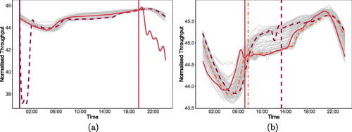
Fig. 7 Figure (a) illustrates the 11 detections returned by FAST, and (b) illustrates the two public holidays on which FAST identifies atypical behavior. In both figures the gray lines represent the days where FAST does not detect anything.
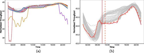
Fig. 8 This figure illustrates a selection of the days on which FAST identifies the emergence of atypical behavior. (a) shows two example magnitude anomalies, while (b) illustrates three example shape anomalies. The vertical lines indicate the point where FAST first identifies this behavior.