Figures & data
Figure 1. Hurricane Ian track and evacuation zones map (FDEM Citation2022).
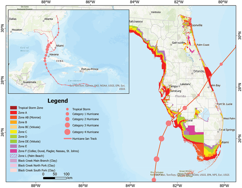
Table 1. Timeline of key events during the three phases of Hurricane Ian.
Figure 2. The analytical workflow.
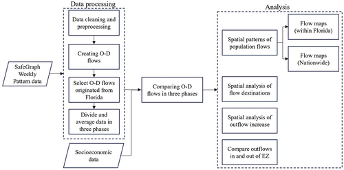
Figure 3. Net population flows within Florida in the pre- (a), in- (b), and post-hurricane (c) phases. The arrows represent the directions of the net outflows.
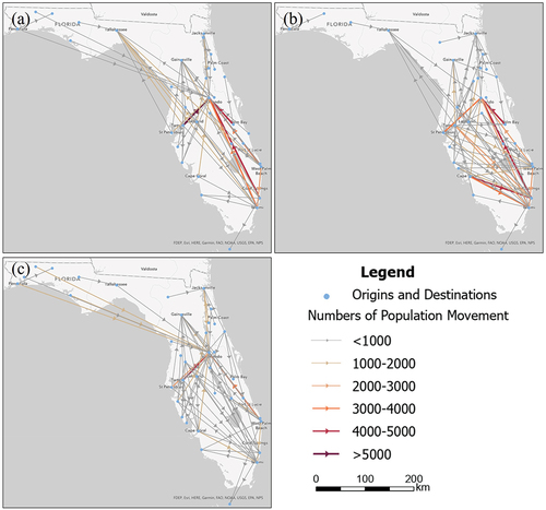
Figure 4. Percent changes of net population flows during the in-hurricane (a) and post-hurricane (b) phases in comparison to the baseline. The arrows represent the directions of the net outflows.
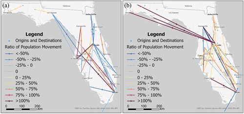
Figure 5. Net population flow in the U.S during the pre-hurricane (a), in-hurricane (b), and post-hurricane (c) phases.
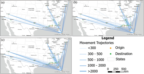
Figure 6. Percent changes of visitors from Florida in contrast to the baseline condition. (a): Percent changes of Florida visitors during the in-hurricane phase. (b): Percent changes of Florida visitors during the post-hurricane phase. (c): hot spot analysis of (a). (d): hot spot analysis of (b).
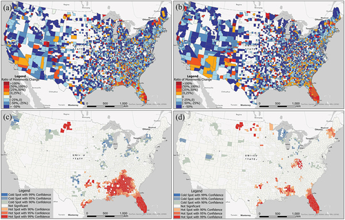
Figure 7. Percent changes of population outflows in Florida counties during the in-(a) and post-hurricane (b) phases.
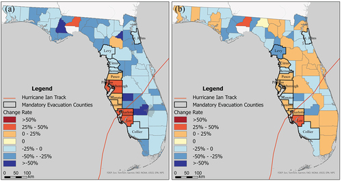
Table 2. Ratio and ratio changes of outflows within and outside the evacuation zone.
Figure 8. Percent changes of population outflows in contrast to the baseline in block groups near the landfall location. (a): Percent change of population outflows during the in-hurricane phase. (b): Percent change of population outflows during the post-hurricane phase. (c) &; (d): Hot spot analysis of (a) &; (d) respectively.
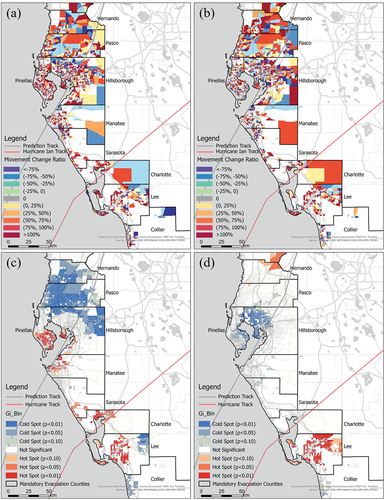
Figure 9. Percent change in population outflow in different distance ranges in the in- and post-hurricane phase compared to the baseline.
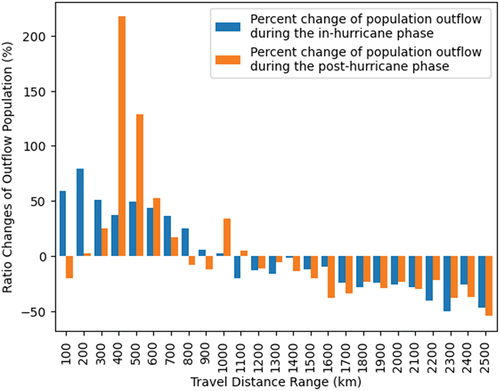
Figure 10. Average distance of movement and outflow ratios of county population line chart.
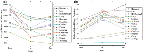
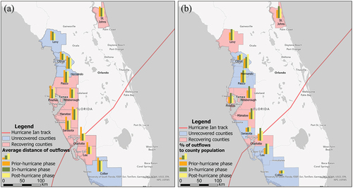
Figure 11. Average distance of outflows (a) and % of population outflows to county population (b) in twelve counties under mandatory evacuation orders during three phases.