
Figures & data
Table 1. Ryder’s classification system recognises six fleece type categories and builds on the methods used in the wool industry to classify the individual fleeces.
Table 2. Rast-Eicher’s classification system consists of a flexible letter system of 11 wool quality categories and takes the process from raw wool to yarns into account.
Figure 1. Wool fibre distribution diagram. The important features to look at in a distribution diagram are the width of the uninterrupted range, the position and the height of the peaks, and the position and number of the outliers.
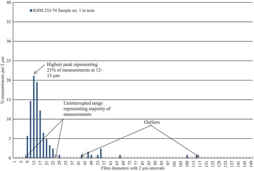
Figure 2. Sampling from textile fragments. Sampling is most often done near open edges or holes where degradation can be more advanced.
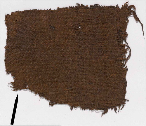
Table 3. Yarn samples from 13 textiles from eight sites dated to the Bronze and Early Iron Ages have been studied in this project. They are listed alphabetically after the sites and numbered consecutively with reference to the specific tests in which they appear.
Figure 3. Measurements on images acquired at scan speed Kalman. Using the embedded scale marker bar of 100 microns, measurements of 0.1 mm on the micrometre deviate by plus 0.6–3.2% to minus 0.3–8% across the SEM image acquired at scan speed Kalman at 500× magnification. The exact measurements are listed in .
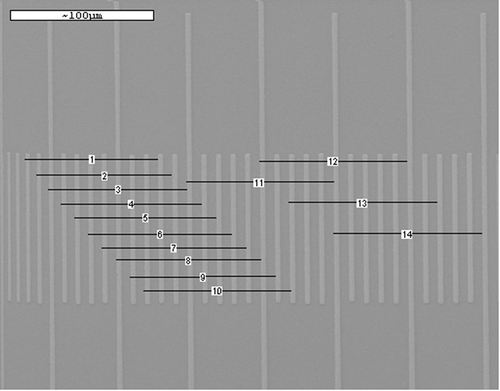
Figure 4. Measurements on images acquired at scan speed Slow. Using the embedded scale marker bar of 50 microns, measurements of 0.05 mm on the micrometre deviates by plus 4.1–5.8% across the SEM image acquired at scan speed Slow at 1000× magnification. The exact measurements are listed in .
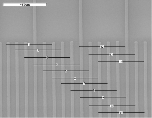
Table 4. Measurements of distances on a micrometre using the embedded SEM scale marker bars differ depending on the scan speed in SEM: In scan speed Kalman, 100 µm can be both longer and shorter than 0.1 mm. In scan speed Slow, 50 µm is in all cases longer than 0.05 mm.
Table 5. The lengths of 0.5 mm, 0.1 mm, and 0.05 mm on the micrometre can be both shorter and longer than the equivalent distances on the SEM scale bar and differ according to the scan speed.
Table 6. Using 0.5 mm, 0.1 mm, and 0.05 mm on the micrometre as scales for measurements of the micrometre, the results in most cases turn out either shorter or longer by 0.3% to 7.7% depending on the scan speed. Discrepancies are seen at all three magnifications.
Table 7. Measurements of distances on the micrometre using the camera software in TLM images with three different objectives give variable results and the most accurate measurements as well as biggest discrepancies are found at the two higher magnifications.
Figure 5. Sample no. 24 analysed using two different methods. Histograms of sample no. 24 has the TLM curve positioned to the left of the SEM curve. TLM produces finer measurements than SEM.
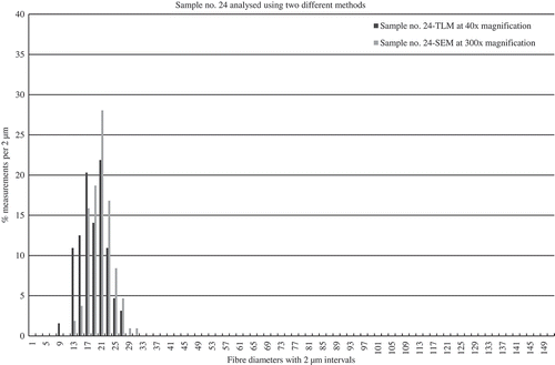
Figure 6. Sample no. 6 analysed using two different methods. In the histograms of sample no. 6, the TLM and the SEM curves appear very similar but a few outliers have been recorded in the SEM analysis.
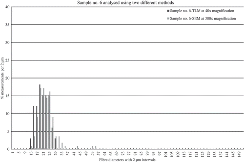
Table 8. The statistical mode calculated from the results from the same yarn samples using different methods is generally higher by a few microns in the SEM results and the finest measurements are generally seen in the TLM results.
Table 9. Results using TLM with the lower magnification appear to be slightly finer giving a lower statistical mode in all cases but one. The results also demonstrate that the same yarn can be attributed two very different categories.
Figure 7. Sample no. 13 analysed using TLM at different magnifications. The two histograms of results from TLM analyses at low and high magnification are positioned similarly and give the same impression of the fibre composition in the yarn.
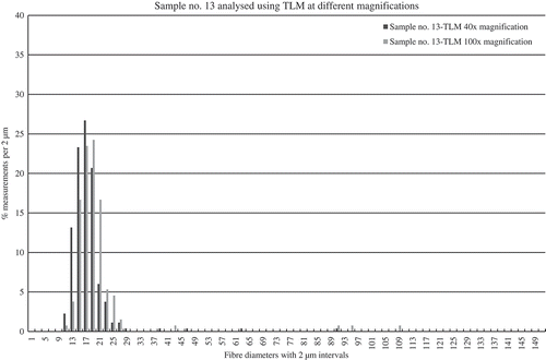
Figure 8. Sample no. 36 analysed using TLM at different magnifications. The two histograms of results from TLM analyses at low and high magnification differ not only in their position on the x-axis but also in the widths of the uninterrupted curves and the peak heights.
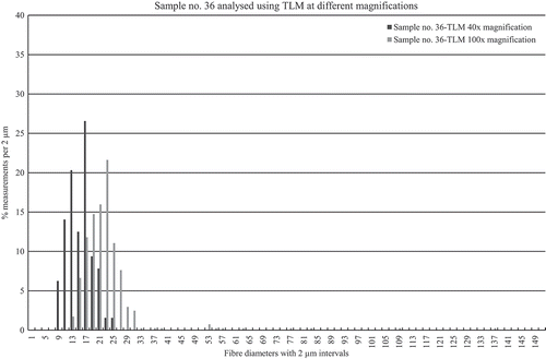
Table 10. The categorisations of two samples from the same yarns vary in most cases and the results demonstrate to what extent small variations in the fibre composition influence the categorisations.
Figure 9. Categorisations of sample nos. 16 and 17 from the same yarn. The TLM analyses of fibres from samples 16 and 17 picked from the same yarn in the textile result in almost identical histograms but very different categorisations due to one measurement of 81 microns in sample 17.
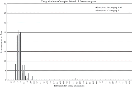
Figure 10. Categorisations of sample nos. 9 and 10 from the same yarn. The histograms of the TLM results from samples 9 and 10 picked from the same yarn in the textile resemble each other and no measurements above 60 microns are recorded. The width of the curve of sample no. 10 is slightly wider and causes the different categorisation.
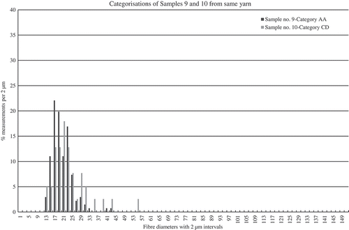
Figure 11. Two TLM analyses of the same digital images of sample no. 13. Two separate analyses of the images of sample no. 13 result in very similar histograms and give the same impression of the fibre content.
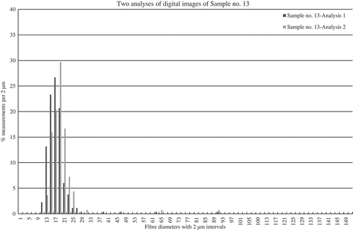
Figure 12. Two TLM analyses of the same digital images of sample no. 14. The recording of two outliers in analysis 1 of sample no. 14 is the major difference between the two analyses of the same images.

Table 11. Two analyses of the same images illustrate the complexity of the material and the difficulties of obtaining identical results. The statistical mode differs in all cases and the categorisations differ in three out of five cases.