
Figures & data
Figure 1. Since 2000 the official RATP Paris Metro map has been a conventional design comprising horizontal, vertical, or 45° diagonal straight lines joined by tightly-radiused curves. The equal intervals of angle rotation make this a regular octolinear design. Image and design ©RATP, all rights reserved, reproduced with permission.
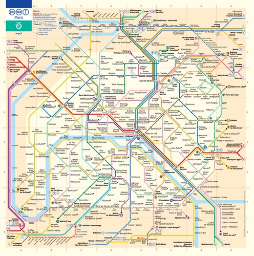
Figure 2. SNCF operates frequent services on Paris RER lines, and the organization has issued its own version of the Paris Metro map which is best described as multilinear, using straight lines but at a variety of different angles. For historians of the Paris Metro map, this version is similar to maps issued by RATP prior to the design shown in (see Ovenden, Citation2009). Image and design © SNCF, all rights reserved, reproduced with permission.
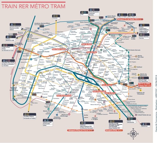
Figure 3. The Paris Metro map issued by Île-de-France Mobilités (formerly STIF) took a different approach to the RATP design. Octolinear lines dominate, but some deviate from this, and widespread use of gentle curves means that the design rules are best described as hybrid. Image and design © Île-de-France Mobilités, all rights reserved, reproduced with permission.
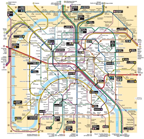
Figure 4. Octolinear schematized central regions of the London Underground. The upper layout is topographically accurate, the lower layout distorts, for example, the relative positions of Paddington and Notting Hill Gate (in a similar way to the official configuration). Guo (Citation2011) observed that around 30% of journeys between Paddington and Bond Street are via Notting Hill Gate, with the implication that the configuration of the official map implies that this route is a reasonable option. The route via Baker Street is considerably shorter in reality. Image and designs © Maxwell J. Roberts, all rights reserved, reproduced with permission.
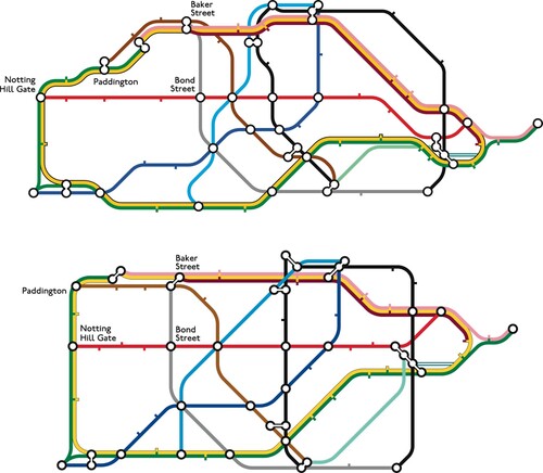
Figure 5. The curvilinear Paris Metro map, designed by the author, consistently out-performs the RATP official octolinear design (see ) in terms of time necessary to plan complex (i.e. two-transfer) journeys between pairs of stations. Image and design © Maxwell J. Roberts, all rights reserved, reproduced with permission.
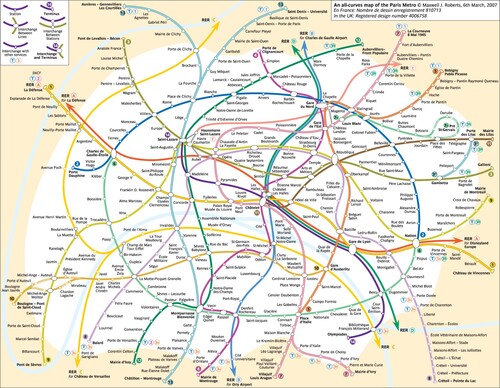
Figure 6. Octolinear London Underground map created by computer algorithms overseen by Martin Nöllenburg and Soeren Terziadis at TU Wien (Roberts, Citation2019b). Image and design © Martin Nöllenburg and Soeren Terziadis, all rights reserved, reproduced with permission.
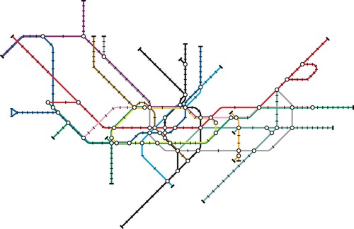
Table 1. The criteria for schematic map design as outlined by Nöllenburg (Citation2014) for the purpose of computer-automated schematic map layout.
Table 2. Good Practice in Diagram Design: Prescriptions for optimizing schematic map design taken from Ovenden (Citation2009).
Figure 7. Three configurations of the same section of the London Underground network from the stylized designs in the internet rating study, illustrating octolinear (top), multilinear (centre), and curvilinear (bottom) approaches. All three have the same priorities, the simplest possible line trajectories inside the Circle Line. Image and designs © Maxwell J. Roberts, all rights reserved, reproduced with permission.
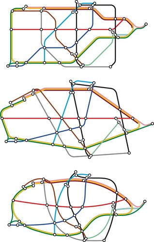
Figure 8. The matrix of nine London Underground maps designed by the author and used in the internet rating study of Roberts et al. (Citation2017). Image and designs © Maxwell J. Roberts, all rights reserved, reproduced with permission.
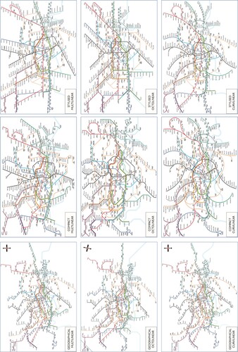
Table 3. Ratings of schematic map usability comparing Expert and Non-expert groups, reanalysing data from Roberts et al. (Citation2017). Responses have been scaled such that 100% would indicate every single person rating a map as easy to use and 0% would indicate every single person rating a map as difficult to use.
Table 4. Criteria for rating individuals as holding a coherent simplicity theory of schematic map usability (top), and a coherent octolinearity theory (middle) along with the ratings given by an individual that would yield a categorization of simultaneous simplicity and octolinear theories.