
Figures & data
Figure 1. Idealised illustrations of Lexis diagrams showing 3 different types of cohort effects: ‘Ideal’ age-, period-, and cohort effects on the Lexis surface. Adapted from Rau et al., Citation2018.
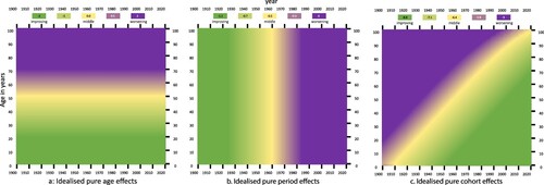
Figure 2. Annual percentage change in smoothed mortality rates, England and Wales, 1913–2008 using three year rolling averages, males (left) and females (right). Source: Goldring et al., Citation2011. Note: an increase in the rate is a decrease in mortality. Reproduced with kind permission of the authors at ONS.
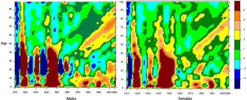
Figure 3. Timeline of selected events from 1914 to 1959 and corresponding age of the Golden Cohort. Adapted from: Goldring et al., Citation2011.
Note: the height of the bars is for illustrative purposes only.
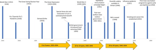
Figure 4. Change in chance of dying from select diseases (by cause of death), England and Wales, 1851–1990. The graph shows the chance of an individual dying per year from each cause (log scale). The numbers in brackets are the International Classification of Disease (ICD) codes that were used by the 1980s. The Registrar General attempted to match, as closely as he/she could, to these from earlier decades. Source: Dorling Citation1995
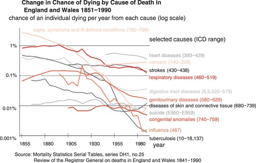
Figure 5. Population estimates for the Golden Cohort, England and Wales, by sex, from mid-1961 to mid-2020.
Note: for mid-2020 the group comprises those aged 87–89, and all over 90 years. Source: Authors’ calculations using ONS population estimates.
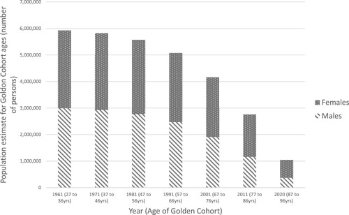
Figure 6. Timeline of selected events from 1960 to 2020 and corresponding age of the Golden Cohort.
Note: the height of the bars is for illustrative purposes only.
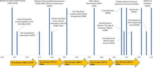
Figure 7. Income Inequality in the UK, 1910–2019. Sources: Pre-tax national income share including pension income, individuals over age 20 from listed sources: (Atkinson et al., Citation2017; Brewer, Citation2019; Dorling, Citation2013; Shine & Webber, Citation2019)
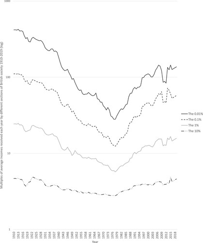
Figure 8. Gini Coefficient of Income Inequality, Great Britain 1961–2020. The range of the Gini Coefficient is 0 (zero) to 1, where 0 reflects total equality and 1 maximum inequality. Thus, the higher the Gini Coefficient, the greater the inequality. Source: IFS (2022) Living standards, poverty and inequality in the UK.
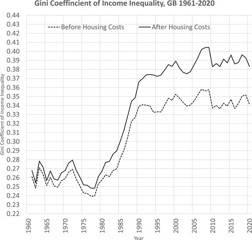
Figure 9. The proportion of people in the UK who live in a home owned outright or mortgaged by year and age. Source: Dorling, Citation2015.
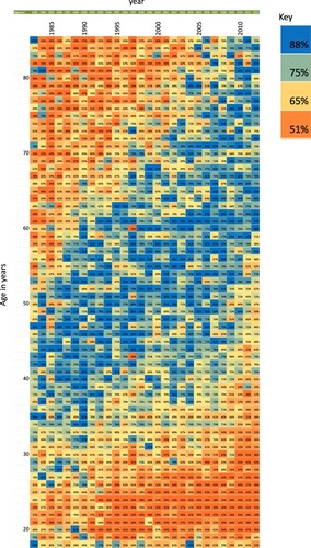
Figure 10. Number of working days lost due to labour disputes, 1925–2022. Source: ONS 2015, (Office for National Statistics, Citation2015) ONS 2023 (Office for National Statistics, Citation2023)
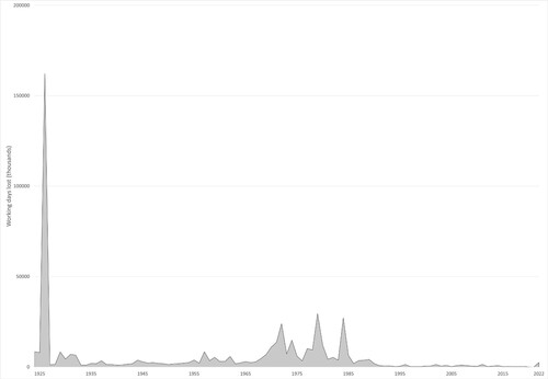
Figure 11. Health and Social Security spending per person in £ to 2019–2020 prices, 1955–2020. Source: IFS data. Grey vertical line represents financial year 2010–2011.
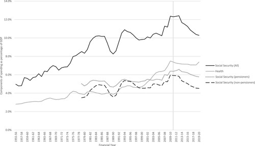
Figure 12. Average annual increase in government spending on health, 1955–2019, based on 2019/2020 prices. Source: authors’ calculations based on IFS spending composition sheet (Institute for Fiscal Studies, Citation2023) adapted from the BBC graphic (Triggle & Butcher, Citation2020)
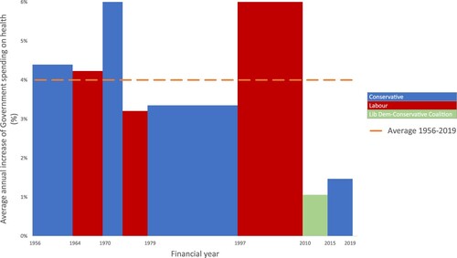
Figure 13. Public spending as a percentage of GDP from 1980 (or earliest available) to 2019 in 5 European Countries. Source: International Monetary Fund, World Economic Outlook Database, April 2021.
Note: Axis does not start at 0.
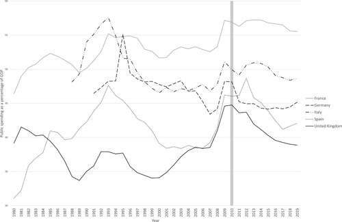
Figure 14. Projections of life expectancy at birth for males and females in the UK, 2012 onwards. The dotted lines show the actual recorded historical data from 2000 to 2019, and the solid lines show ONS projections made every year from 2011 to 2025. Source: Hiam and Dorling, BMJ, Citation2022.
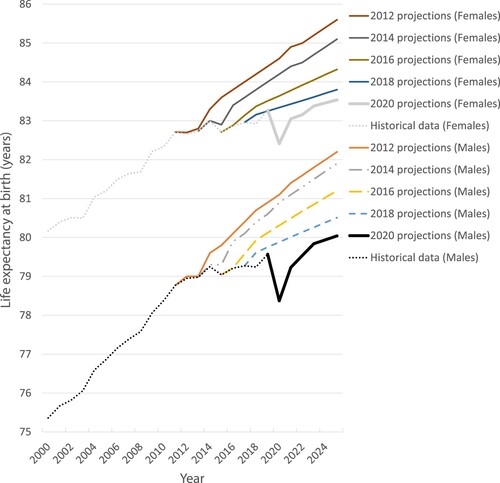
Figure 15. Deaths and Age Standardised Mortality Rates (ASMR) for Dementia (black lines) and Alzheimer’s disease (blue lines) in England and Wales, 2000–2020. Source: ONS
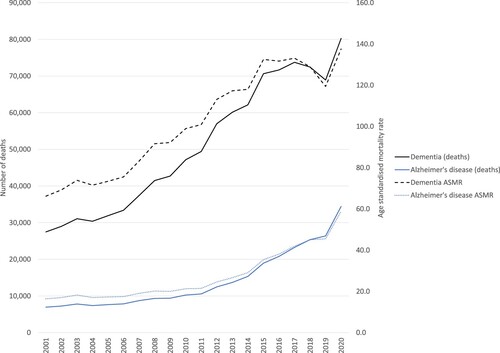
Figure 16. Prevalence of dementia over time (estimated). Note missing data for 2016–2019 (dashed line). England, 2006–2022. Data for 2020–2022 are from January and February. Source: NHS Digital, Citation2022.
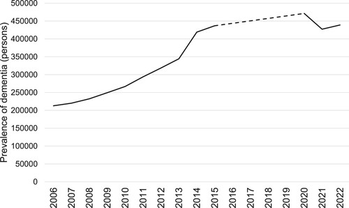
Figure 17. Annual percentage change in female mortality rates in England and Wales, civilian population, 1900–2020 (3-year rolling averages – comparing the three year period up to the year shown with the three years immediately prior to those three years – so the 2020 column is the average annual change in mortality between 2015–2017 and 2018–2020).
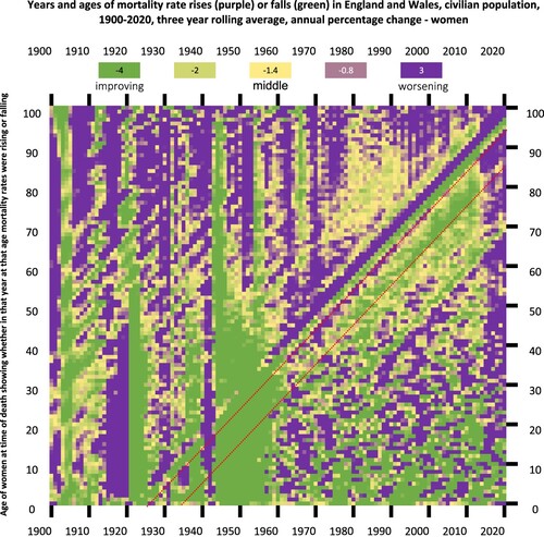
Figure 18. Annual percentage change in male mortality rates in England and Wales, civilian population, 1900–2020 (3-year rolling averages).
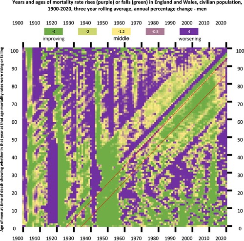
Figure 19. Changes in period female life expectancy in years by age in England and Wales 1978–2020.
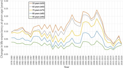
Figure 20. Change in period life expectancy for women between 10-year age group, in years, England and Wales, 1978–2020.
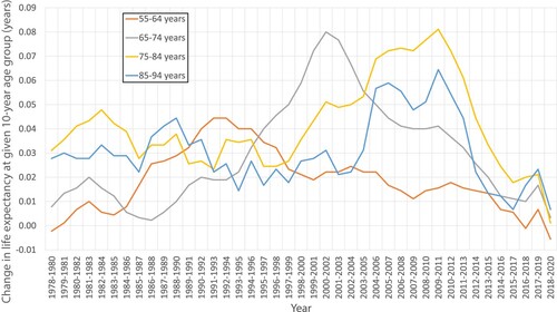
Figure 21. Change in period life expectancy for males by age, in years, England and Wales 1978–2020.
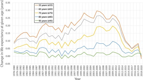
Figure 22. Change in period life expectancy for males between 10-year age group, in years, England and Wales 1978–2020.
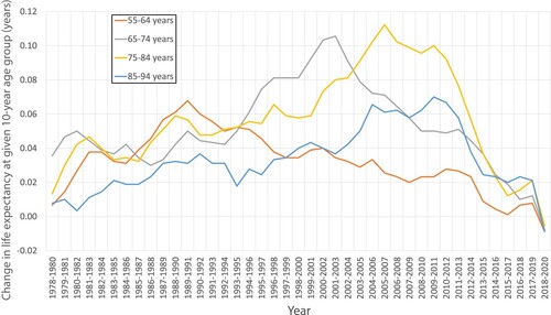
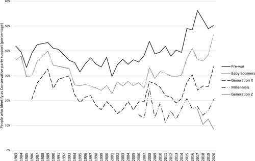
Figure 23. Percentage of people who identify as a Conservative party supporter, 1983–2020. Reproduced with kind permission of Duffy and Stoneman. Source: Are millennials really killing the Tory Party? (Stoneman & Duffy, Citation2023). using British Social Attitudes Survey data.
Supplemental Material
Download MS Word (1 MB)Data availability statement
The authors confirm that the data supporting the findings of this study are available within the article’s supplementary materials.