
Figures & data
Table 1. Expectations for Treatment Primes (In Comparison to the Control Group)
Figure 1. Difference in means in reported historic family loss across control and treatment groups for all respondents (top row) and subset by Western- and Russian-oriented respondents (bottom row).
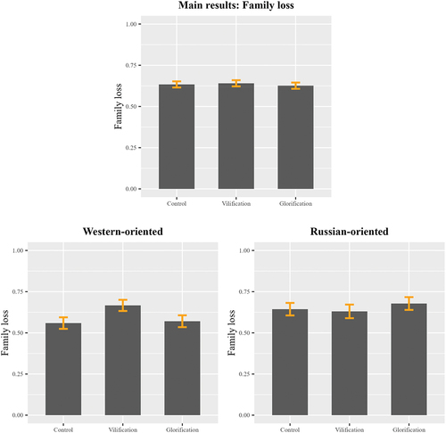
Figure 2. Difference in means in reported historic suffering across control and treatment groups for all respondents (top row) and subset by Western- and Russian-oriented respondents (bottom row).
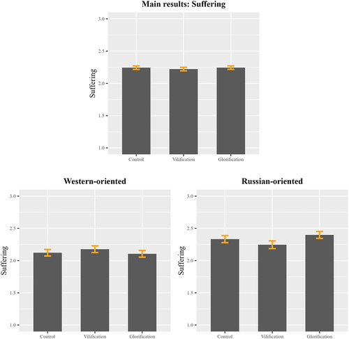
Table 2. Results of Survey Experiment Including Demographic Controls. Models Include Robust Standard Errors
Table 3. Opinion on Russia’s Responsibility for Soviet Crimes, Broken Down Per Respondents’ Geopolitical Orientation
Appendix table 1: Subgroup analysis of the experiment.
Appendix table 2: Analysis with imputed data.
Appendix table 3: Main results reported with oblast-level fixed effects.
Appendix table 4: Main results with control for social desirability.
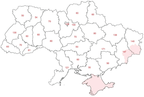
Appendix figure 1: The number of respondents per oblast. Note that the areas shaded in red are not included in the survey. Government-controlled areas of the Luhansk and Donetsk oblasts were oversampled.
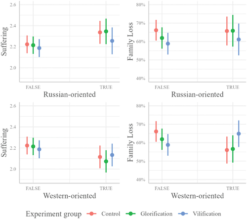
Appendix figure 2: Plotted interaction effects from main findings reported in in the manuscript. Demographic controls are set at their mean or median.
Appendix table 5: Breakdown for the survey questions used to build the key independent variable for respondents’ geopolitical orientation. All percentages are for weighted data. The percentages do not include missing values.
Appendix table 6: Respondents’ geopolitical orientations and association with views on the dissolution of the Soviet Union.
Appendix table 7: Respondents’ geopolitical orientations and association with views on historical figures, monuments, and events.
Appendix table 8: Experiment results for reported family loss (as plotted in Figure 1).
Appendix table 9: Experiment results for reported historic suffering (as plotted in Figure 2).
Appendix table 10: Balance tests for experimental set up. The table reports the mean value of each covariate per treatment group and the p-values of the t-test of the covariate compared to the control group. The treatment groups are balanced (none of the p-values <0.05). The balance tests were conducted using the RCT package in R.
Appendix table 11: Missingness reported per key variable included in the analysis. There is no missing data in demographic controls.
Data Availability Statement
The data and materials that support the findings of this study are available here: https://osf.io/aqkwy/.