Figures & data
Figure 1. Countries with declining CO2 and GHG emissions since peak year. Trends for territorial CO2 (green), territorial GHG (blue) and consumption-based CO2 emissions (orange) are shown. Note that the y-axis limit differs in each plot but always starts at 0, putting an emphasis on the completeness of each decarbonization trajectory. The average annual reduction rate and the reduction in annual CO2 emissions since peak years is shown in each plot subtitle. Clusters are described in the forthcoming section.
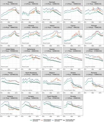
Figure 2. Three groups of decarbonizing countries. Groups are clustered manually, based on socio-economic history (Former Eastern Bloc) and peak years. Panel b depicts country CO2 emissions trends normalized to 1 in 1970, with an average trend by group in bold. Panel c depicts the relative importance of each group in terms of their global CO2 emissions, GHG emissions and population in 2018. Panel d depicts the total relative reduction in annual emissions per group since each underlying peak year.
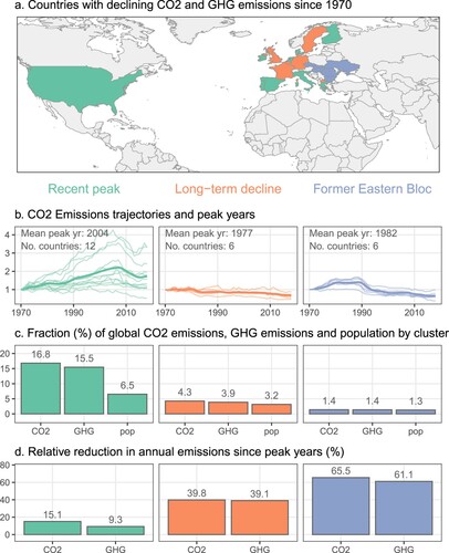
Figure 3. GHG emissions by subsector and country cluster. Solid bars indicate total emissions in 2018, transparent bars indicate total emissions at peak years for each cluster. A solid bar followed by a transparent bar indicates absolute reductions in emissions (with the remaining emissions in solid). A solid bar with no transparent area indicates that emissions were stable or have grown to this level in 2018. Selected large subsectors are shown. Numbers in % following each bar describe the relative change in annual emissions between peak years and 2018.
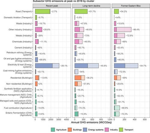
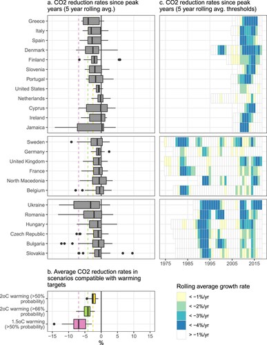
Figure 4. Rolling average country CO2 reduction rates in the context of average future global scenario reduction rates compatible with different climate targets. Panel a shows the rolling average rates of change for each country since their respective peak years, where rates of change in a given year are averaged using data from the prior 4 years. Panel b shows the range of global average CO2 reduction rates between 2020 and 2040 across different scenarios from the IPCC Special Report on 1.5°C (Rogelj et al., Citation2018), which meet three different levels of warming stringency: 2°C at 50% probability, 2°C at 66% probability, and 1.5°C at 50% probability. Dashed lines in panel b projected into panel a show the median values for these scenario categories (−2.5%, −4.1% and −6.9%, respectively). Panel c shows years where CO2 reduction rates exceed 4% per year in dark blue (the approximate median value for scenarios that achieve 2°C at 66% probability), with lighter shading towards yellow for slower growth rates. Only reductions from CO2 emissions are shown, in order to ensure compatibility with the scenario data.