Figures & data
Figure 1. Plots of various molecular profiles averaged over all available samples used in our analysis. Only some form of normalized molecular profiles were provided in the source data. (A) Plot of average expression values for different genes. (B) Plot of average expression values for different miRNAs. (C) Plot of average expression values for different proteins. (D) Plot of average segment means for various chromosomes.
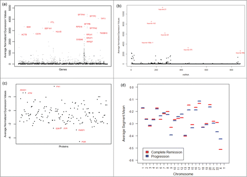
Figure 2. Diagram showing connections between some predictive genes, miRNAs, proteins, and chromosomes. All connected pairs have statistically significant correlations with P values< 0.05, except for one.
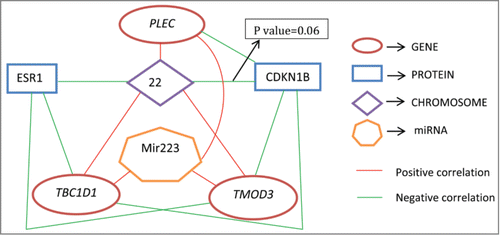
Figure 3. Internal validation measures for 3 different clustering algorithms using proteins. The optimal cluster size is 2 and the k-means clustering optimizes each of the validation measures for the protein data.
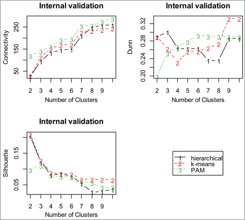
Figure 4. Dendrogram of hierarchical clustering using miRNA profiles. The divisions for the 2 main clusters are indicated by dashed lines; the two main clusters are indicated by 2 different colors.
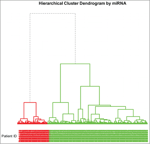
Table 1. Overlap proportions between the subject cluster profiles combining the results of clustering of 2 molcular profiles at a time
Table 2. Accuracy rates for models with different combinations –omics profiles. Here G, M, P and C stand for gene, miRNA, protein and copy number variation, respectively
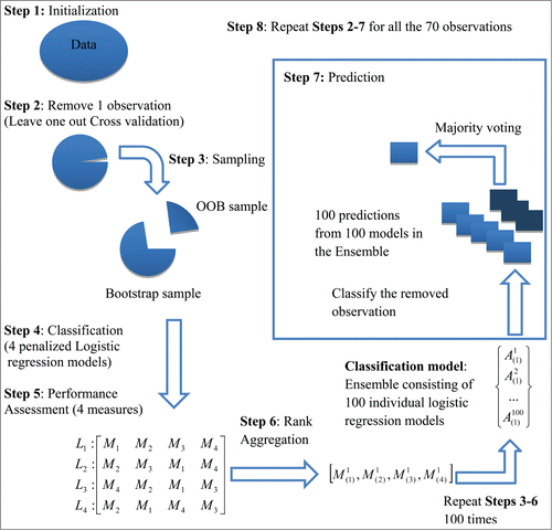
Figure 5. A Schematic Diagram of the Ensemble Binary Regression (adapted from Datta et al., 2010, BMC Bioinformatics, 11, 427).