
Figures & data
Table 1. Sociodemographic characteristics for both groups.
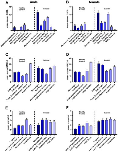
Figure 1. Graphical demonstration of the questionnaire outcomes. (A) GSDS – male healthy controls vs. suicidal patients; (B) GSDS – female healthy controls vs. suicidal patients; (C) STAXI-II – male healthy controls vs. suicidal patients; (D) STAXI-II – female healthy controls vs. suicidal patients; (E) I-8 – male healthy controls vs. suicidal patients; (F) I-8 – female healthy controls vs. suicidal patients. Data is displayed by mean ± SEM.
Visual representation of statistical calculations in the study: A comparative bar chart with two columns. On the left, data for male participants; on the right, data for female participants. Each column is divided into two sections, representing healthy controls (left) and suicidal patients (right). Within each section, there are three separate graphs, each displaying five to six bars. The bars are color-coded from dark to light purple, offering a clear distinction between the different categories and groups under investigation.
Supplemental material
Supplemental Material
Download MS Word (23.5 KB)Data availability statement
The data that support the findings of this study are available from the corresponding author, M.F., upon reasonable request.