
Figures & data
Table 1. Description of articles implementing overinclusion condition in the Cyberball paradigm (34).
Figure 1. PRISMA 2020 flowchart showing the selection process of papers.
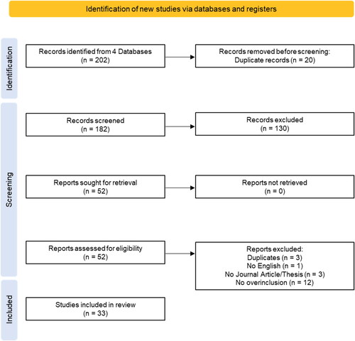
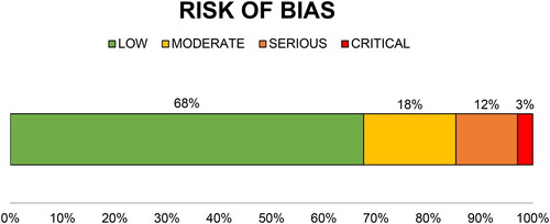
Figure 2. Risk of bias evaluation of the papers extracted from the systematic review procedure. The bar represents the percentage of studies with different degrees of risks of bias: low (green) = randomization and blinding of participants criteria were respected; moderate (yellow) = blinding of participants criterion was respected but randomization data were incomplete; serious (orange) = not respecting the randomization criterion; critical (red) = not respecting any criteria.
Cogent_Alt_Text_figures.docx
Download MS Word (13.1 KB)Data availability statement
The data that support the findings of this study are available at https://osf.io/fd8jx/?view_only=db244ee956bb4eb085dd8e346924206b.