Figures & data
Figure 1. Comparing the effects of menu color on the visual perception of senior adults, we evaluated the impact of a yellow-like tone (right) versus a normal-shade style (left).
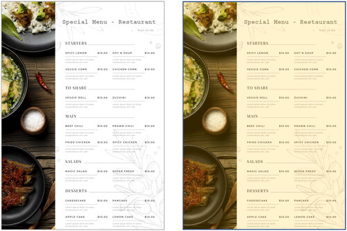
Table 1. Descriptive analysis for the respondent – digital-based questionnaire platform.
Figure 2. Comparing the effects of lighting in a restaurant, the darker tone (left) versus the lighter tone (right) can have contrasting impacts on the dining experience (Huibin, Citation2023; Fohlio, Citation2023).
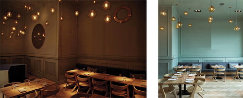
Figure 3. The drafted idea aims to create a menu that supports senior adults.
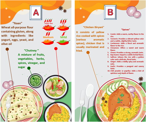
Figure 4. Applying universal and minimal symbol for representing key ingredients.
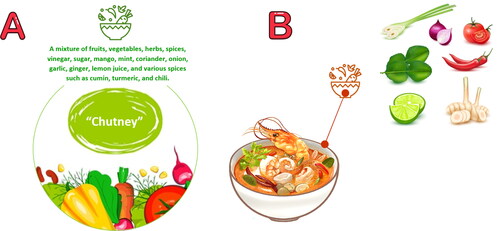
Figure 5. Different font styles can be used for the same phrase.

Figure 6. Three different font styles for conveying cleanliness and tastiness messages.

Figure 7. Low-contrast color combinations: Light gray text on a gray background (left), and navy-tone text on a pale orange background.
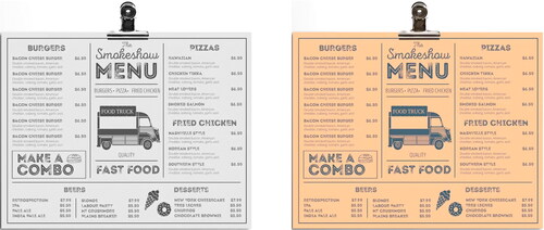
Figure 8. Demonstrating the effect of high-contrast color combinations on readability.
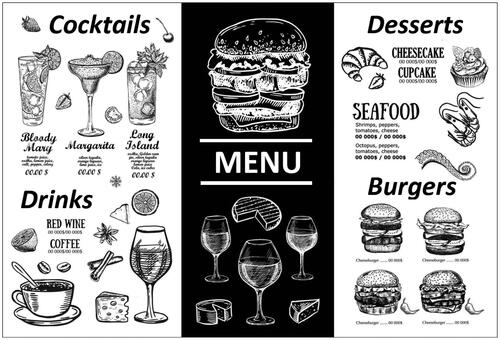
Figure 9. Three lighting styles for the dining area.
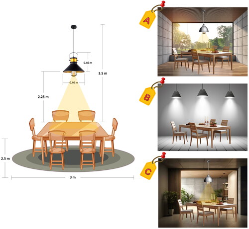
Figure 10. Key factors of concern for senior adults when eating out.

Table 2. Key factors concerned plus definition.
Figure 11. Perceptions of dining out: A case study on senior adults.
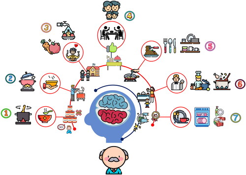
Table 3. Key points of customer perception.
Figure 12. A food tray with partitioned ends – (A) rectangular platform, and (B) fantasy platform.
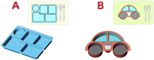
Figure 13. Customer perception influences the dimensions and structure of the food tray design.
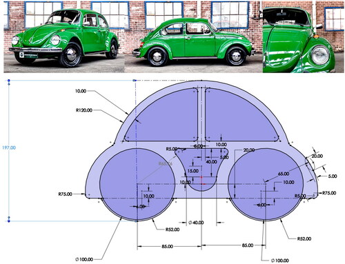
Figure 14. House of Quality (HoQ).
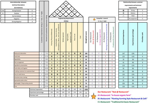
Table 4. Key points of customer perception.
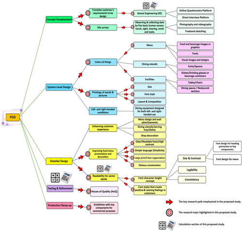
Figure 15. The research framework - guidelines for successful Product Design and Development (PDD).