Figures & data
Figure 1. The experimental flume used for the swimming performance tests with all components connected. The flume consisted of an upstream tank connected with the main open channel flume which discharges water in the downstream water collection tank. The water is recirculated using a water pump via a combination of a stainless steel and plastic pipes connecting the whole flume system.
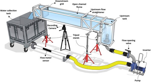
Figure 2. Box plot of time-to-fatigue for 0.5 [min] (n = 7), 5 [min] (n = 27), and 20 [min] (n = 31) habituation time treatments. The red dot is the mean, whereas the solid black horizontal line inside the bounding box is the median fatigue time. The black dots represent the outliers, whereas the bounding box defines the Interquartile Range (IQR) of the time-to-fatigue data for each treatment. The vertical solid black lines mark Q1 – 1.5*IQR (bottom end) and Q3 + 1.5*IQR (top end), where Q1 and Q3 are the 25th and 75th percentiles, respectively.
![Figure 2. Box plot of time-to-fatigue for 0.5 [min] (n = 7), 5 [min] (n = 27), and 20 [min] (n = 31) habituation time treatments. The red dot is the mean, whereas the solid black horizontal line inside the bounding box is the median fatigue time. The black dots represent the outliers, whereas the bounding box defines the Interquartile Range (IQR) of the time-to-fatigue data for each treatment. The vertical solid black lines mark Q1 – 1.5*IQR (bottom end) and Q3 + 1.5*IQR (top end), where Q1 and Q3 are the 25th and 75th percentiles, respectively.](/cms/asset/88d3c9da-df4c-4bb5-a72b-513f3a3d1f0e/tjoe_a_2306411_f0002_c.jpg)
Figure 3. Box plot of time-to-fatigue for the fish swimming or resting in the flume (n = 21) or resting on the grid (n = 37) at the end of habituation/beginning of transition. The red dot is the mean, whereas the solid black line is the median fatigue time. The black dots represent the outliers, whereas the bounding box defines the Interquartile Range (IQR) of the time-to-fatigue data for each treatment. The vertical solid black lines mark Q1 – 1.5*IQR (bottom end) and Q3 + 1.5*IQR (top end), where Q1 and Q3 are the 25th and 75th percentiles, respectively.
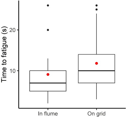
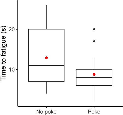
Figure 4. Box plot of time-to-fatigue for fish swimming volitionally in response to flow (“no poke”, n = 29) or swimming first after having been externally motived by poking (“poked”, n = 29). The red dot is the mean, whereas the solid black line is the median fatigue time. The black dots represent the outliers, whereas the bounding box defines the Interquartile Range (IQR) of the time-to-fatigue data for each treatment. The vertical solid black lines mark Q1 – 1.5*IQR (bottom end) and Q3 + 1.5*IQR (top end), where Q1 and Q3 are the 25th and 75th percentiles, respectively.