Figures & data
Table 1 Number of case-control pairs with gene expression data Xg,p in each stratum and year before diagnosis in the screening group
Table 2 Number of case-control pairs with gene expression data Xg,p in each stratum and year before diagnosis in the clinical group
Figure 1 Overview of hypothesis tests, prediction methods, variables, and strata.
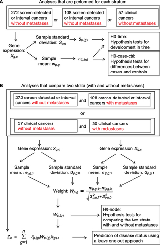
Table 3 Association between tumor size and metastases
Figure 2 The statistics sp,(g) and mp,(g).
Abbreviations: st.dev., standard deviation; w.r.t, with respect to.
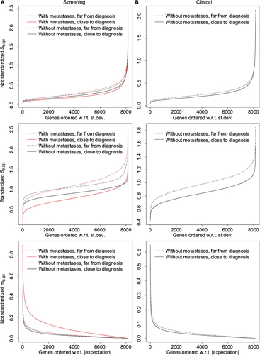
Figure 3 The statistic wp,(g) and hypothesis H0-node.
Abbreviation: w.r.t, with respect to.
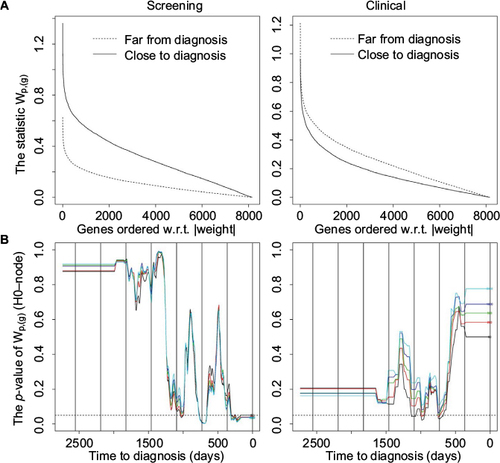
Figure 4 Hypotheses H0-case-ctrl and H0-time.
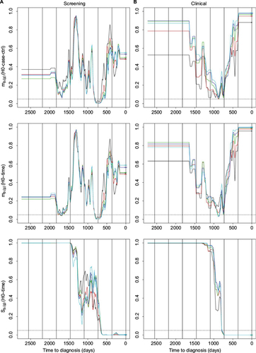
Table 4 Number of correctly and wrongly classified cases in the screening group and the clinical group
Figure 5 Prediction results.
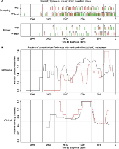
Table 5 Top 10 differentially expressed genes in clinically and screening-detected cases when comparing cases with metastases to cases without metastases
Figure 6 ROC curves.
Abbreviation: ROC, receiver operating characteristic.
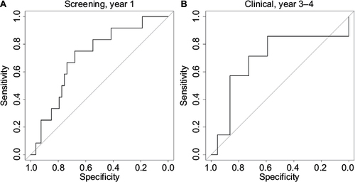
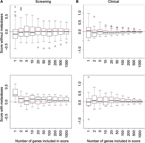
Figure S1 Boxplots illustrating how the score used in the predictor depends on the number of genes included in the score.