
ABSTRACT
Schematization is an established method to improve transit map usability, especially for rail-based modes. However, official designs differ considerably in the application of such methods, leading to the question of whether some designs might be better optimized than others. Objective measurements of performance comparing the use of different versions currently offers the soundest method of determining usability, especially compared with soliciting subjective evaluations from the general public – which are typically uncorrelated with objective measures. A short-cut to design evaluation might be to consult experts in the domains of cartography or graphic design. However, the research discussed here indicates that informal expert-evaluations are almost indistinguishable from those offered by the general public. In order to be given credence, expert-evaluations of usability must be derived from generalized empirical evidence, or else grounded in clearly stated, falsifiable theories of usability, or at least based upon logically transparent arguments.
Planning a journey by public transport in a large city such as London, Paris, New York, Tokyo or Seoul can be a daunting task. So much so that, in an attempt to quantify the level of complexity that faces the user, Gallotti et al. (Citation2016) suggest that there is a cognitive limit to the understandability of complex transport networks, and that a number of these worldwide have already exceeded this threshold. With the size of urban rail networks increasing year-by-year, particularly in Asian cities, and the increased inter-availability of different transport modes made possible by computerized ticketing, the challenge for the cartographer or information designer is to continue to depict these systems with sufficient clarity so that users can plan efficient journeys quickly. One frequent alternative is to offer journey-planning computer software, so that users are relieved of the need to identify options for themselves, but this has the undesirable side-effect of inhibiting the acquisition of knowledge about the network (see Ishikawa et al., Citation2008; Willis et al., Citation2009, for a review of the issues associated with automated wayfinding software). Fortunately, most transport operators continue to make traditional journey planning aids, such as maps and timetables, available to passengers who prefer to use them.
Schematization as a Technique to Enhance Urban Rail Map Usability
The majority of the larger urban transport operators attempt to simplify the depiction of their rail networks by making available schematized representations. The exact nature of what constitutes a schematic map (or diagram) of a transport network is difficult to define precisely (e.g. Dow, Citation2005; Roberts, Citation2005) but there are a number of simplification techniques, introduced and developed over a century ago, which can be identified as potentially enhancing usability.
Variable scale. Many urban rail networks comprise a dense central region with closely-spaced stations, surrounded by more sparsely-served suburbs with wider spacing. Depicting this to scale would be inefficient or could result in poor legibility at the centre. Hence there is a tendency by designers to expand congested regions of the map and compress sparse ones.
Omission of surface details. For the most extensive networks, showing fine details such as individual streets would also render the map illegible, and many designs dispense with all surface features except for major ones such as water and parks.
Simplification of line trajectories. Precise routes of lines connecting stations, especially subterranean ones, are of secondary importance to the rail traveller compared with the locations of the stations themselves. Hence, there is a tendency by designers to simplify line trajectories. At an extreme, routes may be restricted to straight lines with only certain angles permitted, and linked by tightly radiused curves.
Local topographical distortion. In order to effect simplification of line trajectories, relative positions of stations may be adjusted. At an extreme, north-south or east-west relationships may occasionally be reversed.
Schematization Techniques are Applied Inconsistently by Designers
Schematization techniques developed in the early twentieth century, leading towards the disciplined treatments of entire-networks in the 1930s (e.g. see Dow, Citation2005; Roberts, Citation2012; Roberts, Citation2019a). Henry Beck’s London Underground diagram, published in 1933, is a notable example in which all four of the simplification techniques, described earlier, are applied (Garland, Citation1994). It utilized horizontal, vertical and 45° diagonal lines only; a combination of angles which, today, are designated as octolinear (or octilinear) by researchers (e.g. Nöllenburg and Wolff, Citation2011; Roberts, Citation2012). Despite this culmination in the 1930s, the widespread adoption of schematization techniques did not commence until the 1960s (e.g. see Ovenden, Citation2003; Citation2015). Today, such representations are commonplace, and the compilation by Ovenden (Citation2015) demonstrates that the majority of larger and/or mature urban rail networks display all of the simplification techniques described.
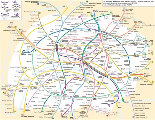
The problem, also in evidence by Ovenden (Citation2015), is that designers differ in their implementations of schematized representations. For example, considering published official versions: (1) variable scale is notably limited for some, even where the result is numerous station names interrupting lines; (2) surface detail omission is inconsistent between networks; (3) the trade-off between line trajectory simplification and topographical distortion varies from city to city; and (4) line trajectories can be simplified by using straight lines at non-octolinear angles, or even simple curves such as circular arcs (Newton and Roberts, Citation2018; Kölnische Rundschau, Citation2021). It could be argued that cities have different structures, and networks have different topographical and topological properties, and so it is reasonable that differences in schematization techniques should reflect these qualities on a network-by-network basis. Unfortunately, this variability is in evidence (1) when different (credible) designers attempt to map the same network; and (2) when a transport organization revamps an established official design and implements considerable changes. The Paris Metro provides the best (but by no means exclusive) illustrations of both of these. Hence, Ovenden (Citation2009) demonstrates the unprecedented design instability that took place from 1970 to 2000 for official maps of this network. Furthermore, three transport organizations with operational interests in Paris have issued schematic maps based on different principles: (1) octolinear from RATP; (2) multilinear (straight lines only, but without obvious restrictions to angles) from SNCF; and (3) hybrid linear/curvilinear from Île-de-France Mobilités (formerly STIF) (see to , the maps date from 2018 when all three were available simultaneously).
Figure 1. Since 2000 the official RATP Paris Metro map has been a conventional design comprising horizontal, vertical, or 45° diagonal straight lines joined by tightly-radiused curves. The equal intervals of angle rotation make this a regular octolinear design. Image and design ©RATP, all rights reserved, reproduced with permission.
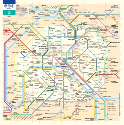
Figure 2. SNCF operates frequent services on Paris RER lines, and the organization has issued its own version of the Paris Metro map which is best described as multilinear, using straight lines but at a variety of different angles. For historians of the Paris Metro map, this version is similar to maps issued by RATP prior to the design shown in (see Ovenden, Citation2009). Image and design © SNCF, all rights reserved, reproduced with permission.
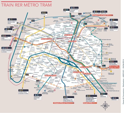
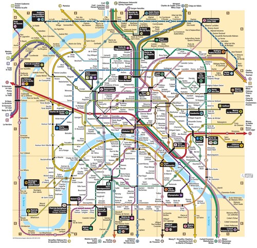
Figure 3. The Paris Metro map issued by Île-de-France Mobilités (formerly STIF) took a different approach to the RATP design. Octolinear lines dominate, but some deviate from this, and widespread use of gentle curves means that the design rules are best described as hybrid. Image and design © Île-de-France Mobilités, all rights reserved, reproduced with permission.
This diversity within the same city challenges the notion that schematic map differences invariably reflect some sort of evolutionary natural selection, such that design principles are refined to reflect the unique environmental niches of individual networks. Instead, the lack of systematicity could indicate widespread differences of opinion amongst expert designers/cartographers in how schematization techniques can assist the user to make sense of a complex network. Hence, even before a consideration of the issues of how best to group services, depict stations and interchanges, and what supplementary information should be added to the base design, there is potential for disagreements on basic layout. Unless design makes no difference to usability, the outcome of this diversity must be that some schematized maps may be fundamentally sub-optimal, insufficiently fulfilling their potential to enhance usability. The question, therefore, becomes: how should schematic map layout be evaluated such that differences in usability can be identified?
Methods for Evaluating the Usability of Schematic Maps
In any situation where a number of competing maps are available for navigating an urban rail network, especially where these use different design techniques, it is legitimate to query which of these might be the more usable in terms of the functions that they would be expected to perform. These might include facilitating the identification of: (1) the appropriate origin and destination stations; (2) alternative candidate stations in the vicinity of each other in order to maximize journey options; (3) valid routes that link pairs of stations; and (4) optimal routes from amongst competing options. Of these, (1) requires topographical accuracy and the presence of surface features; (2) requires, at the very least, topographical accuracy at regions of high station density (although scale distortion may be permissible with care); whereas (3) and (4) require neither, provided that the configuration of lines does not mislead passengers into making inappropriate journeys or selecting inappropriate routes (see Guo, Citation2011, and , for an example of a misleading region of the official London Underground map). Already this list points towards the potential for conflicting design requirements, perhaps solved by offering multiple versions; topographical with surface features for station identification, and schematized for journey planning, or else some sort of hybrid (e.g. Mijksenaar and Vroman, Citation1983, whose design had a topographical centre and schematized suburbs). Overall, restricting attention to schematized maps, the sheer diversity of available designs, even for individual cities, continues to prompt the need for methods of evaluating them to identify those that are more (or less) usable. There are four broad means by which this might be achieved.
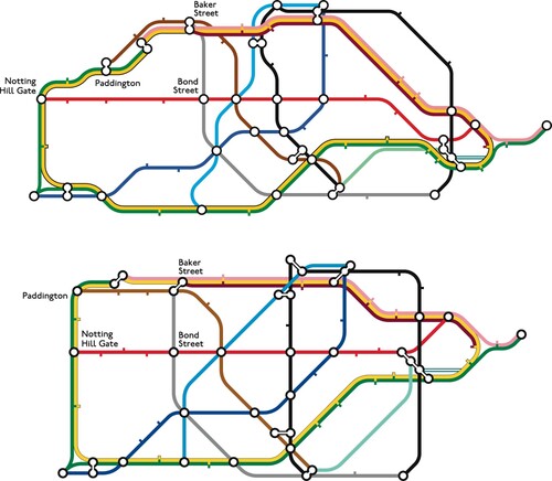
Figure 4. Octolinear schematized central regions of the London Underground. The upper layout is topographically accurate, the lower layout distorts, for example, the relative positions of Paddington and Notting Hill Gate (in a similar way to the official configuration). Guo (Citation2011) observed that around 30% of journeys between Paddington and Bond Street are via Notting Hill Gate, with the implication that the configuration of the official map implies that this route is a reasonable option. The route via Baker Street is considerably shorter in reality. Image and designs © Maxwell J. Roberts, all rights reserved, reproduced with permission.
Measuring Performance
It is possible to investigate various aspects of map usability by administering a variety of tasks, with quantified performance measures indicating which designs are, on average, the best performing. For example, station finding might be tested by asking people to point to names on a touch screen, or to answer a series of simple questions (e.g. Is station X on Line 1; yes or no? Which line is station X on; Line 1 or Line 2?) Measures of performance might include mean times required, or proportions of errors. For journeys between pairs of stations, the mean time required to plan each journey can be investigated, or else simple questions that capture the essence of the planning task can be administered (e.g. Does a journey from Station X to Station Y require a transfer at Station Z; yes or no?). If actual planned journeys are recorded, their quality can be analysed in terms of their likely duration. More elaborate investigations of map usability might include route discriminability – the time required to identify which is the best route from a number of highlighted options – and network learning – the ease with which the overall structure is assimilated as a result of using a map.
Roberts (Citation2014) and Wu et al. (Citation2020) review a number of studies which compare the usability of various designs. Even in terms of a simple measure, such as mean time required to plan a journey between designated pairs of stations, it is possible to identify substantial differences between schematic maps (Roberts et al., Citation2013; Roberts et al., Citation2016; Roberts and Vaeng, Citation2016; Roberts et al., Citation2017). For example, the official RATP Paris Metro map, an octolinear design (see ), is consistently outperformed by a curvilinear alternative, with journey planning times up to 50% faster for the latter (Roberts et al., Citation2013; Roberts et al., Citation2017, see ).
Figure 5. The curvilinear Paris Metro map, designed by the author, consistently out-performs the RATP official octolinear design (see ) in terms of time necessary to plan complex (i.e. two-transfer) journeys between pairs of stations. Image and design © Maxwell J. Roberts, all rights reserved, reproduced with permission.
All methods of evaluating schematic maps have their advantages and disadvantages. Measuring usability via experiments can require considerable testing and resources. For example, Roberts and Rose (Citation2016) investigated a number of London Docklands Light Railway prototype route diagrams, using a variety of station finding and journey planning tasks, with responses collected via touch-screens. The study was successful, in that designs were identified that were associated with larger numbers of errors, or else the planning of inefficient journeys, and the map that formed the basis of the production version had none of these difficulties. However, in order to identify this, it was necessary to test 240 subjects, all for a network comprising fewer than 50 stations.
Measuring Design
Instead of conducting usability tests for every single schematic map for every single city, if objective measurement criteria could be assembled to evaluate directly the layouts themselves, then the task of identifying the best versions would be considerably reduced. Deriving criteria from empirical findings, or at least theoretically grounding them, would be important for their credibility. Measurement criteria might, for example, be based upon quantified analyses of line configurations, such as the simplicity of individual trajectories, and also higher order measures of relatedness of trajectories between lines (e.g. parallelism and symmetry). Hence, if different designs could be scored for usability solely on the basis of various aspects of their layouts, then there would be no need for extensive testing. A number of computer scientists are attempting measurement as part of their research into automated map design, in which computer algorithms are devised for creating schematized representations from topographical data (e.g. Wolff, Citation2007; Nöllenburg and Wolff, Citation2011; Stott et al., Citation2011; Chivers and Rodgers, Citation2015; Terziadis and Nöllenburg, 2023 – see Wu et al., Citation2020 for a state of the art review). To this end, researchers have identified several clearly-stated and quantifiable design principles and priorities that are used to constrain the algorithms and hence produce designs optimized by these criteria (see ). In theory, these could also be used to evaluate any map irrespective of its source, i.e. manually or computer generated. In reality, the requirement for well-specified hierarchical criteria that can be easily quantified for the purpose of computer programming means that the more subtle aspects of schematic map design are not yet captured. Mapping a complex network such as London or Paris, including placement of station labels, currently presents a considerable challenge to computers (see ). The assembly of a set of comprehensive, fully quantifiable, prioritized schematic map evaluation criteria, validated using human usability data, and that could even begin to rank-order manual designs for usability, is a long way off.
Figure 6. Octolinear London Underground map created by computer algorithms overseen by Martin Nöllenburg and Soeren Terziadis at TU Wien (Roberts, Citation2019b). Image and design © Martin Nöllenburg and Soeren Terziadis, all rights reserved, reproduced with permission.
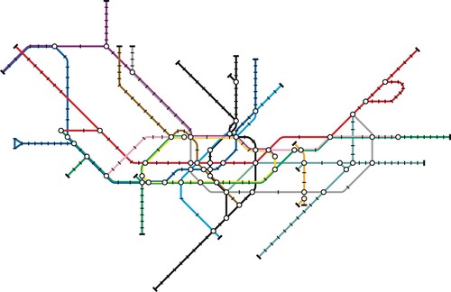
Table 1. The criteria for schematic map design as outlined by Nöllenburg (Citation2014) for the purpose of computer-automated schematic map layout.
Specifying Design
Until it is possible to quantify schematic map usability on the basis of design qualities, it still might be feasible to evaluate different versions in a principled way by specifying various qualitative criteria necessary (and sufficient) to optimize this, and then determining how successfully these have been implemented for individual maps. The lack of requirement for rigorous quantification means that a wider set of criteria can be considered, and Ovenden (Citation2009) has compiled an extensive list (see ).
Table 2. Good Practice in Diagram Design: Prescriptions for optimizing schematic map design taken from Ovenden (Citation2009).
Lists such as this, with many components, present challenges to the conscientious designer who wishes to follow the various prescriptions. Many of these are undoubtedly useful. However, given that this list was created by soliciting opinions from a diverse sample of designers, there is a risk that such an exercise has merely resulted in a set of conflicting prescriptions that is a reflection of the diversity of designers' individual techniques and beliefs. For example, opinions about typography (and, consequently its application) differ considerably: should text always be horizontal, or else is rotated text permissible, and is it acceptable for text to interrupt lines in congested areas of the map? In sum, the list comprises a number of criteria that are isolated heuristics, principles and rules of thumb that have been derived from logic, empirical testing, observation, intuition or prejudice, and inevitably this will lead to poor specification, over-simplification, inconsistencies and conflict. A number of criteria are sufficiently subtle that they are more likely to influence the aesthetic appeal of a design, rather than have a substantial measurable effect on usability, such as the suggestion not to change direction twice between stations, and the specification for horizontal text only.
User Evaluations
Evaluating usability via objective measurement of performance (Pages 3–4) is relatively labour intensive. A preferable method, therefore, of determining this and comparing different designs, might be to survey users directly for their opinions. This would also circumvent difficulties facing current attempts directly to measure and specify criteria for optimized designs (Pages 4–5 and 6).
Opinions could be solicited simply by asking people to choose between different versions after attempting to use them, or else a more structured attempt may be made to quantify these by administering questionnaires in which various aspects of map usability are queried, scored and totalled via a series of statement ratings (e.g. station interchanges were difficult to negotiate using this map – strongly agree/agree/neutral/disagree/strongly disagree). Another example of subjective evaluations would be to administer journey planning tasks and ask people to estimate their planning times and journey durations for the different maps. Alternatively, the general public might simply be asked to vote for their most-preferred map from a set of prototypes without any attempt at use (Boston Globe, Citation2013).
Evaluating usability in this way has the advantage of taking into account user-acceptability of designs. It is important to accommodate this because a map that is rejected by users will have failed, irrespective of its merits (for an account of public rejection of the London Underground diagram minus the River Thames, see Daily Mail, Citation2009). Hence, even if extensive objective measures of usability are being gathered, and compared between designs, it is advisable also to solicit user opinions and their experiences as a result of using them, in order to ensure that there is unlikely to be resistance to introduction. The problem occurs if soliciting user assessments is assumed to be a valid proxy for objective usability data, so that empirical testing is not performed. The utility of user assessments as the sole method of ascertaining usability is undermined by the persistent failure to find any correlation between objective measures and subjective ratings. Hence, although Roberts et al. (Citation2013) and Roberts et al. (Citation2017) found that the curvilinear Paris Metro map () was faster for journey planning than the official octolinear version (), its statement rating task scores were no better and, if anything, the curvilinear design was slightly less likely to be selected in preference. Using appropriate objective measures it is possible, on an individual basis, to identify which specific map of a set of designs yields the best performance for an individual, and yet this has been shown to be unrelated to their individual preferences (Roberts et al., Citation2017). Hegarty et al. (Citation2009) have found similar dissociations for meteorological maps. Hence, people can favour designs which are demonstrably less usable for them personally, and reject designs that are more usable for them. Similarly, Roberts and Rose (Citation2016) found that the most highly rated Docklands Light Railway route diagram was also the one that was associated with the most journey planning errors. Even on the rare occasions where there does appear to be a positive correlation between objective measures and subjective ratings of usability, this appears to be coincidental, so that those aspects of design that are prompting adverse subjective usability assessments are, in fact, independent of those that are detrimental to objectively measured usability (Roberts et al., Citation2016).
The preference by many people for sub-optimal information formats is well-known in the literature on computer interface usability (e.g. Andre and Wickens, Citation1995). Furthermore, the dissociation between objective versus subjective measures of usability is entirely in line with findings in psychology, where metacognitive failures such as these are commonplace (e.g. Kruger and Dunning, Citation1999; Chabris and Simons, Citation2010). One difficulty is that, without clear, salient performance cues, and provided that a map yields the impression of competent performance to the user, then most people (who will not be experts at visual information design) will evaluate maps according to superficial surface properties (such as line colours) or according to their expectations and prejudices concerning how a schematic map should be designed, rather than the more subtle aspects that might contribute more directly to usability. For example, with most European schematic maps utilising octolinearity, this will lead to an expectation that such maps should be designed in this way even when this is less than fully compatible with network structure. The tendency to evaluate by surface properties is analogous to findings in expert-novice physics problem solving, for example, Chi et al. (Citation1981), where novices categorized physics problems by salient features (e.g. springs, slopes) rather than actual physical properties (e.g. conservation of energy, friction).
Roberts (Citation2019c) discusses these issues in depth, highlighting that it is easy to dismiss user ratings of map usability – where these disagree with objectively measured map performance – on the basis of cognitive or metacognitive failures. However, this easy option should not be taken lightly because it is possible that the aspects of performance that are being objectively measured are failing to capture aspects of usability that matter to users. Hence, future research should focus on the possible reasons for the mismatch with a view to developing new, objectively measured, map navigation tasks, whose results have at least some correlation with users’ subjective ratings of map usability. Until this research is completed, however, the only possible conclusion to date is that asking non-expert users to select between maps is no more likely to result in the adoption of the most usable designs than if they were chosen randomly.
Expert Versus Non-expert Assessment of Schematic Map Usability
Empirical data currently implies an inability by non-expert users to evaluate schematic map effectiveness. However, this explanation carries with it an implication that there exist experienced individuals with appropriate domain-relevant knowledge and that, unlike typical users, such individuals would be expected not to be distracted by superficial aspects of design, focussing only on those directly relevant to usability, hence their evaluations would correspond much more closely with objectively measured performance data. If this is the case, then it might still be possible to dispense with extensive, exhaustive usability testing. In a similar manner to an expert physician diagnosing medical problems, schematic maps with usability difficulties could be expertly diagnosed, with usability testing confined to the investigation of novel design techniques for which an accepted body of knowledge has not yet been developed. This seems to be the approach advocated by, for example, Field and Cartwright (Citation2014) who, for a number of different maps, make numerous assertions concerning design success or otherwise, in the absence of objective measures of performance. They also make explicit reference to the possession and application of domain-relevant knowledge by certain individuals, for example, where they complain about mass internet reactions to novel designs of maps, lamenting that ‘the number of experts who may have genuine or legitimate criticisms becomes drowned out by the many’ (p.354). As another consideration in tandem with this, Griffin et al. (Citation2017) indicate that such expertise may be tacit, so that experts may have difficulty articulating justification for their diagnoses, effectively meaning that without empirical evidence to support these, expert judgements have to be taken on trust.
The difficulty with asserting or accepting the principle of expert authority as a means of evaluating schematic map usability commences with the acknowledgement that a number of academic disciplines (cartography, computer science, data visualization, information design, psychology) and professions (graphic design, marketing, transport management) all might legitimately claim to possess their own domain-relevant expertise as regards this. In terms of whether a domain-relevant body of multidisciplinary yet consensual knowledge can even be said to exist, the inconsistency of design approaches discussed (Page 2) alongside the inability to reach a consensus on the issue of specifying criteria for optimizing usability (Page 6) suggests caution in this respect. The validity of expert-evaluations might be given more credence if there was clear conformity of these to generalizable basic principles derived from objective usability data. Failing this, minimally, and given that many social science sub-disciplines have not yet reached a status of full consensus between researchers, we might, at the very least, hope for clear internal consistency of evaluations within individuals amongst a group of experts. This would demonstrate a systematic, principled approach to evaluation by each individual, even if there is not yet agreement between experts as to what the principles might be. Unfortunately, a re-analysis of data obtained in a large-scale internet study by Roberts et al. (Citation2017) will demonstrate that neither of these criteria were satisfied when schematic maps were evaluated by a group of people who might reasonably be expected to possess expertise in the domain of schematic mapping.
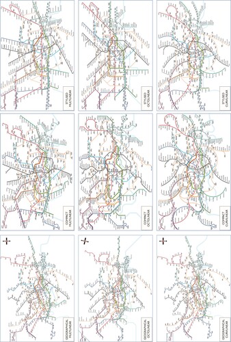
This study solicited simple usability ratings on an array of specially/manually designed, matched London Underground schematic maps. These versions were created according to three different design rules (octolinear, multilinear, curvilinear) and optimized according to three different design priorities (stylized – optimized for simple line trajectories; geographical – optimized for topographical accuracy such that relative positions of stations were spatially informative despite the variable scale; and compact – optimized for neither, deliberately intended to have complex line trajectories). This gave a matrix of nine maps for assessment, see and . Because of London’s somewhat chaotic rail network, it was inevitable that the geographical maps would have complex line trajectories, but the compact maps were designed so that the complex line trajectories were not systematically constrained by requirements for topographical accuracy.
Figure 7. Three configurations of the same section of the London Underground network from the stylized designs in the internet rating study, illustrating octolinear (top), multilinear (centre), and curvilinear (bottom) approaches. All three have the same priorities, the simplest possible line trajectories inside the Circle Line. Image and designs © Maxwell J. Roberts, all rights reserved, reproduced with permission.
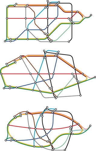
Figure 8. The matrix of nine London Underground maps designed by the author and used in the internet rating study of Roberts et al. (Citation2017). Image and designs © Maxwell J. Roberts, all rights reserved, reproduced with permission.
The intention of this study was to identify intuitive theories of design (e.g. McCloskey, Citation1983; Gelman and Legare, Citation2011) on the basis of individual patterns of assessments. Hence, it is assumed that evaluations concerning the relative usability of maps must entail some sort of theory of the configurations, features and other criteria necessary in order to maximize this. The approach is similar to that taken by Hegarty and colleagues (e.g. Hegarty et al., Citation2009; Hegarty et al., Citation2012; Hegarty, Citation2013) via their research into naïve cartography using meteorology maps. Here, they found that individuals tend to have a preference for realism and embellishment, even where this is irrelevant to the task and can be shown to result in a decrement in performance owing to the presence of spurious information. Overall, in their research, between one-quarter and one-third of expressed preferences were for over-embellished representations and, intriguingly, expert-users were equally prone to this tendency as non-experts, with the main difference between the two groups being that the experts were less likely than the novices to have the accuracy of their inferences reduced when using sub-optimal representations.
As part of the study reported here, respondents were asked whether they had read any books and articles written by the author (indicating a particular interest and awareness in schematic map design issues) and were also asked ‘does your profession involve graphic design, information design, or public transport information?’. People answering in the affirmative to either or these might be expected to have some expertise in, or sensitivity to, issues relevant to schematic map design. In terms of intuitive theories of design, one of the most obvious to look for is named by Roberts et al. (Citation2013) as the octolinearity as a gold standard conjecture. This is the widespread belief that applying octolinearity will result in the most usable schematic map no matter what the structure of the network or the quality of implementation (e.g. Ovenden, Citation2005: 39). For example, Nöllenburg and Wolff (Citation2011) described octolinearity as a Hard Constraint (i.e. it should never be broken) and suggest that ‘the main benefit of octilinear layouts is that they potentially consume less space and use fewer bends while still having a tidy and schematic appearance’ (p.626) and that ‘we believe that octilinearity, which is strictly followed by most real metro maps, is an essential ingredient for tidy and easy-to-read metro map layouts’ (p.627). The problem with this belief is that the conjecture has been refuted by Roberts and colleagues for investigations of Berlin, London and Paris schematic maps (Roberts et al., Citation2013; Roberts and Vaeng, Citation2016; Roberts et al., Citation2017). Hence, by comparing the prevalence of this theory, and other ones, between experts and non-experts, we would be in a position to determine the likely validity of expert judgement of schematic maps compared with non-experts. Furthermore, it might also be predicted that individual expert evaluations of maps should be more coherent, i.e. internally consistent than non-experts.
Method
The full method of the internet-based study is described by Roberts et al. (Citation2017) and only the essentials will be outlined here. Subjects were 649 respondents recruited via the author’s map-related newsletter and recommendations via various map-related websites. 541 were male and 108 were female. The mean age was 36.2 years, SD 14.3. Of the various countries represented, 290 were from the UK, 118 were from the USA/Canada and 116 were from Germany. The study was implemented remotely via a web-browser. During the preliminary phases respondents answered two questions concerning their experience with maps, design and public transport:
Have you ever read any books or articles on map design by Maxwell Roberts? [yes/no]
Does your profession involve graphic design, information design, or public transport information? [yes/no]
The survey was designed to be displayed on a web browser as a sequence of tasks. After the preliminary questions, the first task was usability rating, and its instructions informed subjects that: You are about to see a table with nine different London Underground maps. Your task is to look at these and identify any designs that in your opinion might be particularly easy to use for planning a journey, or particularly difficult. The nine maps were displayed simultaneously on one screen, all initially set to neutral ratings. Subjects could zoom in and view individual designs and rate them in any order, changing their minds if they wished, until they indicated that they had completed this rating task. After this, the attractiveness rating task was completed.
Results
Of the 649 people, 274 answered in the affirmative to one or both of the key questions, and were categorized as Expert, leaving 375 in the Non-expert group. Usability rating scores were scaled such that if all respondents rated a map as easy to use, then its mean score would be 100%, if all respondents rated a map as neutral, its mean score would be 50%, and if all respondents rated a map as hard to use, its mean score would be 0%. Overall ratings by expertise group, split by map design rules and design priorities, are shown in .
Table 3. Ratings of schematic map usability comparing Expert and Non-expert groups, reanalysing data from Roberts et al. (Citation2017). Responses have been scaled such that 100% would indicate every single person rating a map as easy to use and 0% would indicate every single person rating a map as difficult to use.
Group Rating Tendency
Simple group rating tendency refers to overall ratings averaged across individuals. As shown in , and confirmed by a 2 × 3 × 3, Expertise × Design Rules × Design Priorities, mixed-design analysis of variance, findings are dominated by large main effects of Design Rules, F(2, 1249) = 299, MSe = 2028, p < .01 (Octolinear > Multilinear > Curvilinear) and Design Priorities, F(2, 1249) = 288, MSe = 1463, p < .01 (Stylized > Geographical > Compact). This rank order of preference is identical for both Expert and Non-expert groups. The higher-order effects revealed only small, subtle qualifications to these main effects. The three-way interaction was non-significant, F(4, 2588) = 0.87, MSe = 743, p > .05. Hence, the differences in Expert and Non-expert group usability judgements as a function of Design Rules can be discussed independently of their judgements as a function of Design Priorities.
The two-way Expertise × Design Rules interaction was significant, F(2, 1294) = 5.60, MSe = 2028, p < .01. The source of this interaction was the Non-expert group rating octolinear and multilinear designs slightly more favourably than the Expert group, and the Non-expert group rating curvilinear designs slightly less favourably than the Expert group. Multilinear/curvilinear maps were hence rated more similarly by the Expert group than by the Non-expert group. Overall, the differences in judgements between Expert versus Non-expert groups are small compared with the substantial overall preference for octolinear designs irrespective of group, and can best be summarized as follows: non-experts are slightly more likely than experts to rate the linear designs as being more usable than curvilinear designs.
The two-way Expertise × Design Priorities interaction was also significant, F(2, 1463) = 3.38, MSe = 1463, p < .05, but less pronounced than the other, indicating smaller differences between Expert versus Non-expert groups when rating maps with different design priorities than for different design rules. The source of this interaction was the Non-expert group rating geographical and compact designs slightly more favourably than the Expert group, and the Non-expert group rating stylized designs slightly less favourably than the Expert group. Again, the differences between Expert versus Non-expert group judgements are small compared with the substantial overall preference for stylized designs irrespective of expertise, and can best be summarized as follows: experts are slightly more likely than non-experts to be sensitive to simplicity of line trajectories when rating usability.
Rating Coherence and Rating Sophistication of Individuals
Looking at the level of the individual, differences in the internal consistency of ratings can also be identified. Hence, some individuals show a consistent tendency to rate certain categories of map (e.g. octolinear) more favourably than other categories (e.g. multilinear and curvilinear). This response pattern will be designated individual rating coherence (see ). For example, a coherent unambiguous octolinearity theory would be demonstrated by individuals who always give higher ratings to octolinear maps compared with all matched equivalents (e.g. stylized octolinear preferred to stylized curvilinear, compact octolinear preferred to compact curvilinear, and so on). For the Expert group, 76 of the 274 members (28%) were sufficiently consistent for them to be categorizable as holding a clear unambiguous theory of design, compared with 109 of the 375 members of the Non-expert group (29%). This effect was not significant, chi-square = 0.077, p > .05. Hence, Expert group members were no more likely to rate maps in a consistent systematic way than those in the Non-expert group, calling into question the suggestion that each expert would be more likely to hold a clear theory of schematic map usability, irrespective of the precise nature of the theory.
Table 4. Criteria for rating individuals as holding a coherent simplicity theory of schematic map usability (top), and a coherent octolinearity theory (middle) along with the ratings given by an individual that would yield a categorization of simultaneous simplicity and octolinear theories.
On the basis of empirical testing, we can establish that certain theories of schematic map design are more defensible than others. Hence, individual rating sophistication refers to whether individuals are demonstrating defensible versus inappropriate theories. Further to the octolinearity theory that can be identified for certain individuals, other identifiable theories include a linearity theory: maps based upon straight lines are rated more favourably than equivalent curvilinear designs (likewise falsified: Roberts et al., Citation2017), and the more defensible simplicity theory: maps with the simplest line trajectories are rated more favourably than ones with the same design rules but more complex line trajectories. Technically, these theories are not mutually exclusive, although individuals who displayed more than one were rare.
Given that the octolinearity as a gold standard conjecture is falsified (Roberts et al., Citation2013; Roberts et al., Citation2017), for the subset of people flagged as having sufficiently consistent ratings to be categorizable as holding a clear theory of schematic map usability, we might reasonably expect an octolinearity theory to be less widespread in the Expert group than the Non-expert group. However the evidence for any greater rating sophistication of the members of the Expert group is marginal at best, with all effects non-significant. Hence, 38 of the 76 categorizable members of the Expert group (50%) held the octolinearity theory as opposed to 56 of the 109 categorizable members of the Non-expert group (51%), chi-square = 0.011, p > .05. However, only 11/76 categorizable Expert group members (14%) held the linearity theory as opposed to 30/109 categorizable Non-expert group members (28%), but this effect was still non-significant, chi-square = 2.88, p > .05. Overall, taking account of the non-mutual exclusivity of theories, 46/76 categorizable Expert group members (61%) held theories that were empirically falsified, as opposed to 80/109 categorizable Non-expert group members (73%); a step in the right direction perhaps, but the effect was again not statistically significant, chi-square = 0.66, p > .05. Finally, 30/76 of the categorizable Expert group members (39%) held the more defensible simplicity theory as opposed to 27/109 of the categorizable Non-expert group members (25%), but even this effect was non-significant, chi-square = 2.36, p > .05.
Summary
Overall, although it was possible to identify significant rating tendency differences between Expert and Non-expert groups, these were small in relation to the overall main effects of usability ratings both for Design Rules and for Design Priorities, which were not themselves qualified in any way. On an individual basis, although it was possible to identify a subset of people holding clear, consistent theories of schematic map usability, there was little or no evidence for differences in prevalence between groups. Hence, Expert group members and Non-expert group members differed barely, if at all, for individual rating coherence or individual rating sophistication. Despite the relatively large sample size, all relevant effects were non-significant, although their direction did suggest higher levels of rating sophistication for the Expert group.
Discussion and Conclusions
The major findings of this study are clear. Based upon ratings gathered in an internet survey, and categorizing people as to whether or not they were likely to hold knowledge relevant to evaluating the usability of schematic maps, the differences between Expert and Non-expert groups are, at best, marginal. There is no evidence for substantial differences in overall rating tendencies between the groups, nor group differences in the coherence or sophistication of individual’s theories of schematic map usability. There is some evidence to suggest that individuals in the Expert group are slightly less likely to hold theories that are empirically falsified, and more likely to hold defensible theories. Hence, they demonstrated slight tendencies to be more sensitive to the importance of line trajectory simplicity for usability, and to be less likely to rate linear maps as being more usable than curvilinear maps. Even so, the evidence is certainly insufficient to give special credence en masse to the judgements of people categorized as potential experts at schematic map design, as per the method used in this study. As a group, such people were barely distinguishable from the Non-expert group.
The findings complement, and yet provide an interesting contrast with those of Hegarty and colleagues (e.g. Hegarty et al., Citation2009, Citation2012; Hegarty, Citation2013). In both the domain of schematic maps and meteorological maps, experts as a group were almost indistinguishable from novices in terms of their preferences for (sometimes inappropriate) designs. For Hegarty and colleagues, the specific naïve cartography displayed was a preference for maps that were realistic in appearance and embellished with superfluous supplementary information, and the major distinction between experts and novices was that expert performance was less likely to be damaged making inferences from inappropriately detailed maps. The preference for realism was not quite displayed in the current study: Designs labelled as being geographically accurate did not receive disproportionately higher ratings. However, these maps were schematized, and so could not be said to be realistic in appearance. Embellishing these maps with additional information, such as major streets and landmarks, would add to their realism, as well as increasing their complexity. Such designs would be able to facilitate, for example, choice of stations in order to plan a journey between landmarks, but then, as per the findings of Hegarty and colleagues, it would be expected that the embellishments would impede performance at tasks for which these are not necessary, for example planning a journey between two designated stations. Although the complexity of information embellishment was not explicitly investigated in this study, it is nonetheless apparent that complexity of line trajectories did not lead to adverse ratings in many cases. For example, of the 94 people categorized as holding an octolinearity theory of usability, just three additionally held a simplicity of line trajectories theory.
Overall, the findings here show that the usability evaluations of a group of people, who might be expected to have knowledge relevant to optimizing the design of schematic maps, are difficult to distinguish from people expected not to have that knowledge. However, within each group there were considerable individual differences in both the coherence and defensibility of the theories that were displayed. How then, might we be able to judge, a priori whether opinions expressed by a particular ‘expert’ are more likely to be sound, to any useful degree, than those that might be put forward by ‘less-informed’ ‘experts’, let alone members of the general public as a whole? We might expect sound assessments from individuals who attempt to derive judgements via generalized findings from usability studies: these would have the benefit of being evidence-based. Alternatively, the grounding of assessments on a theory or, at least, a framework for effective design – that is able to make clear testable predictions – should ensure that judgements are potentially systematic and falsifiable (for an example of such a framework, see Roberts et al., Citation2017). If such a theory cannot be derived from current empirical findings, then attempting to base one on, for example, findings in the domain of cognitive psychology (such as inference from visual information) would ensure a reasonable chance of a useful theory that will withstand testing. In the absence of even this, we would expect, at the very least, sound definitions and logically coherent and transparent arguments in the evaluation of designs, along with consistent use of concepts and terminology, such that asserted conclusions are not easily subject to reinterpretation. Given that the creation of schematic maps is so rule-constrained, an appeal to the tacit, non-verbalizable nature of cartographic expertise (c.f. Griffin et al., Citation2017) as a counter to these recommendations, is neither a sufficient nor appropriate means of appealing against them. Overall, the coherence and accuracy of people’s evaluations will be contingent on the coherence and accuracy of their underlying theories of design.
Given the, perhaps controversial, implications of this study, the generalizability and validity of its findings need to be discussed. The first set of issues concerns the specially-created maps themselves. Using a well-known network does not seem to have influenced the results unduly. Although the London Underground might be expected to evoke strong expectations about usability from British respondents, substantial numbers of people from Germany and the USA/Canada took part. Roberts et al. (Citation2017) found no clear effects of country of residence to qualify the major findings in any way. Another potential complaint is that, although the respondents were asked to rate maps for usability, the actual level of usability for each design is not yet known. However, this point is not strictly relevant. Although both groups demonstrated broad tendencies towards preferences for octolinear designs, and versions with simple line trajectories, there was considerable variation amongst individuals in their assessments, with more than sufficient scope for the Expert group to differentiate themselves from the Non-expert group by demonstrating greater internal consistency in their responses, and converging on the most appropriate assessments. This was simply not observed.
The second set of issues concern the sampling method. The respondents in this study were self-selected and would be expected to have higher than usual interest in schematic map design. However, Roberts et al. (Citation2017, Experiment 3) subsequently demonstrated that the internet study findings were comparable with ratings obtained from a more conventionally recruited sample tested in a laboratory setting. Therefore, it is unlikely that the internet sample are unusually sophisticated in their usability evaluations such that the members of the Expert group were unable to demonstrate a deeper understanding of usability issues over and above the level attained by the Non-expert group. Credence to this suggestion is given by the observations that only a minority of individuals gave sufficiently consistent ratings to enable them to be categorized as possessing clear theories of schematic map usability, alongside the high frequency of empirically falsified theories amongst this subset. An alternative complaint is that the method of identifying people with relevant expertise was insufficiently sensitive. For example, no attempt was made to identify educational level, attainment, or subject specialisms, although the respondents were explicitly asked to flag their professional connections with the domain of schematic mapping. Although differences between Expert and Non-expert groups in the current study were nebulous to say the least, effect directions did point towards the appropriateness of the categorization method. There is also close agreement in findings with those of Hegarty et al. (Citation2009) and Hegarty et al. (Citation2012); specifically the similarities in erroneous preferences for experts versus novices.
A third issue concerns the (evidence-based) assertion earlier that the octolinearity as a gold standard conjecture has been falsified. There may well exist people who identify themselves as experts and, simultaneously, assert that the conjecture is, in fact, correct, despite evidence reported so far. However, it should be noted that, in the current study, there was also no evidence for the prevalence of an octolinearity theory amongst the Expert group. Hence, the major finding is that the Expert and Non-expert groups here were virtually indistinguishable in their performance.
A more pertinent response to queries about the validity of the sampling and classification methods would be to turn these questions back and ask what is the body of consensus knowledge, concerning principles of schematic map usability, for which possession confers expert status and trustworthy usability judgements and, furthermore, which people are most likely to possess this body of knowledge? The disagreement amongst practitioners concerning even basic design principles, as discussed earlier, and lack of published research on this topic, indicate that it would be premature even to suggest that such a body of knowledge exists. The problem stems from the relative newness of scientific investigations of schematic map usability, so that theories for optimizing design, and methods for empirically investigating usability, are still very much under development; evidence-based design and evaluation require evidence. To form this body of knowledge, therefore, requires the continuation of programmes of empirical testing until generalizable predictions can be made and validated.
Given the current theoretical and empirical vacuum, it would be inappropriate to accept and trust evaluations from experts because there is not yet agreement on specifications and criteria for design. Likewise, it would be inappropriate to confer special status on the judgements of people who have received training in particular academic disciplines. The discursive unsystematic approach to schematic map evaluation taken in certain publications is noteworthy (e.g. Field and Cartwright, Citation2014). With a lack of clearly-specified articulatable principles for optimizing schematic maps, it is inevitable that the evaluation of usability by experts will be inconsistent even within individuals, subject to disagreements between them, and prone to errors, which are precisely the findings of the current study. Where experts are also designing schematic maps, their creations will reflect this, being varied in solution and often poorly optimized for usability. Based on the findings of the current study and also those of Hegarty and colleagues (e.g. Hegarty et al., Citation2012; Hegarty, Citation2009; Citation2013), even from experts, we might expect their designs to reflect a preference for spurious realism, and over-embellishment with supplementary information irrelevant to the task of journey planning. We might also expect a preference for octolinearity even where this is a poor match for the structure of a particular network and also failure to appreciate the need to simplify line trajectories in order to optimize the usability of a design.
Disclosure Statement
No potential conflict of interest was reported by the author.
Additional information
Notes on contributors
Maxwell J. Roberts
Maxwell J. Roberts completed his BSc and PhD in psychology at the University of Nottingham, UK, and joined the University of Essex as a lecturer in 1993. Originally researching into logical reasoning and intelligence, his focus is now on schematic map usability and aesthetics. He creates challenging designs and also tests their ease of use and people's reactions to them. He has authored numerous papers and four books on map design, and his work has been exhibited in Germany, Austria, the USA, and the UK.
References
- Andre, A.D. and Wickens, C.D. (1995) “When Users Want What’s Not Best for Them” Ergonomics in Design 3 10–14.
- Boston Globe (2013) “MBTA Map-Making Contest Garners 17,000 Votes.” https://www.bostonglobe.com/metro/2013/09/21/map-making-contest-garners-votes/egeCO7 ( 7Q8rbfciGVHaSyI/story.html (Accessed: 12th June 2023).
- Chabris, C. and Simons, D. (2010) The Invisible Gorilla New York: Crown Publishing.
- Chi, M.T.H., Feltovich, P.J. and Glaser, R. (1981) “Categorization and Representation of Physics Problems by Experts and Novices” Cognitive Science 5 pp. 121–152.
- Chivers, D. and Rodgers, P. (2015) “Improving Search-Based Schematic Layout by Parameter Manipulation” International Journal of Software Engineering and Knowledge Engineering 25 pp. 961–991.
- Daily Mail (2009) “Boris Johnson Puts Thames Back on London Underground Map After Outrage Over Redesign.” https://www.dailymail.co.uk/news/article-1213932/Boris-Johnson-puts-Thames-London-Underground-map-outrage-redesign.html (Accessed: 12th June 2023).
- Dow, A. (2005) Telling the Passenger Where To Get Off London: Capital Transport Publishing.
- Field, K. and Cartwright, W. (2014) “Becksploitation: The Over-use of a Cartographic Icon” The Cartographic Journal 51 pp. 343–359.
- Gallotti, R., Porter, M.A. and Barthelemy, M. (2016) “Lost in Transportation: Information Measures and Cognitive Limits in Multilayer Navigation” Science Advances 2 e1500445.
- Garland, K. (1994) Mr Beck’s Underground Map London: Capital Transport Publishing.
- Gelman, S.A. and Legare, C.H. (2011) “Concepts and Folk Theories” Annual Review of Anthropology 40 pp. 379–388.
- Griffin, A.L., White, T., Fish, C., Tomio, B., Huang, H., Sluter, C.R., Bravo, J.V.M., Fabrikant, S.I., Bleisch, S., Yamada, M. and Picanço, P. (2017) “Designing Across Map Use Contexts: A Research Agenda” International Journal of Cartography 3 (sup. 1) pp.90–114.
- Guo, Z. (2011) “Mind the Map! The Impact of Transit Maps on Travel Decisions in Public Transit” Transportation Research Part A 45 pp. 625–639.
- Hegarty, M. (2013) “Cognition, Metacognition, and the Design of Maps” Current Directions in Psychological Science 22 pp. 3–9.
- Hegarty, M., Smallman, H.S., and Stull, A.T. (2012) “Choosing and Using Geospatial Displays: Effects of Design on Performance and Metacognition” Journal of Experimental Psychology: Applied 18 pp.1–17.
- Hegarty, M., Smallman, H.S. Stull, A.T. and Canham, M.S. (2009) “Naïve Cartography: How Intuitions About Display Configuration Can Hurt Performance” Cartographica 44 pp.171–186.
- Ishikawa, T., Fujiwara, H., Imai, O. and Okabe, A. (2008) “Wayfinding with a GPS-Based Mobile Navigation System: A Comparison with Maps and Direct Experience” Journal of Environmental Psychology 28 pp.74–82.
- Kölnische Rundschau (2021) “KVB führt im Dezember den konzentrischen Netzplan ein” https://www.rundschau-online.de/koeln/jetzt-geht-es-rund-in-koeln-kvb-fuehrt-im-dezember-den-konzentrischen-netzplan-ein-290274 (Accessed: 12th June 2023).
- Kruger, J. and Dunning, D. (1999) “Unskilled and Unaware of It” Journal of Personality and Social Psychology 77 pp.1121–1134.
- McCloskey, M. (1983) “Intuitive Physics” Scientific American 248 pp.122–130.
- Mijksenaar, P. and Vroman, R. (1983) “London Transport Map: A Delft Project” Typos 6 pp.36–40.
- Newton, E.J. and Roberts, M.J. (2018) “Concentric Circles Maps: Data and Implications” Diagrams 2018: 10th International Conference, Edinburgh, 18th to 22nd June http://www.tubemapcentral.com/writing/academicfiles/Newton_Roberts_Diagrams2018_2018.pdf (Accessed 12th June 2023).
- Nöllenburg, M. (2014) A Survey on Automated Metro Map Layout Methods. Schematic Mapping Workshop 2014, University of Essex, 2nd to 3rd April. https://www.researchgate.net/publication/281587114_A_survey_on_automated_metro_map_layout_methods (Accessed 12th June 2023).
- Nöllenburg, M. and Wolff, A. (2011) “Drawing and Labeling High-Quality Metro Maps by Mixed-Integer Programming” IEEE Transactions on Visualization and Computer Graphics 17 pp.626–641.
- Ovenden, M. (2003) Metro Maps of the World London: Capital Transport Publishing.
- Ovenden, M. (2005) Metro Maps of the World (2nd ed.) London: Capital Transport Publishing.
- Ovenden, M. (2009) Paris Underground: The Maps, Stations, and Design of the Métro New York: Penguin Books.
- Ovenden, M. (2015) Transit Maps of the World (2nd ed.) New York: Penguin Books.
- Roberts, M.J. (2005) Underground Maps After Beck London: Capital Transport Publishing.
- Roberts, M.J. (2012) Underground Maps Unravelled, Explorations in Information Design Wivenhoe, Essex: Author.
- Roberts, M.J. (2014) “Schematic Maps in the Laboratory” Schematic Mapping Workshop 2014, University of Essex, 2nd to 3rd April http://www.tubemapcentral.com/writing/academicfiles/Roberts_empirical_SMW2014_2014.pdf [accessed 12/06/2023].
- Roberts, M.J. (2019a) “The Decade of Diagrams” Schematic Mapping Workshop 2019, TU Wien, 11th to 12th April http://www.tubemapcentral.com/writing/academicfiles/Roberts_diagramsdecade_SMW2019_2019.pdf (Accessed 12th June 2023).
- Roberts, M.J. (2019b) Tube Map Travels London: Capital Transport Publishing.
- Roberts, M.J. (2019c) “Us Versus Them: Ensuring Practical and Psychological Utility of Measurements of Schematic Map Usability” Schematic Mapping Workshop 2019, TU Wien, 11th to 12th April http://www.tubemapcentral.com/writing/academicfiles/Roberts_usabilitygap_SMW2019_2019.pdf (Accessed: 12th June 2023).
- Roberts, M.J., Gray, H. and Lesnik, J. (2017) “Preference Versus Performance: Investigating the Dissociation Between Objective Measures and Subjective Ratings of Usability for Schematic Metro Maps and Intuitive Theories of Design” International Journal of Human Computer Studies 98 pp.109–128.
- Roberts, M.J., Newton, E.J. and Canals, M. (2016) “Radi(c)al Departures: Comparing Conventional Octolinear Versus Concentric Circles Schematic Maps for the Berlin U-Bahn/S-Bahn Networks Using Objective and Subjective Measures of Effectiveness” Information Design Journal 22 pp.92–115.
- Roberts, M.J., Newton, E.J., Lagattolla, F.D., Hughes, S. and Hasler, M.C. (2013) “Objective Versus Subjective Measures of Paris Metro Map Usability: Investigating Traditional Octolinear Versus all-Curves Schematic Maps” International Journal of Human Computer Studies 71 pp.363–386.
- Roberts, M.J. and Rose, D. (2016) “Map-Induced Journey-planning Biases for a Simple Network: A Docklands Light Railway Study” Transportation Research A 94 pp.446–460.
- Roberts, M.J. and Vaeng, I.C.N. (2016) “Expectations and Prejudices Usurp Judgements of Schematic Map Effectiveness” In: Lloyd, P. and Bohemia, E. (Eds) Proceedings of DRS2016: Design + Research + Society – Future-Focused Thinking 8 pp. 2343-2359 DOI:10.21606/drs.2016.123.
- Stott, J.M., Rodgers, P.J., Martinez-Ovando, J.C. and Walker, S.G. (2011) “Automatic Metro Map Layout Using Multicriteria Optimization” IEEE Transactions on Visualization and Computer Graphics 17 pp.101–114.
- Willis, K.S., Hölscher, C., Wilbertz, G. and Li, C. (2009) “A Comparison of Spatial Knowledge Acquisition with Maps and Mobile Maps” Computers, Environment and Urban Systems 33 pp.100–110.
- Wolff, A. (2007) “Drawing Subway Maps: A Survey” Informatik 22 pp.23–44.
- Wu, H.-Y., Niedermann, B., Takahashi, S., Roberts, M.J. and Nöllenburg, M. (2020) “A Survey on Transit Map Layout – from Design, Machine, and Human Perspectives” Computer Graphics Forum (Proceedings of EuroVis 2020) 39 (3) pp.619–646.