
Abstract
The British born between 1925 and 1934 experienced exceptional improvements in their annual mortality; earning them the title ‘the Golden Cohort’. They were the goldilocks generation; almost all too young to fight in WWII, but the right age to benefit from food rationing; too old to be hit by 1980s youth unemployment, and the right age to benefit from increased health and social care spending of the late 1990s and early 2000s. This group has befuddled demographers for many years, and as recently as 2014 it was predicted that their golden luck would continue. However, using the latest data from the Human Mortality Database, we show how the Golden Cohort’s luck changed in 2012 when their outstanding health record was reversed, cutting short most of their remarkable lives. This change coincides with the introduction of austerity in 2010, consistent with the evidence on the harms of austerity in Britain.
KEYWORDS:
1. Introduction
There is something unusual about people born in Britain between 1925 and 1934. The men and women born in that decade were children during the time of the Great Depression and in the wake of World War I (WWI). Yet, for almost all their lives, they consistently benefited from better mortality improvements than those born before and, curiously, after them. This earned them the collective name ‘the Golden Cohort’ (Easton, Citation2011; Goldring et al., Citation2011; Murphy, Citation2009).
For most people, Britain in the years 1925–1934 was not a place of health and prosperity. In adulthood, the Golden Cohort did not start out at an easy time in British history. As adults, they lived in a country that was losing its empire and becoming poorer in relation to other Europeans. As children, most of them lived in poverty which had deepened in some key ways in the previous three decades (Seebohm Rowntree, Citation1941). They were not especially healthy as young adults, and often smoked, but something about this group resulted in their health continuing to improve from early on at rates unrivalled by those born both before them, and after them.
The Golden Cohort may partly just have been lucky. They lived, in their adulthood, through what was the most prolonged period of peace to have occurred across most of Europe for many centuries. They avoided pandemics that came far less frequently for them than such diseases had for earlier generations. They lived through some of the most equitable and progressive eras in British history. When, in the 1980s, there was mass unemployment, it mainly affected people younger than them. When health and social care spending rose greatly after 1997, it mainly benefitted them. Their good fortune had been ‘golden’. However, in this paper we argue that the Golden Cohort, who had been so lucky for so long, encountered extremely bad luck in old age. As a group, they had their lives cut short by a government-imposed policy—austerity. This so badly affected enough of this cohort to alter their collective outcomes in a way we can now see as having been startling, and which perhaps we should have better monitored at the time. Austerity measures, which were introduced in the UK in late 2010, have now been widely linked to rapidly worsening health in the British population, a trend which began long before the COVID-19 pandemic had emerged. Some of those who suffered most were the group who had been called golden.
The Golden Cohort were well into their Golden years of life—in their 70s and 80s—when the impacts of 2010 austerity began to take effect, around 2012 onwards. Here we compare the trends in mortality improvements for them with other people born a little earlier and later than those ages. We show that austerity was most damaging for those who were oldest and had by then the least power to fight it.
We begin by exploring the story of the Golden Cohort throughout the twentieth century, their more recent history from 2000 onwards, and then turn to consider the years of austerity from 2010 until the present day in depth (these austerity years are not yet over). We end with their experience of the COVID-19 pandemic and, now in the mid 2020s, how the very few that remain, but also and in summary, how their children, grandchildren and great grandchildren are today being affected by the cost-of-living crisis coupled with continued austerity in Britain.
2. The cohort effect
2.1. What is the ‘cohort effect’?
The term ‘cohort effect’ refers to a factor which specifically affects a group who were influenced by something in their shared past. Cohort effects can be revealed through variations in one or more characteristics over time, such as age at onset of a disease being seen among a group of individuals (a cohort) who share a defining experience. This experience can include events around their year of birth (such as being born in famine, or when an infectious disease was highly prevalent) or years of a specific exposure such as to smoking or radiation (Jacob & Ganguli, Citation2016). However, definitions vary, including its attribution as a non-statistical descriptive term specifically to the observed trend of the Golden Cohort (also referred to as the Golden Generation) (Murphy, Citation2009; Murphy & Richards, Citation2010; Willets, Citation2004; Willets, Citation1999). Some demographic and actuarial intricacies of the definition can be found in the references provided for Murphy and Willets, for example, at the end of this paper.
In their 2023 paper, Jones et al. demonstrated that graphical visualisations: ‘ … are more effective than the HAPC [a statistical] model for the exploration of the data’ when exploring cohort effects (Jones et al., Citation2023). The authors provide a clear explanation of the ‘identification problem’ – that when considering the three interacting factors of age, period, and cohort ‘there is a problem that by knowing two variables we can perfectly predict the other: age equals period minus cohort, so the three variables have only two degrees of freedom’. What this means is that it is possible, although often unlikely, that what appears to be a cohort effect is a series of unrelated period effects that influence people at a series of different ages. A good example of a clear cohort effect is the long term effects of being in utero during the 1817 hunger crisis in Switzerland (for those born in 1818), and similarly being in utero when the Spanish Flu was at its worse, in 1918 (Matthes, Citation2023). There is much speculation of possible cohort effects of the 1918 flu. However, sometimes when these appear to be found, they may in fact be of something that affected an earlier cohort, but only appear around, for example, at age 30. Thus, what looks like a cohort effect that begins in 1918 may have begun earlier (Blanchard et al., Citation2020). For the Golden Cohort, as we discuss further later on, they may well be an example of the combination of benefitting from only tangentially related period and age effects, for example being old enough to benefit when health spending increased in the New Labour years (Section 3.4).
2.2. The Lexis diagram or ‘heat maps’
One way to identify and visualise a cohort effect is to produce a graphical visualisation, often thought of as a ‘heat map’, but in demography more formally called a Lexis Diagram (or ‘surface’). These diagrams show age in years on the vertical axis and time in calendar years on the horizontal axis, and the coloured squares within them can show a rate for that age/year group, or, if the Lexis diagram is of change over time, then each square can represent the rate of change in mortality rate relative to the rate the previous year for any age/sex group. For example, the change in mortality of a 65-year-old in 2020 is the percentage point change in the proportion of the relevant population that died in 2020 relative to those of that age who died in 2019. Often separate diagrams are drawn for men and women as both their mortality rates and what influences those rates can vary so much.
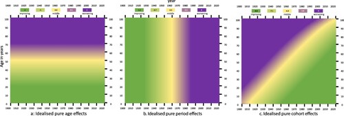
is adapted from ‘The Lexis Diagram’ by Rau et al., and demonstrates how the Lexis surface should look for age-, period- and cohort effects (Rau et al., Citation2018). Figures (a,b) show how a Lexis surface would look with ‘pure’ age or period effects. If this were for mortality, it would imply that either only age or only the time period were impacting the outcome (deaths). Figure 1(c) highlights what we are interested in—a pure cohort effect. Birth cohorts move along the 45-degree line — each 1-year increase in time corresponds with a 1-year increase in age. The diagonal line from bottom left to top right therefore represents a group of individuals born at the same time who have their own specific mortality outcomes across the time period. These are idealised illustrations, as we will see when looking at the real Lexis diagrams of mortality in England and Wales.
Figure 1. Idealised illustrations of Lexis diagrams showing 3 different types of cohort effects: ‘Ideal’ age-, period-, and cohort effects on the Lexis surface. Adapted from Rau et al., Citation2018.
2.3. The golden cohort
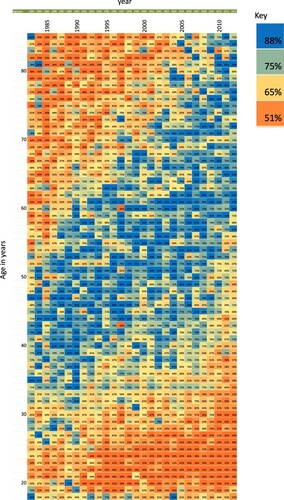
shows Lexis diagrams for males and females from 1913 to 2008, reproduced with kind permission from an Office for National Statistics (ONS) paper exploring the phenomenon of the Golden Cohort in 2011 (Goldring et al., Citation2011). Along the horizontal axis is the year the data refer to, and on the vertical axis is the age of the population being examined. The colours correspond to the annual percentage change in mortality rates where dark, medium, and light blue represent a negative change, i.e. a worsening of mortality compared to the previous year, and yellow, orange, and red represent improvement in mortality. Light green shows no change, and dark green, represents the modest improvements.
Figure 2. Annual percentage change in smoothed mortality rates, England and Wales, 1913–2008 using three year rolling averages, males (left) and females (right). Source: Goldring et al., Citation2011. Note: an increase in the rate is a decrease in mortality. Reproduced with kind permission of the authors at ONS.
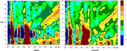
For some major events, the same changes can be seen in both the Lexis diagrams of males and females. For example, the dark blue stripe in the mid-late 1910s corresponds with World War One and the Spanish Flu pandemic. The second blue stripe from the left corresponds with the Great Depression—the period during which the Golden Cohort were born— and shows a greater worsening of mortality for males than females. Wages fell after 1921 and did not return to the level there were then until 1931. However, in that year unemployment benefits were cut by 10% and that life-line for those in great destitution was not restored until 1934 (Dorling, Citation2023b). Geographical health inequality in the UK was higher in the 1930s than at any time afterwards (Dorling, Citation1995). The effects of these circumstances and the political decisions made in these years can be seen in the colours in the Lexis diagram for men between ages 20 and 40 especially. The third blue stripe from the left again is dominant for males in the 1940s, coinciding with WWII, with a lighter blue (i.e. less negative change in mortality) being seen then for females. The red/brown high improvements in the mid-1940s to mid-1950s in both sexes likely represent fewer men dying from war injuries, the creation of the NHS, the welfare state, the new availability of antibiotics, and the onset of vaccination campaigns, with substantial improvements then seen at younger age groups; but also a remarkable fall in the frequency and severity of what people at the time called flu-like diseases (which peaked in Britain in 1951).
There are other features in the Lexis diagrams in that can be picked out, but the key tell-tale sign of a cohort effect is in both Figures: the golden/orange stripe for both males and females around age 40 years old in the late 1970s that continues diagonally up and right from the late 1970s/early 1980s all the way through to 2008 (the end of the timeline). What this very important line represents is a group of people born between 1925 and 1934 having better mortality improvements than all those born around them. This line is the mark of the Golden Cohort on the Lexis surfaces of England and Wales.
3. The rise of the golden cohort, 1925–1934 to 2010 (birth to aged 76–85)
3.1. The early years: 1930s–1960s (birth-aged 16–25 years)
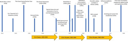
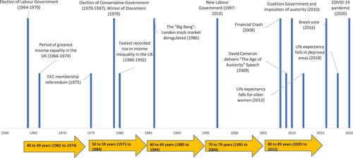
The Golden Cohort lived through, and for the small minority that remain, continue to live through, significant widespread events that impacted on the health of the population in Britain in both positive and negative ways. shows a selection of significant events from 1914 to 1959 (Goldring et al., Citation2011). These include events with a positive impact on health such as the creation of the NHS, immunisation campaigns, and the growing availability of antibiotics. However, there are also substantial ‘unhealthy’ events including two World Wars and the Great Depression, as well as the widespread uptake of smoking which peaked in the 1950s, and then declined gradually thereafter.
Figure 3. Timeline of selected events from 1914 to 1959 and corresponding age of the Golden Cohort. Adapted from: Goldring et al., Citation2011.
Note: the height of the bars is for illustrative purposes only.
3.1.1. Rationing
Rationing was an evidence-based, equitable programme that fed all children equally (and was not quite as generous to adults). Research carried out between 1937 and 1939 resulted in the later war-time ration being set high for children (and their mothers) (Milne, Citation2022). It was fortunate that, in 1936, work at the Rowett Institute in Aberdeen, building on earlier work in the 1920s and early 1930s, had discovered just how important nutrition was for growing children: ‘So great was the interest in the 1936 study that the Carnegie Trust gave the Rowett a grant of £15,000 to carry out a more detailed study. More than a thousand families, including 3,000 children, took part across Scotland and England between 1937 and 1939. Detailed information was gathered on the socioeconomic status of each household and diet and analysis of data from the Carnegie survey was in progress at the Rowett when war broke out. Lord Woolton, Minister for Food, used these results to develop his wartime food rationing policy, which included special measures to safeguard the health of mothers and children’ (Milne, Citation2022).
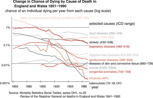
Thus, unlike the children who lived through the First World War, the Golden Cohort benefitted from both better knowledge of what food children needed and a government policy in 1939 to feed them well at low cost to their families. A further huge benefit was in the change over time in our ability to deal with disease. Death in childhood from disease had been common before this cohort were born, but saw rapid changes in their early years (), (Dorling, Citation1995) in large part due to the introduction of immunisations and antibiotics.
Figure 4. Change in chance of dying from select diseases (by cause of death), England and Wales, 1851–1990. The graph shows the chance of an individual dying per year from each cause (log scale). The numbers in brackets are the International Classification of Disease (ICD) codes that were used by the 1980s. The Registrar General attempted to match, as closely as he/she could, to these from earlier decades. Source: Dorling Citation1995
3.1.2. Immunisations and antibiotics
As children and young adults, the Golden Cohort experienced some of the most important developments in medicine. As shown in the Timeline, Diphtheria immunisation and penicillin became available in 1941 and 1946. The latter was especially important to these children’s life chances, who were aged between 12 and 21 when it first became widely used. Tuberculosis (TB) was the leading single cause of death in the UK overall until 1880, and in age groups between infancy and 50 years old for both sexes until the late 1940s (Office for National Statistics, Citation2017). In 1948, when the Golden Cohort were between 14 and 23 years old, the first medical clinical trial of treating pulmonary TB with an antibiotic—streptomycin—was published (Leeming-Latham, Citation2015). This was followed by the introduction of safer combinations of chemotherapy treatments which saw mortality from TB rapidly decline, and case notifications falling due to a combination of decreased infectious contacts and improved social and economic conditions (Glaziou et al., Citation2018; Leeming-Latham, Citation2015; Public Health England, Citation2013). The BCG vaccine against TB was also introduced during this period, entering the UK immunisation schedule in 1953. However, while the BCG vaccine reduces chances of suffering from the most severe forms of TB, such as tuberculous meningitis in children, it is less effective in preventing pulmonary TB. The effect of that immunisation on the overall spread and prevalence of TB is limited, meaning it played a lesser role in mortality reduction (NHS, Citation2019).
3.1.3. Education, employment and housing
The Golden Cohort entered the workforce, often at age 14 or 15 (sometimes earlier, only very rarely later), at a time when jobs were plentiful and when choice over what work to do was increasing. Although the younger among them benefitted from free secondary education due to the Butler Education Act of 1944, almost none of them went to university (less than 1%). As young adults in the late 1940s and 1950s, most of them lived at home with their parents, who were mostly in work (although many women did not work at that time). A narrow majority of children at this time in the UK lived in council housing at some point in their childhood (Pearson, Citation2016). This was a huge improvement on the slum or poor standard of housing that most British children had mostly grown up in during the 1920s.
3.1.4. Birth of the NHS: when the Golden Cohort was aged 14–23 years
On the 5th July 1948, the National Health Service (NHS) took over from the existing structures of charity hospitals and other mostly private services. It was founded on key principles: that provision would be based on clinical need, not ability to pay; that it met the needs of everyone; and that it was free at the point of delivery, funded by national taxation. Before the NHS, the vast majority of the people of Britain had lived in fear that they, or any member of their family, could without notice be faced with the catastrophic costs of disease and/or disability, or simply be unable to pay for medical care. The NHS was one of the first universal health care (UHC) systems in the world, and as with other universal reforms it was formed in the wake of crisis (Hiam & Yates, Citation2021). It transformed health care in Britain. The Secretary of State for Health and founder of the NHS, Aneurin Bevan, wrote in his seminal book, In Place of Fear: ‘The essence of a satisfactory health system is that the rich and poor are treated alike, that poverty is not a disability, and wealth is not advantaged’ (Bevan, Citation1952). In adulthood, the Golden Cohort would not know the risk of financial ruin that ill health could bring, or the fear of simply not being able to access care at all, the worry that almost all of their parents had endured.
3.1.5. ‘Never had it so good’
By the late 1950s, Prime Minister Harold Macmillan told the people of Britain that they had ‘never had it so good’ (Hennessy, Citation2007). Globally, the UK was among the best in the world for life expectancy at birth. Worldwide it ranked at 7th for most of the 1950s (the six countries above it were, in total population size, much smaller than the UK was, even with all their populations combined). The UK continued to be positioned in or around the top 10 until the 1970s, during and after which it began to fall down the ranks (Hiam, Dorling, et al., Citation2023a). In 2022, it was ranked 29th.
3.2. The working years: the optimism of the 1960s (aged 26–35 years)
3.2.1. The number of the Golden Cohort
In mid-1961, the Golden Cohort comprised almost six million people, at this point with slightly more males than females as more boys are born and the cohort was too young to have suffered many war deaths () (Office for National Statistics, Citation2021). The years that followed were no less remarkable than those which had just passed in terms of the social and economic changes seen across the UK, as the timeline from 1960 to 2020 shows ().
Figure 5. Population estimates for the Golden Cohort, England and Wales, by sex, from mid-1961 to mid-2020.
Note: for mid-2020 the group comprises those aged 87–89, and all over 90 years. Source: Authors’ calculations using ONS population estimates.
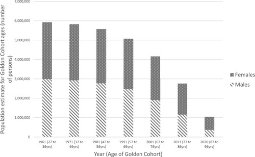
Figure 6. Timeline of selected events from 1960 to 2020 and corresponding age of the Golden Cohort.
Note: the height of the bars is for illustrative purposes only.
3.2.2. Income inequality
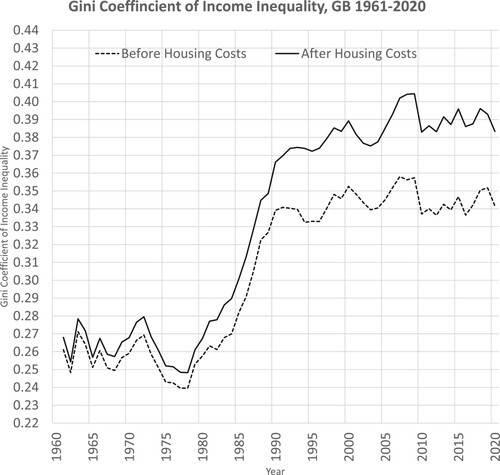
shows income inequality in the UK from 1910 to 2019 (Dorling, Citation2013). The Golden Cohort were born into rapidly falling inequality and lived through most of the best years for equality in the UK, when this measure continued to fall most steeply. Unlike so many of their parents, and an even larger proportion of their grandmothers (for whom it was the most common job), they did not have to ‘go into service’, and by the time that the overall British social and economic situation began to deteriorate again, in the very late 1970s, they were insulated from the immediate effects. shows a measure of income inequality—the Gini Coefficient—for Britain from 1961 to 2020 (Institute for Fiscal Studies, Citation2022). The graph shows the rise in inequality that began at the end of the 1970s, and just how good the 1950s and 1960s were when the Golden Cohort were in their late 20s and 30s. Note that these different figures highlight different aspects of inequality trends. The overall Gini coefficient plateaued after the 1990s (), but the very richest of all continued to take more and more for two more decades (). Increasingly the growing take of the richest was at the expense of those in the middle of the income distribution and harmed overall public expenditure. However, before the impact of that became apparent, people in the middle thought they were doing well, not least in terms of becoming rich themselves (or so they thought) as the value of the homes most of them had purchased appeared to rise rapidly.
Figure 7. Income Inequality in the UK, 1910–2019. Sources: Pre-tax national income share including pension income, individuals over age 20 from listed sources: (Atkinson et al., Citation2017; Brewer, Citation2019; Dorling, Citation2013; Shine & Webber, Citation2019)
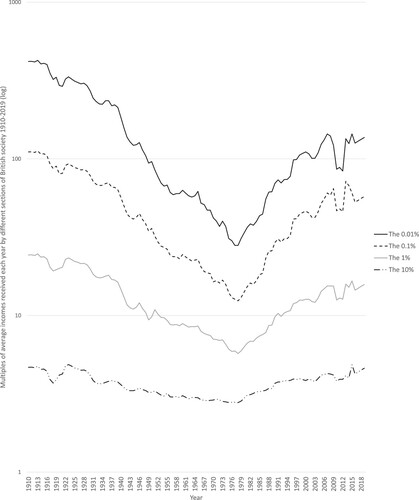
Figure 8. Gini Coefficient of Income Inequality, Great Britain 1961–2020. The range of the Gini Coefficient is 0 (zero) to 1, where 0 reflects total equality and 1 maximum inequality. Thus, the higher the Gini Coefficient, the greater the inequality. Source: IFS (2022) Living standards, poverty and inequality in the UK.
3.2.3. Home ownership
The Golden Cohort were the first generation to strike housing gold. They were the first cohort to escape private landlords and have high home ownership. shows the proportion of people in the UK who, at any point, lived in a home owned outright or mortgaged by date (horizontal axis, from 1982 on left, to 2012) and by their age (vertical axis, from 17 years old at top to 90) (Dorling, Citation2015). In 1982, the Golden Cohort were aged between 48 and 57 years old. Green and blue boxes represent high ownership (greater than 75%). The chart shows the beginning of a golden generation of high homeownership for those born between 1925 and 1934, which maximised for those born in the in 1950s (although that group had to pay far more to secure a home with a mortgage). Later born cohorts did not do so well and were also threatened with unemployment, which was especially frightening if you had a new mortgage and knew there was not enough council housing should you fail to pay the mortgage. When employment became much less secure during and following the oil shocks the 1970s, people (including many new homebuyers) began to strike.
Figure 9. The proportion of people in the UK who live in a home owned outright or mortgaged by year and age. Source: Dorling, Citation2015.
3.2.4. The strikes of the 1970s
The 1970s saw a multitude of strikes take place, including the UK miner’s strike of 1972 (as the Conservative government was holding miners’ pay down compared to that of other workers and in the 1960s) and the Winter of Discontent in 1978/79 (when mass unemployment was beginning). Despite this substantial industrial action, still far fewer working days were lost than in the 1920s () (Office for National Statistics, Citation2015, Citation2023), Furthermore, the strikes of the 1970s failed to galvanise the population as a whole and, in how they were portrayed by the newspapers and TV, may have even increased the size of the 1979 landslide victory for Margaret Thatcher and the Conservative Party, which had promised to restrict the power of the trade unions (Office for National Statistics, Citation2015).
Figure 10. Number of working days lost due to labour disputes, 1925–2022. Source: ONS 2015, (Office for National Statistics, Citation2015) ONS 2023 (Office for National Statistics, Citation2023)
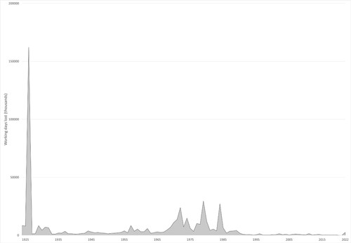
Those striking in the 1970s may have believed that eventually their day would come. The strikes of the 1920s were successful, but not immediately, only in the medium-and long-term, in contributing to equality growing both at the time and afterwardsFootnote1 (Darvos et al., Citation2023). In the short-term, the general strike of 1926, which lasted nine days, was seen as a defeat. However, as the graphs of income inequality above show, it was part of what it took to help maintain the momentum that had only just begun in the early 1920s towards greater and greater income equality for the next five decades. After 1926, successive governments were aware that a general strike was possible—before 1926 it was something that could only be imagined.
3.2.5. The austerity of the 1980s
Following the optimism of the 1960s, and the strikes of the 1970s, the new Conservative government of 1979 immediately introduced severe austerity on much public spending which continued for many years, that harmed the old, the poor and the young the most. The Golden Cohort were not greatly harmed by the austerity of the 1980s, as they were almost all in work, despite unemployment for people younger than them. In the worst years of the early 1980s, 2 million people aged under 25 were out of work and had signed on the dole (Dorling, Citation1995). Widespread use of the dole had last been seen in the 1930s. Poverty rose greatly, but not so much for the lucky Golden Generation. At this point, they were still young enough not to be too reliant on health care, which was not well funded in the 1980s. Britain saw the greatest increase in income inequality experienced in Europe in the 1980s (see ); but this was not the personal experience of the majority of the Golden Cohort, who were mostly in work and approaching retirement.
3.3. The retirement years: 1985–1995 (women aged 60), 1990–2000 (men aged 65)
Retirement came for the women in this cohort at age 60 (in the years 1985–1994) and for men usually at age 65 (1990–1999). With the election of a New Labour government in 1997, which stuck to Conservative spending plans for their first two years, the increase in health and social care funding (see Section 3.4) that came from 1999 onwards benefitted the Golden Cohort considerably. A large majority of this cohort retired while still living in homes they now owned outright, in contrast to previous generations of older people who had often spent their final years in abject poverty (Townsend, Citation1963). Poverty was not a common experience for this Golden Cohort, although for those whose parents were still alive, they were often poorer older pensioners. However, poverty was rising again among younger generations.
3.4. The New Labour years: 1997–2010 (aged 63–72 to 76–85 years)
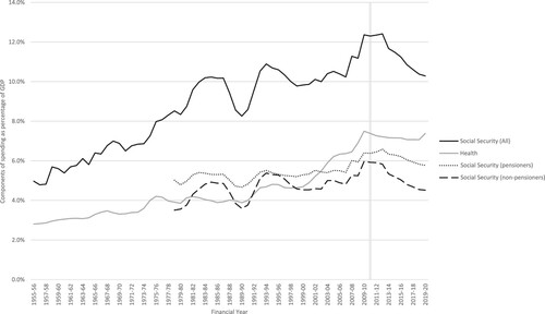
3.4.1. Health and social care investment
The New Labour years of health and social care investment came as the Golden Cohort entered the older years of their lives, and thus when they might have been needing such services the most. Health care and social security spending in pounds (GBP, £) per person to 2019–2020 prices from 1955 to 2020 are shown in (Institute for Fiscal Studies, Citation2023). reveals that spending on both health care and social security increasing from 1999Footnote2 to 2010 (the grey vertical line marks the 2010–2011 financial year). What happens after 2010 is discussed below, in Section 4.2.
Figure 11. Health and Social Security spending per person in £ to 2019–2020 prices, 1955–2020. Source: IFS data. Grey vertical line represents financial year 2010–2011.
3.4.2. Health inequalities strategy
New Labour’s ‘English health inequalities strategy’ from 1999 to 2010 had the aim of reducing the gap in life expectancy between poor and affluent areas. Researchers found that the strategy was successful according to some measures. The time period of the strategy was associated with a reduction in geographical inequalities in the infant mortality rate (IMR) (Robinson et al., Citation2019) and, by some measures, in life expectancy (Barr et al., Citation2017), and the reallocation of NHS resources to increase funding in deprived areas compared to the more affluent areas reduced inequalities from causes amenable to healthcare, especially by increasing resources where fewer people survived into old age (Barr et al., Citation2014). However, other research using a different method of measuring health inequalities concluded that: ‘When measured by the relative index of inequality, geographical inequalities in age-sex standardised rates of mortality below age 75 have increased every two years from 1990–1991 to 2006–2007 without exception’ so the reduction in geographical inequalities was not seen in those younger than the golden cohort (Thomas et al., Citation2010).
3.4.3. Cardiovascular disease mortality improvements
Another important factor of this period is the rapid improvements in cardiovascular disease mortality. Between 1979 and 2013, total deaths from cardiovascular disease decreased by 70% in the UK, with even larger improvements in premature mortality (Bhatnagar et al., Citation2016; World Health Organisation, Citation2023). These improvements were reflected across many affluent countries, with advancements in diagnosis and management, and increasing recognition of prevention. In the UK, the rate of improvement has slowed since 2011 (OECD & The King’s Fund, Citation2020), and this is further explored in Section 4.3. Recent work has suggested that factors not well understood before the onset of the 2019 pandemic might also have played a part in this global decline seen from the late 1950s through to its abrupt end in 2020 (Davey Smith & Dorling, Citation2023).
3.5. The beginning of the end
The Golden Cohort saw overall improvements year-on-year in their mortality from birth to 2010. This was not due to a period or age effect, but due to a series of social and economic events that occurred at just the times that benefitted them, such as war-time rationing and the birth of the NHS, or just at a time that they narrowly avoided adversity, such as the income inequality and unemployment of the 1980s. They were mostly too young to fight in WWII, too old to be hit by the worse effects of 1980s austerity, and just the right age to benefit from the late 1990s and early 2000s spending on health and social care.
State involvement in the lives of the Golden Cohort had been, on balance, positive up until this point. However, they entered the austerity years of the 2010s at just the wrong age: in their late 70s and early 80s, the ages when they would need the state to provide health and social care the most – and when, for many of them, it was no longer reliably there.
4. The austerity years, 2010 onwards (aged 76–85 onwards)
After the financial crash of 2008, much of life in Britain fundamentally changed. The election of the Conservative-Liberal Democrat coalition government of 2010 brought in the ‘age of austerity’, led by then Prime Minister David Cameron, with the aid of the deputy Prime Minster Nick Clegg and, crucially, the Chancellor, George Osborne. For the Golden Cohort, the state which had interfered to a remarkable level in their young lives had effectively walked out on them in their old age - especially for those in this group with great need due to ill health or disability. Here, we first examine what is meant by the often-used term ‘austerity’, we consider the existing evidence on the impact of austerity on life expectancy, and finally present our analysis of the impact of the austerity years on the Golden Cohort. Could the generation that survived World War II, rationing, economic decline, rising inequalities, and epidemics have had their lives cut short by government policy in the most dramatic and harmful of ways?
4.1. What is austerity?
‘Austerity’ originates from the Latin ‘austerus’ meaning dry, plain, or harsh (Anderson & Minneman, Citation2014). Before World War II (WWII), the term was used to describe physical conditions, not economic ones—only in the 1950s was ‘austerity’ used to describe economic policy, at which time it referred to post-War rationing with enforced decreased spending on household goods and on discretionary food, and continued substantial military spending. In its modern use, it refers to fiscal consolidation with spending cuts and/or increased taxes. However, many definitions exist, and this poses a challenge in research (see: in Anderson & Minneman, Citation2014 regarding different definitions of austerity; and Table 1 in McCartney et al., Citation2020 regarding different definitions used in health outcomes research) (Anderson & Minneman, Citation2014; McCartney et al., Citation2020).
4.2. Austerity in Britain
4.2.1. A tale of two austerity Britains
Under 1950s austerity, those living in poverty were still fed well because of rationing (see timeline). The ‘Great Leveller’ of war meant people did not have to witness the inequality of the affluent still being able to spend money (Scheidel, Citation2018). The recently established National Health Service meant people no longer lived in fear of the catastrophic financial cost of illness (Bevan, Citation1952). House prices fell, and housing became more affordable. By 1957, the Prime Minister Harold Macmillan could tell people they had ‘never had it so good’ (Hennessy, Citation2007).
The story of austerity in the twenty-first century is a very different one. In 2009, then leader of the opposition party David Cameron gave his now infamous ‘age of austerity’ speech at the Conservative party conferenceFootnote3 (Evans & Walker, Citation2019; Summers, Citation2009). Due to the support of the Liberal Democrats, the Conservative-led coalition government of 2010 could implement austerity. This led to significant cuts in public spending, including on health and social care. In the 1950s, fear of healthcare costs had been alleviated thanks to the NHS. In the 2020s, following a decade of the twenty-first century austerity and the COVID-19 pandemic, more and more people began to turn to private health care, as the chronically under-funded NHS failed to keep pace with demand, with many if not most ill people now stating their health needs were not met (Hiam & Yates, Citation2022).
In contrast to the ‘leveller’ of food rationing, unprecedented post-war numbers of people in Britain have been forced into food poverty, with austerity policies linked to food insecurity and food bank use (Jenkins et al., Citation2021). Despite an open letter in 2014 from the Faculty of Public Health in the Lancet raising the alarm on rising food poverty (Ashton et al., Citation2014), with coverage citing John Boyd-Orr’s role in the ‘delivery of equitable nutrition’ during the austerity of WWII into the 1950s (The Lancet, Citation2014), there was no government intervention. Subsequently, both food bank use and food insecurity continued to rise (Gorb et al., Citation2023), with the number of children living in food poverty almost doubling between 2022 and 2023 to 4 million (Butler, Citation2023). A survey in September 2022 by the Food Foundation reported 1 in 4 households with children had experienced food insecurity in the past month, increasing to 42.2% of households with 3 or more children (Godie, Citation2022). For older people, cuts to Meals on Wheels across local authorities left many in vulnerable situations going hungry several days a month or a week—this was further exacerbated by the pandemic (Camden Unison, Citation2011; Dickinson & Wills, Citation2022). Those ‘Meals on Wheels’ cuts began in 2011 and 2012 in many local authorities in the UK – from then on, for the frailest of the Golden Cohort, especially those living alone, simply feeding themselves often became much harder.
During the 2010s austerity, house prices rose sharply, out of step with the average salary, so an older person unable to access Meals on Wheels could appear to be wealthy but was increasingly hungry. The number of people rough sleeping in England rose by 74% from 2010 to 2022 (Department for Levelling Up, Housing and Communities, Citation2023), and those living in temporary accommodation have increased sharply (Shelter, Citation2023). The cost of living crisis gave rise to the choice ‘heating or eating’—with older people disproportionately affected (Bullard, Citation2022).
4.2.2. Health and social care spending, 2010–2020
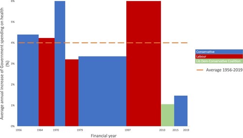
The impact of austerity on public spending has been severe. For example, in England, non-education spending per council resident decreased by almost one quarter between 2009–2010 and 2019–2020 (Ogden, K. et al., Citation2021), while spending on health (specifically NHS England) slowed substantially, well below the average annual increase for 1955–2019, as shown in (Institute for Fiscal Studies, Citation2023).
Figure 12. Average annual increase in government spending on health, 1955–2019, based on 2019/2020 prices. Source: authors’ calculations based on IFS spending composition sheet (Institute for Fiscal Studies, Citation2023) adapted from the BBC graphic (Triggle & Butcher, Citation2020)
Another useful measure to compare spending over time is as per person, as shown in (Section 3.4). In the Figure, social security is shown as a total (all) and divided into pensioners and non-pensioners from 1978. It shows that for all health and social security spending there was a stall and decline since 2010, except for the uptick in 2020 for health spending due to COVID-19. It is noteworthy that the 2020 spending increase includes a reported £15 billion ‘wasted’ on unused COVID supplies (Hall & Campbell, Citation2023), £37 billion over two years on a track and trace system which did not deliver on in its objective of preventing a further lockdown (UK Parliament Public Accounts Committee, Citation2021), and beyond. The Figure also shows that the suggestion pensioners were protected from austerity is not apparent when it comes to spending per person, with a clear decline in social security seen.
4.2.3. Austerity elsewhere in Europe
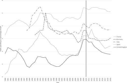
Austerity measures were implemented across Europe following the 2008 financial crash, with cuts to public spending in many countries (McKee et al., Citation2012). However, the UK saw the deepest cuts. shows public spending as a percentage of GDP from 1980 (the earliest available data) to 2019 using IMF data for five comparable Western European countries: France, Italy, Spain, Germany, and the UK. While the UK had seen an increase in public spending from the mid-late 1990s to 2010, at points catching up with Spain and edging closer to post-unification Germany, in 2010 it entered austerity from the lowest position and had the greatest reduction in spending from 2010 to 2019 at 5.9%. In comparison, France and Italy saw a reduction of 1.3% in public spending from 2010 to 2019, Germany 3% and Spain 4%. Other countries, such as Finland, increased the proportion of their GDP spent on the public good during and after the crash as a response to its effects.
Figure 13. Public spending as a percentage of GDP from 1980 (or earliest available) to 2019 in 5 European Countries. Source: International Monetary Fund, World Economic Outlook Database, April 2021.
Note: Axis does not start at 0.
4.3. Austerity and mortality
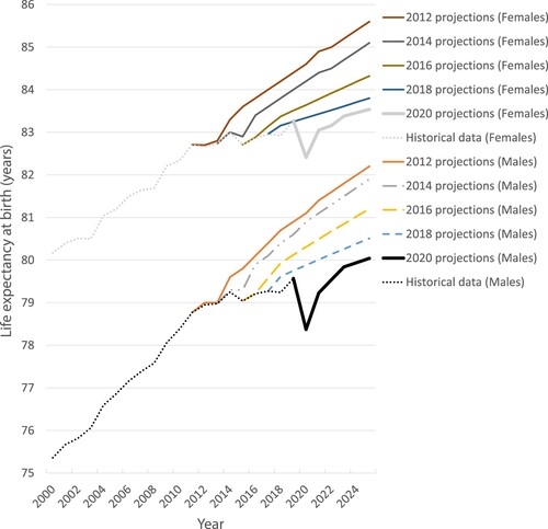
Life expectancy in the UK since 2010 follows a similar pattern to that of health spending (). After decades of improvements, with some fluctuations, life expectancy improvements halted in the years that followed 2010, before falling for some groups, beginning with older women in 2012 (Hiam et al., Citation2020). A plethora of evidence has linked the cuts to public services through austerity with the increase in deaths and the subsequent stall in improvements in life expectancy seen throughout the UK, with some groups and communities seeing their life expectancy fall earlier than others, beginning first with older women in 2012 (first identified and released as a media story in early 2014), followed by others subsequently (Alexiou et al., Citation2021; Bennett et al., Citation2018; Darlington-Pollock et al., Citation2022; Hiam et al., Citation2020; Hiam, Harrison, et al., Citation2018; McCartney, McMaster, et al., Citation2022; Rashid et al., Citation2021; Walsh, Dundas, et al., Citation2022). A 2023 analysis from the Economist suggested, that of 700,000 ‘additional deaths’ in Britain between 2012 and 2022, 250,000 additional deaths were specific to problems in Britain, and not explained by an overall slowdown in life expectancy across Europe nor by the COVID-19 pandemic (The Economist, Citation2023). The change has been so stark that the ONS have had to repeatedly revise their population projections downwards () (Hiam & Dorling, Citation2022), and pension companies have made great adjustments to their expectations.
Figure 14. Projections of life expectancy at birth for males and females in the UK, 2012 onwards. The dotted lines show the actual recorded historical data from 2000 to 2019, and the solid lines show ONS projections made every year from 2011 to 2025. Source: Hiam and Dorling, BMJ, Citation2022.
4.3.1. Other explanations cited for worsening mortality
The stalls in mortality improvements have invited much speculation since they were first highlighted in the 2010s. These trends of stalling life expectancy improvements occurred long before COVID-19. They occurred in the absence of mass-migration, data artefact, large-scale environmental event, or any other disease pandemic. Following the 2015 spike in annual mortality, many, including Public Health England (PHE), attributed the spike in mortality to influenza and cold winters, whilst highlighting the subsequent decrease in mortality in 2016 (Baker et al., Citation2018). While ‘flu may have played a small role in the winter mortality spike in 2015, both in the UK and other European countries (Molbak et al., Citation2015), it does not explain the ongoing trends and slowdown of life expectancy improvements over time, nor the falls for some groups, nor why life expectancy in the UK in 2016 was lower than it had been in 2014, and why it continued to be lower in 2017 and 2018 than in 2014 (for both women and men) (McCartney, Walsh, et al., Citation2022; Hiam et al., Citation2024).
Such was the interest and, at points, controversy, that in 2018 PHE published a report investigating some of the many explanations (Public Health England, Citation2018). In it, they reported that measurement artefact and migration were unlikely to have played a role, but they suggested that a combination of ambient temperature, influenza, increasing mortality rates from dementia, slowdown in previous improvements in cardiovascular disease mortality rates, widening health inequalities, cohort effects, and possibly health and social care spending all required further investigation.
Five years later, with more data to analyse, the evidence has shown some of these explanations to be implausible (McCartney, Walsh, et al., Citation2022). The possibility of the stall in improvements post-2010 being a return to normal improvements after an unusual period of improvement due to declining cardiovascular disease mortality could be an important factor (OECD & The King’s Fund, Citation2020), but analysis has shown the post-2010 rates have not returned to ‘normal’, but to a lower level, suggesting it is, at best, an incomplete explanation (Minton et al., Citation2023). The role of flu has often been over-emphasised in the period after the last serious global pandemic (1968–1970) (Hiam et al., Citation2024). Deaths are usually attributed to influenza without testing for the virus, and mostly among the very elderly. Comparisons of rises in mortality between countries in Europe in winter suggests that there are other social and economic factors that matter more, such as public spending on health care and more equitable socioeconomic circumstances (Healy, Citation2003).
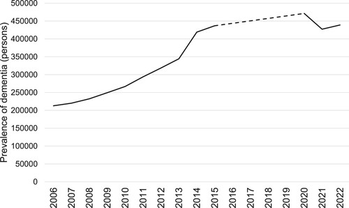
Deaths from dementia and Alzheimer’s disease increased in the past decade, and contributed to the spike in mortality 2014–2015 (Hiam et al., Citation2017; Office for National Statistics, Citation2016), fell in 2019, and increased in 2020 () (Office for National Statistics, Citation2020, Citation2022). However, these data should be interpreted with caution, as outlined by the ONS, as a result of data artefact due to a change in the way causes of deaths were coded between 2011 and 2014, which resulted in an increase in dementia coding; an ageing population surviving other causes of death; and the measures put in place as part of the ‘Prime Minister’s Challenge’ (Department of Health and Social Care et al., Citation2015) which included a target of diagnosing two thirds of people estimated to be living with dementia, alongside financial incentives for GPs offered between October 2014 and March 2015. shows a clear impact of this with a jump in dementia prevalence between 2014 and 2015 (NHS Digital, Citation2022).
Figure 15. Deaths and Age Standardised Mortality Rates (ASMR) for Dementia (black lines) and Alzheimer’s disease (blue lines) in England and Wales, 2000–2020. Source: ONS
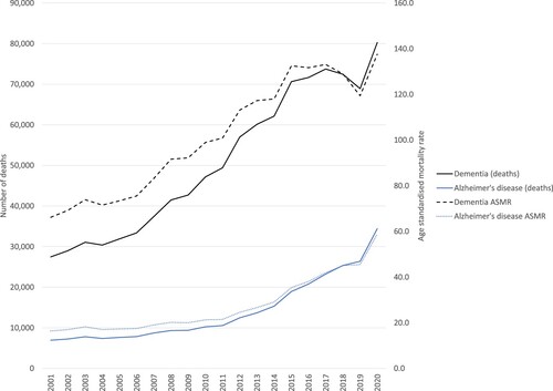
Figure 16. Prevalence of dementia over time (estimated). Note missing data for 2016–2019 (dashed line). England, 2006–2022. Data for 2020–2022 are from January and February. Source: NHS Digital, Citation2022.
Recent research has shown earlier increases in obesity rates in England and Scotland may have played a role in the stalling (Walsh, Tod, et al., Citation2022), though the role of the obesogenic environment and social determinants of health could still be linked back to austerity. There are some who have suggested that it is the demise of the Golden Cohort that has been a factor in stalling life expectancy (Wilson & Coghlan, Citation2018), which we aim to explore further.
4.3.2. International trends
Finally, many argue that these changes were seen across many high-income countries (HICs). Indeed, many countries in Europe experienced both austerity (see ) and adverse impacts on health (Stuckler et al., Citation2017). However, there are challenges with attributing health outcomes to changes in economic policy due to: variable definitions (Anderson & Minneman, Citation2014) (see Section 4.1), the co-occurrence of policies making it difficult to evaluate effects (Matthay et al., Citation2021), and the challenges of causality (Hiam, Dorling, et al., Citation2018).
Few studies internationally have explored the impact of austerity on health outcomes. For example, researchers examined standardised mortality rates (SMRs) in 15 European countries between 2011 and 2015, stratifying the nations into high-, intermediate-, and low-levels of austerity (measured as cyclical adjusted primary balance using IMF figures) (Rajmil & Fernández de Sanmamed, Citation2019). They found that while SMRs decreased for all nations between 2011 and 2014, in countries implementing high- and intermediate-levels of austerity, SMRs increased in 2015, while mortality rates summarised in that way continued to fall where there was little austerity. There was one notable exception: Germany, which was included as a country that had limited austerity but also saw an increase in its SMRs.
Other research has found that austerity increased all-cause mortality by 0.7% across 28 EU countries between 1991 and 2013 (Toffolutti & Suhrcke, Citation2019), and that it was associated with an increase in inequalities in self-reported general health, an effect that grew over time, from 2002 to 2015 in 25 European countries (van der Wel et al., Citation2018), and slower improvements in subjective health across age groups. The UK was an exception in what was then the EU-28, with all age groups experiencing a fall in subjective health, in particular the population aged over 65 (Franklin, Citation2017). Countries that had the greatest spending cuts had a positive statistical relationship with greatest level of unmet health needs.
In contrast with the support for other causes, such as flu, which have become weaker with time and more data (Hiam et al., Citation2024), the evidence linking austerity and poor health in the UK is becoming increasingly robust as more studies are being released in the current decade (McCartney, McMaster, et al., Citation2022; McCartney, Walsh, et al., Citation2022). Research in 2021 linked austerity to excess deaths due to cuts in local government funding (Alexiou et al., Citation2021), excess deaths in older adults and widening inequalities for younger populations (Darlington-Pollock et al., Citation2022), not just to stalls but to absolute declines in life expectancy in an increasing number of communities (Rashid et al., Citation2021), and widened inequalities impacting the most deprived deciles, with declines in life expectancy in the two most deprived deciles for women in 2018 (Bennett et al., Citation2018).
Furthermore, while other high-income or affluent countries did see stalls in improvements in life expectancy between 2014 and 2015, research has shown of 18 Organisation for Economic Cooperation and Development (OECD) countries, only the US, where life expectancy is falling, and in the UK, was there no recovery in 2015–2016 with any of the ‘robust gains’ found elsewhere (Ho & Hendi, Citation2018). Of course, a comparison of rates of improvement depends on the time periods being compared. However, research examining different time periods have also concluded the same: Fenton et al. found the smallest improvements in life expectancy in Iceland, USA and UK nations when comparing 5-year time periods from 1992 to 2016 (Fenton et al., Citation2019), while Leon et al. found that from 1970 to 2016 while many affluent countries saw slowed increases since 2011, England and Wales performed the worst (Leon et al., Citation2019).
4.3.3. Lack of consensus
It may be that in the future when you are reading these words history may appear more clear, but it is important to note that in 2023 the link between austerity and flatlining life expectancy improvement remained a contested one, with a lack of agreement not only among politicians, but also among public health experts (Hiam, Dorling, et al., Citation2023b). There were those who asserted that it cannot be proven that austerity has caused harm to health, as it is impossible to analyse the impact of no austerity compared to austerity. However others suggested that is reasonable to draw conclusions with the use of the mounting evidence and plausibility, along with other criteria for cause and effect (Hiam, Dorling, et al., Citation2018). Finally, we explore further by asking: ‘Could some of the key answers to settling this lack of consensus lie with the fate of the Golden Cohort?’
4.4. Austerity and the Golden Cohort
By mid-2011, 2.7 million of the Golden Cohort remained alive, now with substantially more females than males (see ). The Golden Cohort continued to see remarkable mortality improvements up until 2008 compared to those born both before and after them (). Here we present the latest available data on the mortality improvements of this generation in recent years, to explore what happened to the Golden Cohort in the 2010s when austerity came into effect. At the beginning of the decade, the Golden Cohort were aged between 76 and 85 years old. Statistically, there were few years of life left for this remarkable generation. Yet, as we demonstrate, over time, those few years became even fewer, as they began to die at a faster rate the cohorts born before them had. In short, the Golden Cohort in its final years was shattered. What we find is that the trend shown in was caused to a disproportionate degree by what happened to the Golden Cohort in those years – a period effect.
4.5. Data sources and methods
We use publicly available data from the Human Mortality Database (HMD) for 1900–2020 for males and females for England and Wales. We have triangulated these data with that provided by the ONS and the results coincided exactly or varied minimally (e.g. by 1 year)—we present the HMD data here as it has a slightly different definition and allows for international comparisons. First, we show an updated Lexis diagrams to demonstrate the cohort effect outlined in Section 2 (seen up to 2008 in ). Next, we look in more detail at the change in life expectancy improvements, presented as descriptive graphs.Footnote4 The data used are available in an open repository available at: https://ora.ox.ac.uk/objects/uuid:17917e56-0965-49bc-9fb2-70bbd97529bc.
4.6. Results
4.6.1. Lexis diagrams (or heat maps)
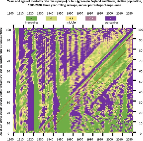
We present Lexis diagrams similar to those in with some key differences. First, we have used the latest data up to 2020 (from 1900). Second, we use HMD data for the civilian population of England and Wales. This means the deaths of soldiers during the two World Wars are excluded, though the wider impacts of the wars can still be seen. Third, the data are not smoothed. Finally, the colours are different. Here, purple represents worsening mortality, and green improving mortality, measured as the annual percentage change compared to the 3-year rolling average. The Golden Cohort are highlighted with the two red lines—born between 1925 and 1934. These are presented for females () and males ().
Figure 17. Annual percentage change in female mortality rates in England and Wales, civilian population, 1900–2020 (3-year rolling averages – comparing the three year period up to the year shown with the three years immediately prior to those three years – so the 2020 column is the average annual change in mortality between 2015–2017 and 2018–2020).
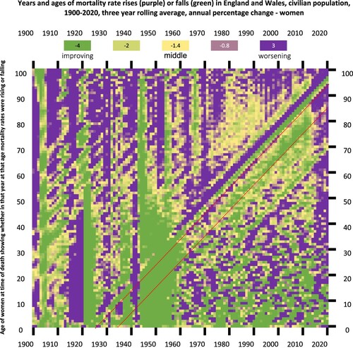
Figure 18. Annual percentage change in male mortality rates in England and Wales, civilian population, 1900–2020 (3-year rolling averages).
shows the annual percentage change in female mortality rates from 1900 to 2020 (increase in mortality in purple, decrease in mortality in green). The same trend of mortality improvements (green) shown in are replicated here up to and beyond 2008, continuing for 2010 and 2011. At 2012, for the older members of the cohort, these change to purple (worsening/increasing mortality), and do not return to green again. For the younger members of the cohort, first the mortality improvements slow, before also declining, and by 2014 the Golden Cohort for the first time since 1942 has declining mortality across almost all ages. Looking beyond the Golden Cohort, the purple squares (worsening mortality) around 2014 are visible in a vertical stripe across almost age groups and continue for the subsequent years for many (a period effect, see Section 2.2). This is continued, and for some, worsened, in 2020, when the COVID-19 pandemic hit.
shows the same for males from 1900 to 2020. It is important again to note here these data are for the civilian population, though men decommissioned from fighting became civilians and many were very badly injured, and some did not survive their wounds. This shows a similar pattern to females, with many good years of improvement after WWII (green), but, in contrast to females, more varied experiences in middle age though still better than generations either side. As shown in females, for males these trends of consistent mortality improvements continue post-2008 into 2010 and 2011 but in 2012 and the subsequent years mortality improvements stall and, for some ages, reduce. As for females, a similar period effect is seen across many years at this period (2012–2014 onwards), and the impact of the 2020 COVID-19 pandemic clear.
Another consistent finding in both Figures is an apparent cohort effect seen of those born around 1918–1919—a purple stripe from the late 1950s onwards. This is consistent with the impact of those born to mothers who had influenza in 1918 while pregnant (see Section 2.1) and may be one reason the Golden Cohort did so much better than the generation born just before them.
A key finding in both Lexis diagrams is that while the Golden Cohort have had a remarkable lifetime of mortality improvements, it has not always been the case. This is important as it suggests what is being seen is not a ‘birth cohort effect’, but a series of economic and social events, as outlined in Section 3, that for them were often very beneficial to their health and, consequently, their lower mortality.
4.6.2. Changes in life expectancy at different ages
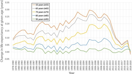
It is clear from the Lexis diagrams that the Golden Cohort saw an unusual and large number of years of improvement compared to those born before and after them (the green squares) for almost all their lives until 2012. To examine this in more detail, and their later years, we next compare life expectancy at ages 55, 65, 75, 85, and 95 (denoted ‘e55, e65’ etc.), for females and males in England and Wales from 1978 to 2020. , below, includes five lines. Each line shows the annual change in life expectancy for people of that age group. To be precise over our definition of change: the three-year average life expectancy up to any year is compared to the three-year period immediately before and the change is reported as an annual rate of change (in years).
Figure 19. Changes in period female life expectancy in years by age in England and Wales 1978–2020.
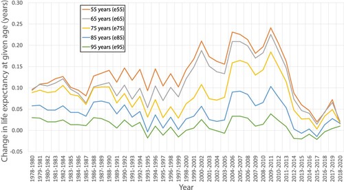
An example: in 2009–2011 women aged 55 had a life expectancy of 29.34 years. The equivalent figure for 2006–2008 was 28.63 years. The difference between those two numbers is 0.71 years over a three-year period. Dividing that by three, to determine an annual rate of change, we see that life expectancy for women of these ages was rising at 0.24 years per year; an extra 86 days of life gained, each year, in just three years (on average). The highest point in the graph above is that example, 0.24 years. After 2009–2011 the line for those aged 55 decreases very substantially in a fall that, except for briefly in the depths of WWII in 1942, is without precedent. does not include 1942, but that fall is visible in the Lexis diagram for women ().
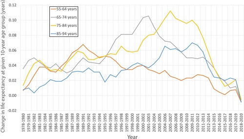
The next graph () shows the change between age groups. It can be thought of as showing a ‘difference in difference’ or the difference between two measures which are themselves calculated as differences between two points in time.Footnote5
Figure 20. Change in period life expectancy for women between 10-year age group, in years, England and Wales, 1978–2020.
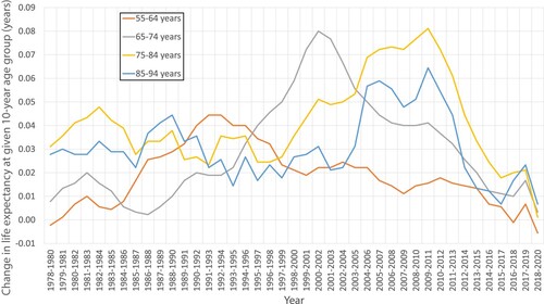
Taking the same example as before, we are now comparing that figure of 0.24, which is almost a quarter of a year gain for women aged 55 in 2009–2011, with the figure for the average annual improvement for women aged ten years older, 65. For women aged 65 years, their life expectancy improved by 0.22 years in those three years. The difference between 0.24 and 0.22 without rounding is a little less than 0.02 years. Thus, the gap in the size of the improvements between these two age groups was positive. The younger women were gaining fractionally more years of life than the older women over this time. The trend for this difference in the rates of improvement between these two age groups (55 and 65) is shown by the orange line in . We can see that the 55–64 line had been falling since 1992–1994. The Figure also shows the trends for the other three ten-year age gap differences. If, as a reader, you are new to this way of thinking then it can be at first complex to understand, but understanding these differences in difference graphs is key to knowing what happened and precisely when it happened and to who.
When we look at the change in life expectancy between the 10-year age groups for women, some clear distinctions stand out. Life expectancy at ages 55–64 improved most quickly in 1991–1995 (when the Golden Cohort were aged 57–66). It rose by around 0.04 years and then fell—it has not reached the same level since. At ages 65–74 years, life expectancy improved most quickly in the years 2000–2002 (the Golden Cohort were aged 65–74) at 0.08 years a year, and since then has fallen until a recent uptick (just before the pandemic began). At ages 75–84 years, improvements peaked in 2009–2011 at 0.08 years before falling every year since, quite sharply. That is when the blue line in also falls as those aged 85+ also see their fortunes change quickly then.
The fall in the grey line (65–74 years) could represent the unusual ageing effect of a ‘golden cohort’, and the fall that follows the peak in that line could be suggested to be due to their passing through the ages, rather than austerity, and perhaps an unusual number of them having lived to reach old age and there being more ‘weaklings’ amongst the survivors. However, life expectancy at ages 85–94 years does not continue the trend seen every decade before it. Instead, it improved most quickly first in 1988–1990, possibly suggesting an earlier golden cohort, but then the next peak rise was 2005–2007 at 0.06 years. It peaks again in 2009–2011 and then falls sharply, at a similar rate to the 75–84 years group, before briefly increasing from 2016 onwards. So, there are several things going on earlier that are complex, and very probably no ‘weaklings’. However, after 2011, all four lines in crash down together – in sync in a way and forming a pattern that is not at all complicated. For men, as we show next, the pattern is even clearer.
We will not be going into as much detail in our description of as we did for its equivalent for women. Instead, we simply point out that they show very similar patterns. One day someone might be interested in studying the small differences between them, but for now it is not those small differences that matter most. What matters most is that for men after the worse years of the 1980s, the lines in are all generally rising (i.e. life expectancy is improving), least quickly for those of older ages, but still rising. Those improvements peak just before the year of the banking crisis of 2008, but do not end then. All five lines begin to fall immediately after 2011.
Figure 21. Change in period life expectancy for males by age, in years, England and Wales 1978–2020.
What do we see when we consider the ‘difference in difference’ graph for men ()? Again, it is very similar to that for women (). In general, the four lines representing the four 10-year age groups were rising from the late 1970s onwards with a couple of dips in the economic recessions of the 1980s and early 1990s, and the grey line (65–74 years) begins to fall earlier. This is the improvement for the generation who are a little younger than the Golden Cohort. It did not continue to improve as quickly – an interesting but, in the grand scheme of things, minor detail. Again, all four lines begin to fall after 2011: exactly when the adult social service visits were being cut, the meals on wheels were ending, the health budget was being squeezed – exactly when you would expect if austerity were as deadly as COVID-19 to the very elderly. In fact, it is only just possible to see the influence of the pandemic in the last data point on . One could speculate that this may be because compared to austerity it was a less important event as here it is just contributing to part of the 2018–2020 three-year average that forms the basis of the calculations that produce .
Figure 22. Change in period life expectancy for males between 10-year age group, in years, England and Wales 1978–2020.
4.6.3. Raising the alarm
Looking at these figures, and many before them, it is difficult to understand why no action was taken and why no outrage was seen. We now turn to what was happening in those early years of the changes, 2012–2015, that might have meant that these trends were not noticed by enough people at the time, when the lines were going in the wrong direction, and when the evidence existed to show that they were – as early as in February 2014 (Dorling, Citation2014). Many, as outlined in Section 4.3, were comfortable to follow alternative explanations for what was happening (Hiam et al., Citation2024). The general view was that a combination of flu, a bad winter, and an ageing population had meant more people were dying. This referred, in particular, to the 2014/2015 mortality spike, which was easy for some politicians to brush away as a blip. For those working in health care, it was clear it was not. Our first research published on that spike suggesting austerity could be playing a major role was dismissed by the Department of Health and Social Care as ‘a triumph of personal bias over research’ (Forster, Citation2017). A similar response has persisted from the government to multiple studies (highlighted above) showing the link between austerity and poor health with increasing veracity.
During those early austerity years, political attention was elsewhere. Europe and migration slowly climbed to the top of the agenda, and UKIP performed well at the 2014 elections. David Cameron promised an EU referendum in the 2015 manifesto, and won a majority which saw that promise enacted.
4.7. Brexit, 2016 (aged 82–91 years)
Six years into austerity came the referendum for the UK to leave the European Union (EU), known ubiquitously as Brexit. This was the second time the Golden Cohort had voted on Britain’s relationship with Europe. In 1975, 65% of registered voters turned out to vote in the United Kingdom European Communities membership referendum (or EEC membership referendum). More than two thirds of them voted to ‘stay joined’ including over 70% of the Golden CohortFootnote6 (Andrew, Citation2017). By 2016, the Golden Cohort switched and voted for Brexit, with 64% of those aged 65 years voting to leave the EU (Moore, Citation2016). The impact of Brexit on health is beyond the scope of this paper, but those who voted for it were more likely to be older, more impacted by austerity, and, according to research, be from areas with worsening mortality (Koltai et al., Citation2020), echoing what had been seen in the USA with voting for Donald Trump (Bor, Citation2017). Poor health may have been a factor in the vote for Brexit, and it is clear Brexit is bad for health (Fahy et al., Citation2019).
4.8. ‘Things fall apart’: 2020 onwards (aged 86–95 years to present)
Life for the Golden Cohort has not improved in the years since austerity began in 2010. The enactment of Brexit in January 2020 was followed swiftly by the first lockdown due to COVID-19, which began on 23rd March 2020. The COVID-19 virus, like the subsequent cost-of-living crisis, and NHS crises which continue to this day, disproportionately impact older people. For those member of the Golden Cohort who remain, these years have failed to meet the expectations of demographers, who predicted their Golden luck would continue (see in this paper, and in the Appendix) (Hiam & Dorling, Citation2022; Nash, Citation2016), and the state has failed to meet the expectations of those individuals and their families, as it had in the past. Detailed information about these years can be found in the Appendix.
5. Conclusion
The Golden Cohort saw remarkable improvements in their mortality over many decades – probably greater than ever experienced by any cohort born in the UK before. It is unlikely this was due to something special about the time they were born, 1925–1934, which were not prosperous years in Britain and when economic inequality was very high. They were born in the aftermath of the devastation of WWI, during the time of the Great Depression, and with a second World War on the horizon. They were born at a time without routine immunisations, antibiotics, or a National Health Service. They were born at a time of the dole, of poverty, and of great hunger. Yet, their early years saw remarkable social and political change. The introduction of wartime rationing, focused on equality, meant they ate well—regardless of their background—for more of them throughout a formative part of their childhood than children ever had before. The ‘Great Leveller’ of war is sometimes said to have led to a time of income equality, affordable housing, of social cohesion, and to the creation of the NHS (Scheidel, Citation2018). However, most of the equality secured between 1918 and 1974 had already been achieved by 1939—it was just not realised at the time (Dorling, Citation2023a). Medical discoveries in immunisations and antibiotics saw dramatic falls in causes of death such as tuberculosis, and these discoveries could not have efficiently been implemented without public sector support. In short, governments of different political parties in the 1920s and 1930s intervened with policies that impacted positively on health, housing, and education, in ways which transformed the early years of this cohort, and later meant that they entered adulthood, for most of them, in a time when full employment was being secured largely through post-war government determination.
When the good times of the 1950s, 1960s and early 1970s ended, at first this cohort were sheltered, and isolated from initial harm. Through the turbulence of the 1970s and 1980s, the Golden Cohort were largely protected—the majority being homeowners in more secure forms of employment, with little exposure to the severe economic chaos that a large minority of adults suffered. By the time of their retirement, health and social care spending increased to keep pace with demand and, as a result, inequalities narrowed and health improved.
In this paper we have demonstrated how sharply the situation changed in 2010. The Golden Cohort were trailblazers of mortality improvements. The fall in improvement in life expectancy among and between age groups is dramatic and seen first in 2012. For the Golden Cohort, the state, which had supported them in their childhood and other eras of their lives to remarkable effect, abandoned them in their final years.
One key difference between their early years and the years of austerity from 2010 onwards is that they had played no part in influencing the state as children. In fact, the youngest of the Golden Cohort turned 18 in 1952—the year Queen Elizabeth II came to the throne; and so, had approximately 21 opportunities in their lifetimes to vote on national issues. They were able, and most of them did, vote in 18 General Elections between 1955 and 2019, in two referendums on Britain’s place in Europe, and in one referendum on potentially changing the voting system to a more democratic one.
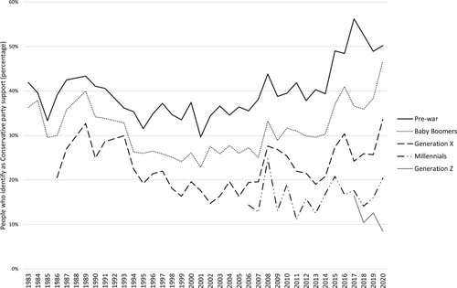
By 2023, the surviving members of the Golden Cohort had lived through (and continue to live in) a global pandemic, since 2021 a cost-of-living crisis so stark that people in modern day Britain were forced to choose between ‘heating and eating’, and a health and social crisis so entrenched that public satisfaction with the health service has fallen to the lowest levels since records began (Morris et al., Citation2023). The Golden Cohort identified as Conservative supporters for much of their lifetimes () (Stoneman & Duffy, Citation2023), and, perhaps surprisingly, the support by most of them for the party of austerity rose substantially during the austerity years including the last election of 2019, where they voted overwhelmingly for a continuation of the then Government, and, by proxy, for Brexit (Dorling, Citation2020). It would not be hard to argue that this cohort did not vote for options that, in the long run, ensured the best possible final years of their own lives, let alone the future of the next generation.
Figure 23. Percentage of people who identify as a Conservative party supporter, 1983–2020. Reproduced with kind permission of Duffy and Stoneman. Source: Are millennials really killing the Tory Party? (Stoneman & Duffy, Citation2023). using British Social Attitudes Survey data.
Writing in 2019, we quoted Yates’ famous poem ‘The Second Coming’ when assessing the state of health in the UK—when he wrote on how ‘Things Fall Apart’ (Hiam et al., Citation2020). We documented rising infant mortality rates, poverty, falling life expectancy, and widening health inequalities, concluding that the countries of the UK could be on their way to becoming a failed state. We could not have imagined the years that have followed, but certainly the markers we examined have, sadly, all worsened with other impacts now seen, such as reports in 2023 describing that children in the UK ‘raised under austerity’ are, in terms of height attained, shorter than their European counterparts (Hill, Citation2023). Thus, while the impact of austerity has not only affected those towards the end of their lives, for the Golden Cohort, these years further exacerbated a significant change in outlook. With the Conservatives still in power at the start of 2024, and the Labour Party now appearing to support austerity, there is little to suggest that outlook will suddenly change. Certainly not in time to aid the final few survivors of the Golden Cohort. Now, writing four years later in 2024, we end with a few of the lines of another famous poet, W.H. Auden, concerning history repeating. The Golden Cohort were born into poverty, relieved by intervention, yet, ended their days mostly in austerity. Auden was 20 years senior to this cohort. In 1939 in ‘September 1st’ he wrote:
The enlightenment driven away,
The habit-forming pain,
Mismanagement and grief:
We must suffer them all again.
Supplemental Material
Download MS Word (1 MB)Acknowledgements
The authors are extremely grateful to the production team for their work on producing the paper, the reviewers and editors who helped improve the paper in its earlier versions, and the colleagues at the ONS who kindly permitted the re-production of Figure 2.
Data availability statement
The authors confirm that the data supporting the findings of this study are available within the article’s supplementary materials.
Disclosure statement
No potential conflict of interest was reported by the author(s).
Additional information
Notes on contributors
Lucinda Hiam
Lucinda Hiam a GP and Clarendon Scholar studying for a DPhil in geography and the environment at the University of Oxford, has been researching the impact of austerity since 2010 on health outcomes in the UK.
Danny Dorling
Danny Dorling is the Halford Mackinder professor of geography at the University of Oxford, UK. His most recent book is Shattered Nation (Verso 2023).
Notes
1 At the time of writing in 2023, substantial strike action which begun in 2022 is continuing across the public sector. The impact remains to be seen, and the level is much lower than that seen in the 1970s.
2 New Labour kept its promise to not increase spending for the first 2 years of government following the election.
3 David Cameron delivered his age of austerity speech on 26 April 2009. Excerpts available at: https://www.theguardian.com/politics/2009/apr/26/david-cameron-conservative-economic-policy1 (accessed 18th April 2023). In it, he asserts the answer is “delivering more for less”.
4 We do not use statistical analysis as the possible identification of cohort effects is “not a statistical issue” – it cannot be done through statistical methods (See Murphy Citation2009).
5 This can be difficult to understand. It only becomes easy to understand with practice, but it is not complex. It is the simplest way to understand how underlying trends themselves are changing. So please bear with us!
6 For the 1975 referendum, they were aged 41–50 years, and 73% of those aged between 46 and 64 years voted in support of staying in the EEC (Andrew, Citation2017)
References
- Alexiou, A., Fahy, K., Mason, K., Bennett, D., Brown, H., Bambra, C., Taylor-Robinson, D., & Barr, B. (2021). Local government funding and life expectancy in England: A longitudinal ecological study. The Lancet Public Health, 6(9), e641–e647. https://doi.org/10.1016/S2468-2667(21)00110-9
- Anderson, B., & Minneman, E. (2014). The abuse and misuse of the term “Austerity” implications for OECD countries. OECD Journal on Budgeting, 14(1), 109–122. https://doi.org/10.1787/budget-14-5jxrmdxc6sq1
- Andrew. (31 July 2017). The referendums of 1975 and 2016 illustrate the continuity and change in British Euroscepticism. LSE BREXIT. https://blogs.lse.ac.uk/brexit/2017/07/31/the-referendums-of-1975-and-2016-illustrate-the-continuity-and-change-in-british-euroscepticism/.
- Ashton, J. R., Middleton, J., & Lang, T. (2014). Open letter to prime minister David Cameron on food poverty in the UK. The Lancet, 383(9929), 1631. https://doi.org/10.1016/S0140-6736(14)60536-5
- Atkinson, T., Hasell, J., Morelli, S., & Roser, M. (2017). The chartbook of economic inequality. Institute for New Economic Thinking. https://www.inet.ox.ac.uk/files/Chartbook_Of_Economic_Inequality_complete.pdf.
- Baker, A., Ege, F., Fitzpatrick, J., & Newton, J. (2018). Response to articles on mortality in England and Wales. Journal of the Royal Society of Medicine, 111(2), 40–41. https://doi.org/10.1177/0141076817743075
- Barr, B., Bambra, C., & Whitehead, M. (2014). The impact of NHS resource allocation policy on health inequalities in England 2001–11: Longitudinal ecological study. BMJ, 348, g3231. https://doi.org/10.1136/bmj.g3231
- Barr, B., Higgerson, J., & Whitehead, M. (2017). Investigating the impact of the English health inequalities strategy: Time trend analysis. BMJ, 358, j3310. https://doi.org/10.1136/bmj.j3310
- Bennett, J. E., Pearson-Stuttard, J., Kontis, V., Capewell, S., Wolfe, I., & Ezzati, M. (2018). Contributions of diseases and injuries to widening life expectancy inequalities in England from 2001 to 2016: A population-based analysis of vital registration data. The Lancet Public Health, 3(12), e586–e597. https://doi.org/10.1016/S2468-2667(18)30214-7
- Bevan, A. (1952). In Place of Fear.
- Bhatnagar, P., Wickramasinghe, K., Wilkins, E., & Townsend, N. (2016). Trends in the epidemiology of cardiovascular disease in the UK. Heart, 102(24), 1945–1952. https://doi.org/10.1136/heartjnl-2016-309573
- Blanchard, S., Bradshaw, B. S., Herbold, J. R., & Smith, D. W. (2020). The pandemic of 1918 and the heart disease epidemic in middle-aged men and women in the United States. Biodemography and Social Biology, 65(2), 137–155. https://doi.org/10.1080/19485565.2019.1689352
- Bor, J. (2017). Diverging life expectancies and voting patterns in the 2016 US presidential election. American Journal of Public Health, 107(10), 1560–1562. https://doi.org/10.2105/ajph.2017.303945
- Brewer, M. (2019). What do we know and what should we do about inequality? (1st edition). SAGE.
- Bullard, T. B. (10 January 2022). Forced to choose between heating or eating. Medium. https://wearecitizensadvice.org.uk/forced-to-choose-between-heating-or-eating-8c6bdcd0565f.
- Butler, P. (2023). Number of UK children in food poverty nearly doubles in a year to 4 m | Food poverty | The Guardian. https://www.theguardian.com/society/2023/mar/01/number-of-uk-children-in-food-poverty-nearly-doubles-in-a-year-to-4m.
- Camden Unison. (2011). Meals on wheels ended. https://camdenunison.org.uk/2011/07/22/meals-on-wheels-ended/.
- Darlington-Pollock, F., Green, M. A., & Simpson, L. (2022). Why were there 231 707 more deaths than expected in England between 2010 and 2018? An ecological analysis of mortality records. Journal of Public Health (Oxford, England), 44(2), 310–318. https://doi.org/10.1093/pubmed/fdab023
- Darvos, Z., Gotti, G., & Sekut, K. (2023, July 26). Collective bargaining is associated with lower income inequality. Bruegel | The Brussels-Based Economic Think Tank. https://www.bruegel.org/analysis/collective-bargaining-associated-lower-income-inequality.
- Davey Smith, G., & Dorling, D. (2023). Revisiting the point-source hypothesis of the coronary heart disease epidemic in light of the COVID-19 pandemic. https://ora.ox.ac.uk/objects/uuid:12849f9e-ffdd-40af-8b69-1250285dc2a6.
- Department for Levelling Up, Housing and Communities. (2023). Rough sleeping snapshot in England: Autumn 2022. GOV.UK. https://www.gov.uk/government/statistics/rough-sleeping-snapshot-in-england-autumn-2022.
- Department of Health and Social Care, Cabinet Office, & Prime Minister’s Office. (2015). Prime Minister’s challenge on dementia 2020. GOV.UK. https://www.gov.uk/government/publications/prime-ministers-challenge-on-dementia-2020.
- Dickinson, A., & Wills, W. (2022). Meals on wheels services and the food security of older people. Health & Social Care in the Community, 30(6), e6699–e6707. https://doi.org/10.1111/hsc.14092
- Dorling, D. (1995). A new social atlas of Britain. A New Social Atlas of Britain. https://ora.ox.ac.uk/objects/uuid:df0f93aa-d387-4269-9b08-6d4a8f99f458.
- Dorling, D. (2013). Fairness and the changing fortunes of people in Britain. Journal of the Royal Statistical Society. Series A (Statistics in Society), 176(1), 97–128. JSTOR. https://doi.org/10.1111/j.1467-985X.2012.01079.x
- Dorling, D. (2014). Why are old people in Britain dying before their time? https://www.newstatesman.com/politics/2014/02/why-are-old-people-britain-dying-their-time.
- Dorling, D. (2015). Only one lucky generation ever struck housing gold – Danny Dorling. https://www.dannydorling.org/?page_id=4635.
- Dorling, D. (2020). So, how did we end up with this government? Public Sector Focus, January/February, 14–7. https://flickread.com/edition/html/index.php?pdf=5e56a367a7601#17.
- Dorling, D. (2023a). Are things about to get better? https://pocketmags.com/prospect-magazine/may-2023/articles/1297839/are-things-about-to-get-better.
- Dorling, D. (2023b). Have we reached peak inequality? https://dlv.prospect.gcpp.io/politics/policy/inequality/60924/have-we-reached-peak-inequality.
- Easton, M. (2011). The mystery of the ‘golden cohort’. BBC News. https://www.bbc.com/news/uk-15024436.
- The Economist. (2023). Why did 250,000 Britons die sooner than expected? The Economist. https://www.economist.com/interactive/britain/2023/03/09/why-did-250000-britons-die-sooner-than-expected.
- Evans, M., & Walker, B. (2019). The beginning of ‘the age of austerity’: A critical stylistic analysis of David Cameron’s 2009 spring conference speech. Critical Approaches to Discourse Analysis across Disciplines, 11(2), 169–186.
- Fahy, N., Hervey, T., Greer, S., Jarman, H., Stuckler, D., Galsworthy, M., & McKee, M. (2019). How will Brexit affect health services in the UK? An updated evaluation. Lancet (London, England), 393(10174), 949–958. https://doi.org/10.1016/S0140-6736(19)30425-8
- Fenton, L., Minton, J., Ramsay, J., Kaye-Bardgett, M., Fischbacher, C., Wyper, G. M. A., & McCartney, G. (2019). Recent adverse mortality trends in Scotland: Comparison with other high-income countries. BMJ Open, 9(10), e029936. https://doi.org/10.1136/bmjopen-2019-029936
- Forster, K. (2017). NHS cuts blamed for 30,000 deaths in new study | The Independent | The Independent. https://www.independent.co.uk/news/world/americas/us-politics/nhs-cuts-excess-deaths-30000-study-research-royal-society-medicine-london-school-hygiene-martin-mckee-jeremy-hunt-a7585001.html.
- Franklin, B. H. D. (2017). Public health in Europe during the austerity years: A research report from ILC-UK. ILC-UK.
- Glaziou, P., Floyd, K., & Raviglione, M. (2018). Trends in tuberculosis in the UK. Thorax, 73(8), 702–703. https://doi.org/10.1136/thoraxjnl-2018-211537
- Godie, S. (October 2022). New data show 4 million children in households affected by food insecurity | Food Foundation. The Food Foundation. https://foodfoundation.org.uk/publication/new-data-show-4-million-children-households-affected-food-insecurity.
- Goldring, S., Henretty, N., Mills, J., Johnson, K., & Smallwood, S. (2011). Mortality of the ‘golden generation’: What can the ONS longitudinal study tell us? Population Trends, 145(1), 203–232. https://doi.org/10.1057/pt.2011.24
- Gorb, A., Francis-Devine, B., Danechi, S., Malik, X., & Zayed, Y. (2023). Food poverty: Households, food banks and free school meals. https://commonslibrary.parliament.uk/research-briefings/cbp-9209/.
- Hall, R., & Campbell, D. (2023). Department of Health wasted £15bn on unused Covid supplies, watchdog finds | NHS | The Guardian. https://www.theguardian.com/society/2023/jan/26/department-of-health-wasted-15bn-on-unused-covid-supplies-watchdog-finds.
- Healy, J. D. (2003). Excess winter mortality in Europe: A cross country analysis identifying key risk factors. Journal of Epidemiology & Community Health, 57(10), 784–789. https://doi.org/10.1136/jech.57.10.784
- Hennessy, P. (2007). Having it so good: Britain in the fifties, Penguin.
- Hiam, L., Dorling, D., Harrison, D., & McKee, M. (2017). Why has mortality in England and Wales been increasing? An iterative demographic analysis. Journal of the Royal Society of Medicine, 110(4), 153–162. https://doi.org/10.1177/0141076817693599
- Hiam, L., Dorling, D., & McKee, M. (2018). The cuts and poor health: When and how can we say that one thing causes another? Journal of the Royal Society of Medicine, 111(6), 199–202. https://doi.org/10.1177/0141076818779237
- Hiam, L., Harrison, D., McKee, M., & Dorling, D. (2018). Why is life expectancy in England and Wales ‘stalling’? Journal of Epidemiology & Community Health, 72(5), 404–408. https://doi.org/10.1136/jech-2017-210401
- Hiam, L., Dorling, D., & McKee, M. (2020). Things Fall Apart: The British Health Crisis 2010-2020. British Medical Bulletin, 133(1), 4–15. https://doi.org/10.1093/bmb/ldz041
- Hiam, L., & Yates, R. (2021). Will the COVID-19 crisis catalyse universal health reforms? Lancet (London, England), 398(10301), 646–648. https://doi.org/10.1016/S0140-6736(21)01650-0
- Hiam, L., & Dorling, D. (2022). The end of great expectations? BMJ, 377, e071329. https://doi.org/10.1136/bmj-2022-071329
- Hiam, L., & Yates, R. (2022). Britain can afford the NHS—and it must to reduce fear during a period of crisis. BMJ, 379, o2987. https://doi.org/10.1136/bmj.o2987
- Hiam, L., Dorling, D., & McKee, M. (2023a). Falling down the global ranks: Life expectancy in the UK, 1952–2021. Journal of the Royal Society of Medicine, 116(3), 89–92. https://doi.org/10.1177/01410768231155637
- Hiam, L., Dorling, D., & McKee, M. (2023b). When experts disagree: Interviews with public health experts on health outcomes in the UK 2010–2020. Public Health, 214, 96–105. https://doi.org/10.1016/j.puhe.2022.10.019
- Hiam, L., McKee, M., & Dorling, D. (2024). Influenza: Cause or excuse? An analysis of flu's influence on worsening mortality trends in England and Wales, 2010–19. British Medical Bulletin. https://doi.org/10.1093/bmb/ldad028
- Hill, A. (21 June 2023). Children raised under UK austerity shorter than European peers, study finds. The Guardian. https://www.theguardian.com/business/2023/jun/21/children-raised-under-uk-austerity-shorter-than-european-peers-study.
- Ho, J. Y., & Hendi, A. S. (2018). Recent trends in life expectancy across high income countries: Retrospective observational study. BMJ, 362, k2562. https://doi.org/10.1136/bmj.k2562
- Institute for Fiscal Studies. (2022). Living standards, poverty and inequality in the UK | Institute for Fiscal Studies. https://ifs.org.uk/living-standards-poverty-and-inequality-uk.
- Institute for Fiscal Studies. (2023). IFS spending composition sheet | IFS Taxlab. Institute for Fiscal Studies. https://ifs.org.uk/taxlab/taxlab-data-item/ifs-spending-composition-sheet.
- Jacob, M. E., & Ganguli, M. (2016). Chapter 1—epidemiology for the clinical neurologist. In M. J. Aminoff, F. Boller, & D. F. Swaab (Eds.), Handbook of clinical neurology Vol. 138, (pp. 3–16). Elsevier. https://doi.org/10.1016/B978-0-12-802973-2.00001-X
- Jenkins, R. H., Aliabadi, S., Vamos, E. P., Taylor-Robinson, D., Wickham, S., Millett, C., & Laverty, A. A. (2021). The relationship between austerity and food insecurity in the UK: A systematic review. EClinicalMedicine, 33, 100781. https://doi.org/10.1016/j.eclinm.2021.100781
- Jones, P. M., Minton, J., & Bell, A. (2023). Methods for disentangling period and cohort changes in mortality risk over the twentieth century: Comparing graphical and modelling approaches. Quality & Quantity, 57, 32191–3239. https://doi.org/10.1007/s11135-022-01498-3.
- Koltai, J., Varchetta, F. M., McKee, M., & Stuckler, D. (2020). Deaths of despair and brexit votes: Cross-local authority statistical analysis in England and Wales. American Journal of Public Health, 110(3), 401–406. https://doi.org/10.2105/AJPH.2019.305488
- The Lancet. (2014). Economic austerity, food poverty, and health. The Lancet, 383(9929), 1609. https://doi.org/10.1016/S0140-6736(14)60771-6
- Leeming-Latham, C. (2015). Unravelling the ‘tangled web’: Chemotherapy for tuberculosis in Britain, 1940–1970 the William Bynum prize essay. Medical History, 59(2), 156–176. https://doi.org/10.1017/mdh.2015.19
- Leon, D. A., Jdanov, D. A., & Shkolnikov, V. M. (2019). Trends in life expectancy and age-specific mortality in England and Wales, 1970–2016, in comparison with a set of 22 high-income countries: An analysis of vital statistics data. The Lancet Public Health, 4(11), e575–e582. https://doi.org/10.1016/S2468-2667(19)30177-X
- Matthay, E. C., Hagan, E., Joshi, S., Tan, M. L., Vlahov, D., Adler, N., & Glymour, M. M. (2021). The revolution will be hard to evaluate: How co-occurring policy changes affect research on the health effects of social policies. Epidemiologic Reviews, 43(1), 19–32. https://doi.org/10.1093/epirev/mxab009
- Matthes, K. L. (2023). Long-term mortality effects of century crises: A warning from the past for the decades after COVID-19? Swiss Medical Weekly, 153(3), 40057–40057. https://doi.org/10.57187/smw.2023.40057
- McCartney, G., Fenton, L., Minton, J., Fischbacher, C., Taulbut, M., Little, K., Humphreys, C., Cumbers, A., Popham, F., & McMaster, R. (2020). Is austerity responsible for the recent change in mortality trends across high-income nations? A protocol for an observational study. BMJ Open, 10(1), e034832. https://doi.org/10.1136/bmjopen-2019-034832
- McCartney, G., McMaster, R., Popham, F., Dundas, R., & Walsh, D. (2022). Is austerity a cause of slower improvements in mortality in high-income countries? A panel analysis. Social Science & Medicine, 313, 115397. https://doi.org/10.1016/j.socscimed.2022.115397
- McCartney, G., Walsh, D., Fenton, L., & Devine, R. (2022). Resetting the course for population health: Evidence and recommendations to address stalled mortality improvements in Scotland and the rest of the UK. Glasgow Centre for Population Health/University of Glasgow.
- McKee, M., Karanikolos, M., Belcher, P., & Stuckler, D. (2012). Austerity: A failed experiment on the people of Europe. Clinical Medicine, 12(4), 346–350. https://doi.org/10.7861/clinmedicine.12-4-346
- Milne, J. (2022). A vision to feed the world. https://www.abdn.ac.uk/stories/a-vision-to-feed-the-world/index.html.
- Minton, J., Hiam, L., McKee, M., & Dorling, D. (2023). Slowing down or returning to normal? Life expectancy improvements in Britain compared to five large European countries before the COVID-19 pandemic. British Medical Bulletin, 145(1), 6–16. https://doi.org/10.1093/bmb/ldac036
- Molbak, K., Espenhain, L., Nielsen, J., Tersago, K., Bossuyt, N., Denissov, G., Baburin, A., Virtanen, M., Fouillet, A., Sideroglou, T., Gkolfinopoulou, K., Paldy, A., Bobvos, J., van Asten, L., de Lange, M., Nunes, B., da Silva, S., Larrauri, A., Gomez, I. L., & Mazick, A. (2015). Excess mortality among the elderly in European countries, December 2014 to February 2015. Euro Surveillance: Bulletin Europeen Sur Les Maladies Transmissibles=European Communicable Disease Bulletin, 20(11), 21065. https://doi.org/10.2807/1560-7917.es2015.20.11.21065
- Moore, P. (2016). How Britain voted at the EU referendum | YouGov. https://yougov.co.uk/topics/politics/articles-reports/2016/06/27/how-britain-voted.
- Morris, J., Schlepper, L., Dayan, M., Jefferies, D., Maguire, D., Merry, L., & Wellings, D. (2023). Public satisfaction with the NHS and social care in 2022 | The King’s Fund. https://www.kingsfund.org.uk/publications/public-satisfaction-nhs-and-social-care-2022.
- Murphy, M. (2009). The ‘golden generations’ in historical context. British Actuarial Journal, 15(S1), 151–184. https://doi.org/10.1017/S1357321700005559
- Murphy, M., & Richards, S. (2010). Detecting year-of-birth mortality patterns with limited data. Journal of the Royal Statistical Society Series A: Statistics in Society, 173(4), 915–920. https://doi.org/10.1111/j.1467-985X.2010.00650_1.x
- Nash, A. (2016). Mortality, 2014-based national population projections reference volume. Office for National Statistics.
- NHS. (2019). BCG vaccine for tuberculosis (TB) overview. Nhs.Uk. https://www.nhs.uk/conditions/vaccinations/bcg-tuberculosis-tb-vaccine/.
- NHS Digital. (2022). Recorded Dementia Diagnoses, January 2022. NDRS. https://digital.nhs.uk/data-and-information/publications/statistical/recorded-dementia-diagnoses/january-2022.
- OECD, & The King’s Fund. (2020). Is Cardiovascular Disease Slowing Improvements in Life Expectancy?
- Office for National Statistics. (2015). The history of strikes in the UK. https://www.ons.gov.uk/employmentandlabourmarket/peopleinwork/employmentandemployeetypes/articles/thehistoryofstrikesintheuk/2015-09-21.
- Office for National Statistics. (2016). Dementia/Alzheimer’s and respiratory disesase behind biggest annual increase in deaths since the 1960s—Office for National Statistics. https://www.ons.gov.uk/peoplepopulationandcommunity/birthsdeathsandmarriages/deaths/articles/dementiaandrespiratorydiseasebehindbiggestannualdeathsincreasesincethe1960s/2016-04-07.
- Office for National Statistics. (2017). Causes of death over 100 years. https://www.ons.gov.uk/peoplepopulationandcommunity/birthsdeathsandmarriages/deaths/articles/causesofdeathover100years/2017-09-18.
- Office for National Statistics. (2020). Dementia and Alzheimer’s disease deaths including comorbidities, England and Wales—Office for National Statistics. https://www.ons.gov.uk/peoplepopulationandcommunity/birthsdeathsandmarriages/deaths/bulletins/dementiaandalzheimersdiseasedeathsincludingcomorbiditiesenglandandwales/2019registrations.
- Office for National Statistics. (2021). Estimates of the population for the UK, England and Wales, Scotland and Northern Ireland. https://www.ons.gov.uk/peoplepopulationandcommunity/populationandmigration/populationestimates/datasets/populationestimatesforukenglandandwalesscotlandandnorthernireland.
- Office for National Statistics. (2022). Climate-related mortality and hospital admissions, England and Wales—Office for National Statistics. https://www.ons.gov.uk/peoplepopulationandcommunity/birthsdeathsandmarriages/deaths/datasets/climaterelatedmortalityandhospitaladmissionsenglandandwales.
- Office for National Statistics. (2023). Labour disputes;UK;Sic 07;total working days lost;all inds. & services (000’s). https://www.ons.gov.uk/employmentandlabourmarket/peopleinwork/employmentandemployeetypes/timeseries/bbfw/lms.
- Ogden, K., Phillips, D., & Siôn, C. (2021). What’s happened and what’s next for councils? Institute for Fiscal Studies. https://ifs.org.uk/books/whats-happened-and-whats-next-councils.
- Pearson, H. (2016). The life project: The extraordinary story of our ordinary lives. Allen Lane, an imprint of Penguin Books.
- Public Health England. (2013). Tuberculosis (TB): Annual notification data 1913 onwards. GOV.UK. https://www.gov.uk/government/publications/tuberculosis-tb-annual-notifications-1913-onwards.
- Public Health England. (2018). A review of recent trends in mortality in England.
- Rajmil, L., & Fernández de Sanmamed, M. J. (2019). Austerity policies and mortality rates in European countries, 2011–2015. American Journal of Public Health, 109(5), 768–770. https://doi.org/10.2105/ajph.2019.304997
- Rashid, T., Bennett, J. E., Paciorek, C. J., Doyle, Y., Pearson-Stuttard, J., Flaxman, S., Fecht, D., Toledano, M. B., Li, G., Daby, H. I., Johnson, E., Davies, B., & Ezzati, M. (2021). Life expectancy and risk of death in 6791 communities in England from 2002 to 2019: High-resolution spatiotemporal analysis of civil registration data. The Lancet Public Health, 6(11), e805–e816, https://doi.org/10.1016/S2468-2667(21)00205-X
- Rau, R., Bohk-Ewald, C., Muszyńska, M. M., & Vaupel, J. W. (2018). The lexis diagram. In R. Rau, C. Bohk-Ewald, M. M. Muszyńska, & J. W. Vaupel (Eds.), Visualizing mortality dynamics in the lexis diagram (pp. 5–10). Springer International Publishing. https://doi.org/10.1007/978-3-319-64820-0_2
- Robinson, T., Brown, H., Norman, P. D., Fraser, L. K., Barr, B., & Bambra, C. (2019). The impact of new labour’s English health inequalities strategy on geographical inequalities in infant mortality: A time-trend analysis. Journal of Epidemiology and Community Health, 73(6), 564–568. https://doi.org/10.1136/jech-2018-211679
- Scheidel, W. (2018). The great leveler: Violence and the history of inequality from the stone age to the twenty-first century (First paperback printing. Princeton University Press.
- Seebohm Rowntree, B. (1941). Poverty and progress: A second social survey of York.
- Shelter. (2023). At least 271,000 people are homeless in England today. Shelter England. https://england.shelter.org.uk/media/press_release/at_least_271000_people_are_homeless_in_england_today.
- Shine, M., & Webber, D. (2019). Using tax data to better capture top earners in household income inequality statistics. Office for National Statistics. https://www.ons.gov.uk/peoplepopulationandcommunity/personalandhouseholdfinances/incomeandwealth/articles/usingtaxdatatobettercapturetopearnersinhouseholdincomeinequalitystatistics/2019-02-26.
- Stoneman, P., & Duffy, B. (2023). Are Millennials really killing the Tory party? https://www.kcl.ac.uk/news/are-millennials-really-killing-the-tory-party.
- Stuckler, D., Reeves, A., Loopstra, R., Karanikolos, M., & McKee, M. (2017). Austerity and health: The impact in the UK and Europe. European Journal of Public Health, 27(suppl_4), 18–21. https://doi.org/10.1093/eurpub/ckx167
- Summers, D. (2009). David Cameron warns of ‘new age of austerity’. The Guardian. https://www.theguardian.com/politics/2009/apr/26/david-cameron-conservative-economic-policy1.
- Thomas, B., Dorling, D., & Smith, G. D. (2010). Inequalities in premature mortality in Britain: Observational study from 1921 to 2007. BMJ, 341, c3639. https://doi.org/10.1136/bmj.c3639
- Toffolutti, V., & Suhrcke, M. (2019). Does austerity really kill? Economics & Human Biology, 33, 211–223. https://doi.org/10.1016/j.ehb.2019.03.002
- Townsend, P. (1963). The family life of old people: An inquiry in East London. Pelican Books. 188–205.
- Triggle, N., & Butcher, B. (9 January 2020). 11 charts on the problems facing the NHS - BBC News. https://www.bbc.com/news/health-50290033.
- UK Parliament Public Accounts Committee. (2021). “Unimaginable” cost of Test & Trace failed to deliver central promise of averting another lockdown—Committees—UK Parliament. https://committees.parliament.uk/committee/127/public-accounts-committee/news/150988/unimaginable-cost-of-test-trace-failed-to-deliver-central-promise-of-averting-another-lockdown/.
- van der Wel, K. A., Saltkjel, T., Chen, W. H., Dahl, E., & Halvorsen, K. (2018). European health inequality through the ‘great recession’: Social policy matters. Sociology of Health & Illness, 40(4), 750–768. https://doi.org/10.1111/1467-9566.12723
- Walsh, D., Dundas, R., McCartney, G., Gibson, M., & Seaman, R. (2022). Bearing the burden of austerity: How do changing mortality rates in the UK compare between men and women? Journal of Epidemiology and Community Health, 76(12), 1027–1033, https://doi.org/10.1136/jech-2022-219645
- Walsh, D., Tod, E., McCartney, G., & Levin, K. A. (2022). How much of the stalled mortality trends in Scotland and England can be attributed to obesity? BMJ Open, 12(12), e067310. https://doi.org/10.1136/bmjopen-2022-067310
- Willets, R. (1999). Mortality in the next millennium. Paper presented to the Staple Inn Actuarial Society. https://www.actuaries.org.uk/system/files/documents/pdf/sm20040426longevity.pdf.
- Willets, R. C. (2004). The cohort effect: Insights and explanations. British Actuarial Journal, 10(4), 833–877. https://doi.org/10.1017/S1357321700002762
- Wilson, C., & Coghlan, A. (2018). The big slowdown. New Scientist, 239(3192), 20–21. ISSN 0262-4079. https://doi.org/10.1016/S0262-4079(18)31522-7
- World Health Organisation. (2023). Cardiovascular diseases. https://platform.who.int/mortality/themes/theme-details/topics/topic-details/MDB/cardiovascular-diseases.