
ABSTRACT
This paper examines the typographic form of Plowden’s Commentaries within its legal, printing, and technological histories, demonstrating that its typographic appearance embeds complex tensions over the study and dissemination of the common law into its material form. There are legally relevant meanings in the shape of letters, beyond mere legibility, that are connected with the heritage of type design and print technologies. Within the context of debates over the propriety of early common law printing, this paper provides an examination of Plowden’s typographic style as roman and humanist. Tracing the genealogy of roman and humanist letters that led to the ones used in Plowden’s opening judgment, the typography of the Commentaries is connected to debates over the resistance of the common law (as an unwritten law) to humanism and Roman-style codification. Plowden’s typographic register is thereby seen to encode the Latinate traditions to which the structure and custom of the English common law is opposed.
1. Introduction
The early printing of common law decisions in roman type embeds the continental practices of Roman law and renaissance humanism into the English tradition.Footnote1 While representational aspects of authority tend to be seen as ‘incidental to modern forms of law’,Footnote2 typeface – often seen in itself to be merely incidental, passive, or decorative – has particular and identifiable effects on the meanings available in printed texts.Footnote3 Legal texts have both authoritative and typographic dimensions, and, like other affective or ‘decorative’ qualities of the legal institution, the typographic dimension of law usually sits in the background where its meanings and significations tend to be overlooked or discounted.Footnote4 This is in line with more general tendencies, under which ‘we commonly … suppress the connections between format and design and the history of their meanings’ in textual reading practices.Footnote5 But, perhaps by being overlooked, law’s typographic dimension has smuggled Latinate traditions into the English common law in its earliest printed expression. The forms of printed text are not merely transparent ‘containers’ of meaning,Footnote6 but have latent significations worthy of critical elaboration within the study of the common law tradition. In particular, the heritage of the roman font used to represent the written language of early common law decisions connects these texts with renaissance humanism and Romanist codification. To elaborate this heritage and its common law meanings, the current paper presents a study of the typographic form of a key early common law text: Plowden’s Commentaries. This text was first published in the sixteenth century following the introduction of the printing press to England, and the current paper traces the continental inheritance of its roman letterforms. In doing so, this typographic appearance becomes a visual and material expression of on-going tensions around the codification and study of the English common law in the form of (arguably) the first modern printed law report. This paper thus shows the radical way in which the Latinate traditions of Roman law and renaissance humanism were embedded into an English common law that was (and generally remains) resistant to both.
The first stage of the argument recounts the debates around printing the common law. These debates centred largely on the propriety of making law visible and accessible to the general population, and encompassed resistance to these efforts that sought to maintain the authority of the legal profession and protect the English tradition from continental influences. These were debates within which print, and printed form, played significant roles. The paper then turns to a close analysis of the typographic appearance of Plowden’s Commentaries, a text that is considered to be one of, if not the, first ‘modern’ law report in terms of form and method. Printed initially in 1571 by Richard Tottel – the printer who held the first patent to ‘officially’ print common law textsFootnote7 – Plowden’s text participates in a complex process of what this paper terms ‘romanizing’ the common law. Plowden’s reports are printed in both blackletter and roman letterforms (see , below, for examples of ‘blackletter’ and ‘roman’), with commentary in italic, and this paper reads the details and heritage of these typographic forms within the contested contexts of renaissance humanism and the influence of Roman legal method on the English common law tradition, ultimately demonstrating how these tensions are encoded in the visual design of the letterforms used by Tottel to imprint the Commentaries. From the very first moments of printed common law reporting, despite being an unwritten law grounded in the authority of timeless tradition, the common law’s transmission was infused with the Latinate ideals to which it was opposed.
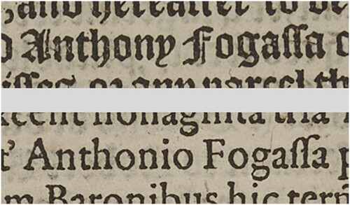
Figure 1. Examples of text in ‘blackletter’ (Anthony Fogassa) and ‘roman’ (Anthonio Fogassa), sampled from fol 21 of Plowden. Image kindly provided by the University of Aberdeen, Museums and Special Collections (licenced under CC By 4.0: https://creativecommons.org/licenses/by/4.0/).
2. Print and the common law
The common law tradition is one of an ultimately unwritten law, yet common law study and practice is replete with written sources. If the common law is unwritten, how is it found in legal texts? Put more generally, how does the common law appear and how is it communicated? That is, what systems of inscription (broadly understood) are used to reveal the common law’s unwritten principles? There are many practices surrounding the revelation of the law, beyond the seeming ubiquity of textual writing. Beyond text, the law may be revealed through the visual images of legal emblems,Footnote8 or manifested in architectural formsFootnote9 or judicial dress,Footnote10 or – if one is radical enough – in space itself.Footnote11 Such appearances are important for a broad understanding of the modern legal institution, but the written law remains a central or dominant form that also requires attention. Words, and the appearance of the letters used to build them – of alphabets and the shape of literal figures – are neither merely transparent ‘containers’ of legal meaning, nor naturally occurring or predetermined forms or conventions.Footnote12 In the case of mechanically reproduced typographic figures – that is, the Western alphabetic system of printed inscription through which English law is commonly represented – their early evolution took place under the impetus and requirements of the technologies of print, an evolution that moved from the manuscript culture of handwritten documents to the increasingly standardized forms of printed type.Footnote13
Prior to print, legal information circulated primarily via manuscripts, oral culture at the Inns of Court, and the shared expertise of legal professionals. Law was based on convention and the erudition of those steeped in the practices of the vocation, anchored to and supported by a rich professional culture of manuscript production and use.Footnote14 In terms of primary law, the year books are arguably the most prominent example of written texts produced by the legal profession. The function of the year books was not to record authoritative judgments;Footnote15 they were akin to technical manuals on the ‘occult science’ of pleading,Footnote16 and required a high degree of proficiency to understand and apply.Footnote17 Lawyers ‘required special skills to make sense of what was on the page’, de facto excluding lay readers from this socially privileged profession.Footnote18
The question of printing the law concerned not simply the familiar potential benefits of consistent and accessible legal sources, itself instrumental in the development of precedent.Footnote19 Printing legal materials was also seen to be dangerous: it risked reproducing errors in the original, or amplifying those created in the printing process overseen by individuals without lawyerly expertise, and – most worryingly – enabling the general public to access law’s mysteries. William Hudson, writing after legal print was already underway,Footnote20 argued that the legal system ‘should present to the multitude … a surface layer of commands while reserving to professionals the deeper stratum of fictions and judgments’.Footnote21 The occult science of establishing the common law should only be handled by those suitably adept in this complex and powerful art. But even the wide promulgation of bare rule or principle, without their establishing reasons and debates, presents interpretive opportunities to those not sufficiently versed in the accepted conventions of legal reading.Footnote22
In its most general terms, this problem confronts the concept of arcana imperii, under which subjects should not ‘wade in all the deepest mysteries that belong to the persons or state of kings’,Footnote23 connecting lawyers with ‘magicians’,Footnote24 ‘alchemists’,Footnote25 and other early modern specialists unwilling to reveal their secrets. To publish the law was an affront to both the crown and the professional expertise of lawyers; law should thus remain safely hidden within the halls of the profession, a safety facilitated by the limited circulation provided by the manuscript format. Yet the material promulgation of the law does not automatically undo the occlusion of arcana imperii, since even printed appearances still require appropriate expertise to decode – as the culture surrounding manuscript proficiency demonstrates. Put more generally:
Those who rule do so by specialized means, by virtue of their knowledge of the arcana imperii, the hieroglyphics of power, and that message requires expression of an absent and invisible source in a temporal and visible, though elliptical and properly speaking involuted, form.Footnote26
Despite its vaunted status as a lex non scripta, the English common law in practice came by the sixteenth century to rely on a body of texts after which lawyers and judges ordered their thinking and judgements [sic]. … [Moreover], expositors and judges … tended to view legal texts as permeated by a sensus beyond the texts’ mere words … [that] was essential to the true construction and working of the common law.Footnote29
While it may be impossible to fully display law’s raw and unmediated source, or the principles that constitute or underpin its immaterial structure,Footnote32 the other side of the publication debate was nevertheless characterized by an impulse to permit public access to the law. Initially associated with law printer John Rastell,Footnote33 this position favoured wide dissemination of the law as part of a humanist educational movement aimed at increasing virtue through classical scholarship.Footnote34 To reveal the law enhanced the subject’s capacity to know and understand the limits of their conduct and the freedoms of community members. Downplaying any reformist tendencies, Rastell promoted knowledge of the law as enhancing the order and peacefulness of society,Footnote35 as shoring up royal power rather than undoing its theatrics – at least, insofar as the law was seen to descend from the crown rather than constrain it.Footnote36 The humanist position favoured the recourse to rational or scholarly principle-building, and revealed the historical contingency and disciplinary connections of legal knowledge.Footnote37 Accordingly, it did not resonate with the common law’s practical focus, and contradicted its traditional model of authority.Footnote38 Printing the law would not only undo law’s rhetorical power, permitting the masses to enter the sacred space of legal reasoning, but also distract from its ability to function as a practical system of adjudication and undo the mythic source of the common law’s authority, which was found within its timeless English heritage and supposedly isolated from continental influences.Footnote39
3. Analysing Plowden’s typeface
Amid these tensions over common law printing emerged Les Commentaries, ou les Reports de Edmunde Plowden. Initially circulating as manuscript, it was first printed in 1571 by Richard Tottel, and was distinct in providing for each case: a record of pleadings; the various arguments of counsel and judges; and, the ultimate judgment given by the court.Footnote40 Prior to Plowden, the year books represented the main – if not only – printed forms approaching reports (although only some were printed), and, as noted above, these did not focus on reporting legal decisions, but instead the practice of pleading.Footnote41 Plowden, meanwhile, omitted the procedural pleadings and inconclusive debates of the year books, and focused on providing a record of decisions on substantive points of lawFootnote42 – i.e. a materially accessible record of the common law, as embodied in judicial decision. Plowden’s text is thus the first ‘modern’ law report, demonstrating the core methods and formal elements that would become the conventions of law reporting. As JH Baker puts it, ‘Plowden represents the beginning of modern law reporting’.Footnote43
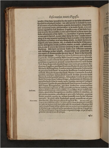
Typographically, Plowden is set in a variety of letterforms, using different styles to clearly demarcate the arguments of counsel, the court record (not usually accessible at the time, even to practicing lawyers), and the reporter’s commentary. In even a basic sense, then, its typography has authoritative functions, delineating ‘law’ from other genres of discourse present within its corpus. On this level, Baker merely notes the use of ‘a different type’ for the commentary,Footnote44 which can be seen in . The text at the top of the page is set in a characteristically angular blackletter font, while the lower portion of the page is set in the thinner roman – perhaps more familiar to the eyes of readers today – and recounts the decision made by the court (see also for examples of ‘blackletter’ and ‘roman’ from Plowden). However, there is more sophistication evident.Footnote45 Plowden’s text reproduces the Latin record of the court’s judgment,Footnote46 with the key arguments of council presented in Law French, alongside Plowden’s own commentary (also in Law French).Footnote47 As glimpsed in , where the record is in Latin it is invariably set in roman type (with vernacular text in blackletter); indeed, even when used within the Law French pleadings, which are otherwise set in blackletter, the manual arrangement painstakingly sets Latin terminology in roman. The marginal notes are in a smaller roman, and Plowden’s concluding commentary (evident at the bottom of the page in , as indicated by the marginal ‘Notatamen’) appears in italic.
Figure 2. Verso page of Folio 21 from Plowden’s Commentaries (Richard Tottel 1571). The first printed common law decision appears in roman font, about three-quarters of the way down the page. It is indicated by the marginal ‘Iudicium’, and begins with the words ‘Concessum est’. Image kindly provided by the University of Aberdeen, Museums and Special Collections (licenced under CC By 4.0: https://creativecommons.org/licenses/by/4.0/).
The choice of letterforms used in the Commentaries was influenced by wider trends in printing conventions across the sixteenth century: Latin was commonly set in roman, and the use of italic for Plowden’s opinions, for instance, associates this text with the cursive hand lettering of Italian renaissance scripts, suggesting a contingent human origin to the opinions set in the text.Footnote48 Thus, even if font is seen as more than a neutral device in the ‘background’ of a text that transparently transmits content, on one level it may be tempting to dismiss Plowden’s typography as simply reflecting contemporary conventions. However, in their extensive study of the heritage of visual conventions in information transmission, Kostelnick and Hassett argue that ‘convention carries the rhetorical weight of the discourse community that sanctions it’.Footnote49 By reproducing contemporary print conventions within a leading legal text, Plowden’s typography not only encodes the histories of meaning associated with the visual form of its letters, but embeds them within the legal tradition of which it was – and has increasingly become – a leading artefact.
Refocusing attention to these traditionally ‘background’ elements, this paper reads the typographic dimension of Plowden as a discourse on ‘romanizing’ the common law. The term ‘romanizing’ is more than a legal-typographic pun: its wordplay evokes the question of ‘Roman-style’ legal codification in a sense that is meaningfully connected to the concerns of typography and the cultural heritage of roman letterforms.Footnote50 ‘Romanizing’ is intended to have at least a dual sense: i) as the codifying of law through a method akin to that of Roman law; and ii) as the rendering of text in roman letterforms. These dimensions of ‘romanizing’ are interlinked in the common law context, operating at the intersection of the authoritative and typographic – a nexus made explicit by a close analysis of Plowden’s visual appearance within the wider printing and legal histories of which it is a part.
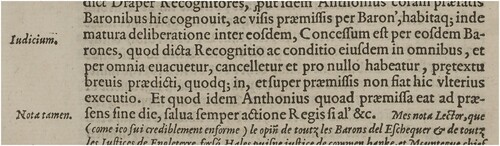
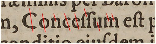
To unpack the ‘romanizing’ of the common law in Plowden, the analysis focuses on its first reported case: Renyger v Fogassa.Footnote51 And, more specifically, the style in which the opening words of the stated judgment or decision in that case appear. This typographic artefact sits on the verso page of folio 21 (see ), indicated by a marginal note of Iudicium (‘Judgment’):
Concessum est per eosdem Barones, quod dicta Recognitio ac conditio eiusdem in omnibus, per omnia euacuetur, cancelletur et pro nullo habeatur, pretextu breuis praedicti, quodq (‘it is granted by the same barons that the said recognizance and the condition thereof in and by every thing be made void, cancelled, and holden for none, by reason of the writ aforesaid’Footnote52).
Figure 3. Excerpt from Plowden’s Commentaries (Richard Tottel 1571), folio 21, verso. Image kindly provided by the University of Aberdeen, Museums and Special Collections (licenced under CC By 4.0: https://creativecommons.org/licenses/by/4.0/).
Before we can trace its visual heritage, it is necessary to undertake a detailed analysis of the letters in order to identify the font used to set out the iudicium. Type historian Harry Carter asserts that one can only know what type a text is printed in by knowing i) its conventional style classification, ii) its body-size, and iii) the name of the person who cut the type.Footnote54 These aspects are progressively harder to identify: we have already noted the type is roman in style, but what is its size, and who cut it? Once we have established all three of these elements, we will be in a position to analyse the history of meanings attached to the letterforms themselves, and thereby to properly substantiate the history and associations that the iudicium’s letters carry and their connotations within the common law tradition.
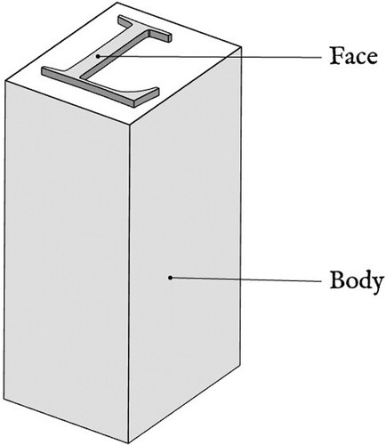
In print typography, the size of a text is determined largely by the ‘body’ of the font being used. The body refers to the piece of metal which carries the raised shape of a letter (see ),Footnote55 and thus determines the blank space around a printed letter on the page. The body is usually the same across all letters for a particular font, which are arranged in a grid or frame for printing, and is a significant factor determining its line spacing.Footnote56 Before the development of the modern ‘point’ system, body size was measured using a number of conventional labels, such as ‘pica’ and ‘long primer’, that roughly corresponded to commonly used sizes.Footnote57 The size of the iudicium is ‘english’ size:Footnote58 Plowden’s text measures approximately 95 mm over 20 lines,Footnote59 equating to about 13 ‘point’ in modern measurement. The first printed words of the modern common law thus appear as ‘english roman’: the style convention is roman, and it is cast on an english body.
Figure 4. Simplified diagram of printing type, showing ‘face’ and ‘body’. Image created by the author.
In terms of the typecutter, Frank Isaac notes that Tottel’s printing house used predominantly ‘post-Garamond’ fonts, and increasingly so as the sixteenth century unfolded.Footnote60 Claude Garamond worked in early to mid-sixteenth century Paris, producing elegant roman letterforms ‘of uniform design distinguished by their graceful proportions and brilliance of cut’.Footnote61 The influence of Garamond is large, and firmly allied with a humanist ethos.Footnote62 Although in a ‘post-Garamond’ style, Plowden’s roman font was more likely cut by Pierre Haultin – another leading humanist typecutter working around the same time.Footnote63 There were very few punchcutters working in London in the early sixteenth century, but Haultin’s nephew Jérôme did cast and sell type there using type matricesFootnote64 created by his uncle Pierre in Paris. Carter thus claims that a London-printed text that initially looks like a Garamond is often actually a Haultin,Footnote65 and it seems Plowden might fit this thesis.
According to Vervliet, Haultin’s ‘english roman’ equates to approximately 92 mm for 20 linesFootnote66 – but these measurements can vary slightly between different examples and usages, and the 95 mm of Plowden is within tolerance for the ‘english’ standard.Footnote67 Vervliet’s extensive study of Haultin’s type specimens reveals key features of his english roman on the capitals R (and K), T, M, and P. Haultin tended to cut his Rs narrow, omitting the elongated tail as found on a Garamond (his Ks are similarly ‘steep-tailed’), and his capital Ts with serifs above and below the crossbar, rather than only hanging below.Footnote68 Perhaps most distinctive is Haultin’s ‘very particular treatment’ of the upper serifs of the capital M, which Vervliet terms ‘dog-eared’.Footnote69 Other humanist typecutters, such as Garamond, tended to give their Ms top serifs with defined inner corners, while Haultin’s are tilted slightly inward and curved, giving the impression of a canine ear. Along with the ‘steep-tailed’ R and a large-bowledFootnote70 P, Vervliet notes the dog-eared M as a key letter in identifying Haultin’s english roman.Footnote71
We can see a number of these distinctive features of Haultin’s work in Plowden’s letterforms. reproduces an example of Haultin’s english roman, from a 1700 type specimen by printer Johannes Rolu. This particular cut was first seen in 1559 in Venice, but is also evident by at least 1566 in London in the work of printer John DayFootnote72 (many printers commonly purchased from the same limited pool of available fontsFootnote73). This Rolu specimen shows examples of Haultin’s ‘dog-eared’ Ms, steep-tailed Rs, double-serifed T crossbar, and large-bowled P (see extracted letters in ). shows enlarged letters M, R, and P sampled from Fol 21 of Plowden, with T from Fol 1, placed alongside the same letters from the Rolu specimen and from various examples of Garamond. There is clear similarity of letter shape and design between Plowden and Haultin, notably with respect to these four key features.
Figure 5. The Rolu specimen of Pierre Haultin’s english roman type, from Dreyfus.74 Image is in the public domain.
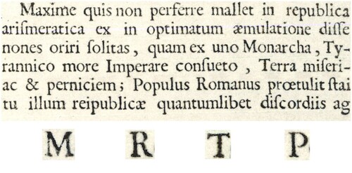
Table 1. Comparing Plowden's letters with Haultin and Garamond. The Plowden letters show more similarity to Haultin than Garamond: note the ‘dog-eared' serifs on the M, the ‘steep-tailed' R, the ‘double-serifed' T, and the ‘big-bowled’ P, all of which are not reflected in the Garamond letters. The Haultin letters are the same as in Figure 5 and are in the public domain. The Garamond letters are reproduced from DreyfusFootnote78 under fair use. The letters from Plowden were taken from images kindly provided by the University of Aberdeen, Museums and Special Collections (licenced under CC By 4.0: https://creativecommons.org/licenses/by/4.0/).
While this may not be a conclusive analysis, reading Plowden through the existing historical evidence compiled by Carter and Vervliet suggests that Tottel’s letters could have been of Haultin’s design.Footnote75 At the very least, Plowden’s roman is a text in a ‘post-Garamond’ humanist style, as Isaac notes of Tottel’s press generally. This humanist character is also demonstrated in , which shows the opening words of the printed common law (‘Concessum est’) adhering to what Bringhurst calls a ‘humanist axis’. Typographic ‘axis’ refers to the orientation of an imagined writer’s ‘hand and forearm’, as evidenced by the variation in line width, as if the letters were ‘produced by a broadnib pen held in the right hand in a comfortable and relaxed writing position’.Footnote76 With a humanist font, the ‘thick strokes run NW/SE, [along] the axis of the [imagined] writer’s hand and forearm’,Footnote77 connecting the letterforms to their human origin. The letters of ‘Concessum est’ display their thick lines generally flowing from upper left (‘NW’) to bottom right (‘SE’), with the thinner lines perpendicular to this, displaying a modest but clear variation in line width – matching the humanist lines produced by Bringhurst’s imaginary pen. (Note that the capital C appears to be damaged, with its lower end bent down, out of line with the axis displayed in other capital Cs in Plowden.) The crossbar on the lowercase e does not fit this pattern, but – as Bringhurst also notes – from about 1500, the humanist style of e adopted a horizontal bar out of line with the ‘natural’ axis of the rest of the letters.Footnote79
Figure 6. The humanist axis of the printed iudicium in Renyger v Fogassa. Produced by the author from an image kindly provided by the University of Aberdeen, Museums and Special Collections (licenced under CC By 4.0: https://creativecommons.org/licenses/by/4.0/).
The iudicium appears in a humanist ‘english’ sized ‘roman’ face, potentially cut by Pierre Haultin. Speculatively, the juxtaposition of the terms ‘english’ and ‘roman’ indicate something of the paradox or tension involved in the ‘Roman-style’ codification of the unwritten ‘English’ common law, to which ‘romanizing’ refers. As shows, the body of the type supports the visible face of the imprinted text, and thus remains unprinted and invisible to the reader. Plowden’s ‘english roman’ can be read as indicating a visible face of Roman text with structure and support given by an invisible and unprinted (that is, unwritten) body of English principle. Given that the opening word of the iudicium is ‘Concessum’, this might be pushed further: printed reports involve a ‘concession’ to materiality by the invisible and inaccessible authority of (English) law, granting visible form to the mysteries of the law in order to enable a practical decision to be taken (the imperfection of the opening C, if it attracts any meaning at all, might support this reading, with the ‘perfection’ of principle appearing in ‘imperfect’ form as it enters typographic materiality). Such readings may appear superficial, coincidental, or strained, but fuller analysis of this typographic form can bring substance to at least some of these connections.
4. Roman font’s humanist heritage
While it is arguably on one level mere coincidence that an ‘english’ size was used to print Plowden’s iudicium in ‘roman’ text, there is a deeper significance at work in the material conventions of the type – beyond its naming conventions. The naming of roman font, for instance, derives from the historical and geographic emergence of a particular style of letterform. Indeed, letters themselves are not neutral containers of meaning, but are contingent visual forms that reflect wider forces of influence and genealogical meanings. In order to understand the arrangement of the opening moment of printed common law in Plowden more fully, and having now identified them, we need to trace the meaningful heritage of the letterforms themselves, and how they encounter and thus encode wider tensions over the influence of (visible) Roman law on the (invisible) common law of England. Understanding the cultural and aesthetic influences that shaped Plowden’s particular typographic appearance involves examining the heritage of roman letterforms, and of ‘humanist’ letters in particular, and how this history of meanings plays into the authoritative debates over printing the common law. To understand the significance of the deployment of (Haultin’s) roman font in Plowden, we need to go back to the development of humanist script. The usual origin cited for roman type is Nicolas Jenson, who in fifteenth century Venice produced arguably the first full set of roman letterforms. The heritage of his typographic consolidation, however, lies in the scribal forms of the Italian renaissance.
Humanist script evolved out of Carolingian letterforms, which were promulgated as one of the leading written forms of both the Roman Empire and the empire of Charlemagne, and eventually resulted in roman type.Footnote80 While the Carolingian form was replaced across most of Europe by an angular gothic script (blackletter), it persisted in a ‘relatively pure and graceful’ form in Italian manuscripts.Footnote81 Ullman’s analysis detects innovations in the handwriting practices of early humanist Coluccio Salutati. Ullman claims this was inspired by the comparably open legibility of the earlier Carolingian script he was reading, and the need for more legible script for humanists devoted to the benefits of scholarly study:Footnote82 ‘The humanists of the fourteenth century … read more, perhaps, than their predecessors, [and] preferred manuscripts in large, clear writing, … i.e. in the Carolingian script of the ninth to twelfth centuries.’Footnote83 These early experiments, however, may also have initially stemmed from replacing lost or damaged sections of text in a style intended to emulate the older script of the original.Footnote84 In either case, Ullman’s analysis of surviving manuscripts traces the development of technical shifts in scribal handwriting in Italy across the fourteenth and into the fifteenth century, resulting in what De Robertis observes as the ‘instant success’Footnote85 of a newly evolved Latin script based on the ‘qualities of formal balance, sobriety, and legibility’Footnote86 of the earlier Carolingian model.Footnote87 These innovations eventually led to roman type, as writing developed ‘almost imperceptibly into the printer’s art’,Footnote88 with the bifurcation of blackletter and roman styles of text becoming ‘canonized in the fonts of typography’.Footnote89
The evolving forms of humanist script were preferred not only by humanists who read a lot, but also by book collectors across Europe. Given this widespread preference, Ullman concludes that it was inevitably ‘preferred by the early Italian printers.’Footnote90 Scribes experimented in ways they hoped would improve their products, primarily by making them more legible, emulating older models of ‘legibility’ and ‘cleanliness’ in manuscript style,Footnote91 and while some experiments did not succeed, ‘others have persisted to this day’ in typographic design.Footnote92 As Bringhurst puts it, Roman type shares the ‘sensuous and unhurried light and space’ of Renaissance handwriting, and this typographic design itself has had lasting effects, serving ‘as typographic benchmarks for five hundred years’.Footnote93 Indeed, Bland notes that ‘the arrival of roman as the primary face of composition in English books, and the changes that it brought, are still with us and … are never likely to be entirely displaced.’Footnote94
Jenson, then, did not create his roman type out of nothing. He took the ‘rounder, lighter forms’ of humanist script as his model,Footnote95 just as blackletter typecutters derived letterforms from existing gothic script. In both cases, typecutters sought to emulate existing forms of handwriting in a regularized and legible manner for the printing press, adapting familiar textual forms to the technology of the press. Febvre and Martin note how early printers ‘took extreme care to produce exact imitations’ of existing manuscripts.Footnote96 The more cramped and less readable blackletter style, which was adopted by Gutenberg and others, was traditionally dominant in most of Europe as the most usual form of hand-written script. Despite both clearly being linked with the human hand,Footnote97 however, blackletter and roman have different lines of heritage and different cultural associations: blackletter typically resonates with tradition and conservatism, and roman with the ‘humanist’ scholarship of the Italian renaissance and its civilizing ethos. The visual form of letters has a significant practical dimension, especially in a book or prose context where legibility and ease of reading are paramount concerns. Yet such practical questions have evident ideological significance in terms of their commitment to the openness or accessibility of a text, or the decorative traditions that might be maintained at the cost of legibility.
The spread of roman letterforms was not immediate, and moved quicker in some textual contexts than others. Like the conventions of handwriting, blackletter was the dominant typographic form in most of Europe in the early days of print, and was gradually displaced in different kinds of texts at different times.Footnote98 Blackletter was the first type to dominate England, with roman only being used to set Latin text, in line with sixteenth century convention.Footnote99 ‘Despite the appearance of some well-printed books in roman or italic during the 1570s and 1580s, the [London] trade remained conservative in its typographic practices’.Footnote100 In the sixteenth century, many printers would thus carry sets of both roman and blackletter types in various sizes, as well as italics, to use as the conventions of different texts demanded. Yet it was blackletter that ‘remained the predominant English language typeface’ until the late 1600s.Footnote101 Blackletter was also heavily associated with Norman French, and thus endured in legal texts (as well as in e.g. Bibles) long after it had died out elsewhere.Footnote102
Roman typography thus carries various political and cultural connotations, regardless of any conscious choice or intent on the part of the printer, and these were heightened in a legal context. On the one hand, blackletter was familiar and traditional, visually similar to the handwritten texts of manuscript culture and strongly associated with the technical French used by common lawyers. Roman text, on the other hand, was a Latin font, connected with the linguistic and legal traditions of Rome as much as the scholarly ethos of the renaissance. Indeed, the spread of roman font across Europe was symptomatic of a ‘triumphant humanism [that] had imposed the use of roman type’.Footnote103 And the connections of roman font with renaissance learning and Roman heritage have particular resonances for common lawyers that are intricately linked, as outlined above, with the debate over print itself.
Plowden’s typographic details go to the heart of the concept of ‘romanizing’ the common law. While the specificity of Haultin may be questionable, the visual design of the roman letters in Plowden’s text is nevertheless intimately connected to humanist influences stemming from continental Europe. The loose ‘school’ of early Parisian typecutters that includes the likes of Garamond and Haultin exerted a lasting influence over type design, evolving the initial model founded by Jenson that in itself was modelled on the humanist handwritten script of the renaissance. A genealogy can be traced from the humanist ethos of the Italian renaissance, via the practical changes in handwriting to improve legibility in the scholarly endeavours that were seen to underpin good civilization, through the typographical encoding of this humanist script into printed letterforms by Jenson, to the development of more refined characters in the work of Garamond and his contemporaries.Footnote104 The intricate details of the roman text in which Plowden’s first reported words of the common law appears are not mere decoration, technical happenstance, or design pretence – but represent the material encoding of a pragmatic shift in writing technologies, heavily freighted with a humanist ethos that found civilizing value in scholarly study and rational principle-building, and resulted in the innovations in written form that became encoded in the typographic design of roman fonts.
5. Romanizing the law
Displaying the law in ‘roman’ form embeds the question of a ‘Roman’ method into Plowden as an artefact of both printing heritage and common law history – a Roman method connected both to the general humanism of the Italian renaissance and the specific practices of codification and scholarly glosses in Roman law. Plowden is not simply a marker of legal humanism, but is itself materially caught in the complex tensions over printing the common law – of ‘writing’ what is essentially ‘unwritten’. Indeed, Plowden himself equivocated on the benefits of print, but resolved that a stabilized and thus authoritative version of his well-respected manuscript – with its production overseen by himself and the seemingly trustworthy TottelFootnote105 – was better than the alternative.Footnote106
Chronologically, Plowden is located between the progressive humanism associated with Rastell and the stronger Romanist codification associated with the later Francis Bacon. Where Plowden hesitates around printing his law reports, Bacon was directly inspired by the Roman model in his desire for a total codification of the common law in text.Footnote107 Yet despite this desire he remained firm in his commitment to the common law as an unwritten law, even though it seemed unavoidable that codification would radically alter the nature of common law authority. The structure of the Roman Corpus Iuris hung entirely on the word of the sovereign as the ultimate source of the law: ‘Without a royal author’, according to Romanist logic, ‘the law could not be written’.Footnote108 While Plowden published his reports only because his manuscript was highly valued in the legal community, and suffered or risked error in its reproduction as a manuscript, Bacon’s dream of a Roman-style code would render the common law the direct textual expression of sovereign authority – as a de facto written law, rather than remaining essentially unwritten.Footnote109
Edward Coke’s counter-rendition of a printed common law, meanwhile, avoided such a fate. Coke was keen on print, and supported the publication of his Reports and later treatises. His general ‘emphasis upon learning, understanding and a knowledge of the law … could only be resolved by a wide distribution of information, which print enabled.’Footnote110 It was for the good of law students that an accurate text be widely available for study, and for the good of Coke’s political position that the superiority of the common law to the crown be publicly set out.Footnote111 Importantly for the current argument, Coke also challenged the inevitability of a Romanist code in the mere fact of common law print. The prefaces to Coke’s Reports took the nascent and relatively passive practice of law reporting and recast it ‘as an ideological weapon’.Footnote112 Judges, not the sovereign, author the law:Footnote113 it ‘embodies the wisdom of generations’ of judicial acts.Footnote114 The law may be the sovereign’s, but ‘only as the kingdom is his, by due and lawful inheritance; it is not his to make or to alter’.Footnote115 Presented as reports – as evidence of an unwritten law ultimately decided outwith the text – Coke’s typographic edifice represents the ‘raw’ material of legal decision, with such reports (like the older year books) requiring sophisticated expertise to understand and apply. One can only glean their insights through immersion in the textuality of their available form, through a diligent studyFootnote116 by which one might come to master the bespoke or artificial mode of reason that characterizes the common law.Footnote117
Reports are indexes, evidence of a law elsewhere, accessible only with proficiency in the requisite methods. Coke’s writing of the common law is emblematic of this structure, being – as Helgerson puts it – ‘a writing against the written’.Footnote118 Reporting decisions resolves questions of the source of law in a particular way, positioning its textual appearance as a hermeneutic of a ‘true’, unwritten source. For Coke, digests and abridgments resolve legal sources in the opposite direction, setting up ever more barriers that stop the law flowing from its judicial source to its reader.Footnote119 This version of the common law, intimately connected with its expression through typographic artefacts, also increases the legitimacy of the law by divorcing it from the whims of a monarch: ‘while written laws contain only the wisdom of one Prince, or Legislator, customary law by definition contains the wisdom and experience of generations of people who have tested and used it.’Footnote120 The immemorial quality of the common law disarms any suggestion that it has an ultimate author in the sovereign, and retains for it a separate line of heritage – and thus an alternative source of authority and concomitant jurisdiction. One that provides the crown with limits through which its power may be exercised.Footnote121
Printing the common law stems predominantly from two interlinked humanist desires. One for public legal education and an accessible legal text, associated with the humanism of the renaissance and the apparent open legibility of roman letterforms. The other for a Romanist codification, associated with prioritizing material texts as the stabilized source of law. The common law has generally come to be rendered in printed form, but it resists both the humanist openness to rational analysis and the authoritative codification characteristic of Roman law along lines established by Coke. Coke’s insular vision of law reporting builds upon previous practices of legal reportage established in the year books and the emergent nominate reports in the latter half of the sixteenth century, of which Plowden is an innovative and influential example. The significant legacy of Coke’s Reports serves as a relay and augmentation of the earlier watershed evident in the material register of Plowden’s typography.
As the first modern law report, printed in a font that is materially linked to both the humanism of Rastell and the Roman codification championed by Bacon, and caught between the potential authority of a standardized text and the traditional practices of manuscript culture, Plowden’s Commentaries occupy a space in common law history where authority and typography overlap and, in their overlap, are implicated in the tensions inherent in ‘romanizing’ the law. On the one hand, the roman font in Plowden signifies a law that is not only written and disseminated, in the model preferred by Rastell and other early publicists, but one written in a codified form, authored by the sovereign, to be further elucidated and understood through scholarly study and the setting of other institutional texts to surround and support the primary code. The civilizing efforts of law become dependent on scholarship, on the textual work of the code itself and its supporting sources – mediated through a written form with a particular renaissance heritage, visually contoured for legibility and ease of study. This is not an imperious blackletter text – hard to read, steeped in a ‘timeless’ tradition and visual complexity – but an interpretively open roman one, able to be studied and examined through the endeavours of any reading subject. Such humanist roman letters have distinct implications in a legal context. They change the understanding of a text’s status and its nature as a legal source, rendering law not invisible or determined elsewhere, or only accessible through a certain kind of cloistered proficiency, but as present in its very code. The law is made available for analysis by anyone who would care to make sense of it – by scholars and the wider population, not only the exclusive community of trained lawyers and judges. Yet on the other hand, the roman letterforms of Plowden only reveal a report of the law – not the law itself. The ideological trajectory implied by the humanist font is frustrated, and the text remains at a distance from the law, only ever indicating it as something decided elsewhere, by those with the proficiency to do so. Such a law remains invisible – and distinctly English.
We thus return to the initially frivolous associations of the ‘english roman’ of Plowden’s printing. A terminological happenstance that actually does, upon fuller analysis, help signify much of the complexity and anxiety around the common law as an increasingly print-based tradition – regardless of the specific name that might be attached to the ‘body’ of the font in use. Encountered and developed in light of the humanist and Roman histories of the letterforms of Plowden’s opening iudicium, and connecting to the wider debates of the propriety and effect of legal print, the opening words of the printed common law display in their visual form a structural relation between law’s visibility and invisibility that is freighted with the complex tensions surrounding the qualities of the common law tradition. The text of the iudicium appears as a humanist roman text on an unseen english body: it is characterized by a Roman face or visible surface, supported or held together by an invisible, unprinted body of English principle, which can only be divined – in Coke’s rendition, at least – through the expert study of trained jurists in line with immemorial tradition. The printed reports of the common law only codify that law to the extent they are visible, and remain contingent upon that which is not printed: the invisible body that supports the visible face.
Weaving a tricky path within the heritage of both unwritten and written traditions of law, under the seemingly unstoppable impetus of a proliferating communications technology, the first printed words of the English common law both codify and resist codification: they present the law in text in the same moment they resist the capacity of text to reveal the law. And, moreover, as found in their typographic meanings, they embed this contradiction in the aesthetics of their contingent visual form, signifying an (imperfect) Roman-style code for an unwritten English law.
6. Conclusion
More than mere decoration or practical necessity, the visible surfaces of the common law texts encountered within the legal institution, the design and appearance of their letterforms, manifest enduring questions worthy of legal attention and that go to fundamental debates as to the nature and study of the common law tradition. The style and design of common law font, as exemplified in Plowden’s opening imprint, are not without legal consequence, and have complex histories and associations. As we have seen, these trajectories meaningfully encounter core questions of common law authority, form, and method, captured here under the term ‘romanizing’. These typographic dimensions of common law texts tend to sit in the background, or become suppressed through familiarity and convention, dismissed as ‘mere style’. The analysis in this paper has sought to bring these aspects into the foreground. Often overlooked, their latent meanings linger, and can be extracted and elaborated through visual analysis. These meanings are not isolated from the substantive and authoritative qualities usually presumed to be the central, if not only, legally relevant dimensions of common law texts. And, in the case of Plowden, they reveal the Latinate traditions embedded in the material foundations of the modern common law – a tradition now beholden to the technology of typographically constituted law reports.
Acknowledgments
Sincere thanks to Peter Goodrich, Valérie Hayaert, Dominic Smith, and Ian Williams for commenting on earlier drafts of this paper, as well as colleagues at Dundee Law School for their constructive engagements and discussion. Any errors or failings remain my own.
Disclosure statement
No potential conflict of interest was reported by the author(s).
Notes
1 I have made a distinction throughout this paper between ‘Roman’ and ‘roman’, and between ‘English’ and ‘english’. Where reference is to the national or geographic entity, proper nouns are used (‘Roman’, ‘English’); where reference is to general typographic categories, improper nouns are used: ‘roman’ for the serifed style of typeface; ‘english’ for the body size (the body size of type is discussed below: see text to notes 55-59).
2 Shaunnagh Dorsett and Shaun McVeigh, Jurisdiction (Routledge 2012) 34.
3 The literature is extensive. For an overview and practical guide, see Robert Bringhurst, The Elements of Typographic Style (Hartley and Marks 2002). For an exemplary textbook, see Ellen Lupton, Thinking With Type: A Critical Guide for Designers, Writers, Editors, and Students (2nd edn, Princeton Architectural Press 2010). For a wider range of critical perspectives and analyses, see Christopher Scott Wyatt and Dànielle Nicole DeVoss (eds), Type Matters: The Rhetoricity of Letterforms (Parlour Press 2018).
4 On the ‘backgrounding’ of law’s affective qualities, see, for example, Illan rua Wall, ‘The Ordinary Affects of Law’ (2023) 19 Law, Culture and the Humanities 191.
5 Mark Bland, ‘The Appearance of the Text in Early Modern England’ (1998) 11 Text 91, 92. As Jean-François Lyotard claims more generally, linguistic writing operates precisely through the suppression of text’s imagistic form: see Jean-François Lyotard, Discourse, Figure (University of Minnesota Press 2010) 210.
6 Even seeking to be ‘invisible’ to the reader, as much typography does, is a rhetorical move. For debate on the ‘crystal goblet’ thesis, that ‘type should not interfere with reading’ and instead transparently carry meaning, see Christopher Scott Wyatt, ‘On Type and Typographic Anatomy’ in Christopher Scott Wyatt and Dànielle Nicole DeVoss (eds), Type Matters: The Rhetoricity of Letterforms (Parlour Press 2018) 6–8; quotation at 6. As Wyatt concludes: type ‘is always rhetorical, including when it tries to be invisible’ (28).
7 See, for example, David Harvey, The Law Emprynted and Englysshed: The Printing Press as an Agent of Change in Law and Legal Culture 1475-–1642 (Hart 2017) 97. Tottel is better known for his poetic Miscellany: see, for example, Rachel Stenner, The Typographic Imaginary in Early Modern English Literature (Routledge 2019) 128–143.
8 See Peter Goodrich, Legal Emblems and the Art of Law: Obiter Depicta as the Vision of Governance (Cambridge University Press 2013).
9 See Linda Mulcahy, Legal Architecture: Justice, Due Process and the Place of Law (London: Routledge 2011).
10 See Leslie J Moran, ‘Judicial Bodies as Sexual Bodies: A Tale of Two Portraits’ (2008) 29 The Australian Feminist Law Journal 91. On law and dress more generally, see Gary Watt, Dress, Law and Naked Truth: A Cultural Study of Fashion and Form (London: Bloomsbury 2013).
11 See Andreas Philippopoulos-Mihalopoulos, Spatial Justice: Body, Lawscape, Atmosphere (Routledge 2014).
12 On the innovation and concomitant effects of language’s written form, see Walter J Ong, Orality and Literacy: The Technologizing of the Word (Routledge 1988). As he notes (at 87): ‘Writing … moves speech from the oral-aural to a new sensory world, that of vision’, thereby transforming both speech and thought. For a detailed study of evolving conventions in visual communication more widely (including text), see Charles Kostelnick and Michael Hassett, Shaping Information: The Rhetoric of Visual Conventions (Southern Illinois University Press 2003).
13 In terms of type design, this shift is discussed more fully below: see section 4.
14 On lawyers’ professional immersion under the concept of ‘nos erudition’, see Harvey (n 7) 135–139.
15 Theodore FT Plucknett, A Concise History of the Common Law (Liberty Fund 2010) 272–273. Judicial reasoning was ‘off the record’, with early records containing only the order of the court: see John Baker, ‘Law Reporting in England 1550–1650’ (2017) 45 International Journal of Legal Information 209, 212.
16 John P Dawson, The Oracles of the Law (University Press of Michigan 1968) 10.
17 Ian Williams, ‘“He Creditted More the Printed Booke”: Common Lawyers’ Receptivity to Print, c.1550–1640’ (2010) 28 Law and History Review 39, 42.
18 Richard J Ross, ‘The Commoning of the Common Law: The Renaissance Debate over Printing English Law, 1520-1640’ (1998) 146 University of Pennsylvania Law Review 323, 392.
19 See Ian Williams, ‘Early-Modern Judges and the Practice of Precedent’ in Joshua Getzler and Paul Brand (eds), Judges and Judging in the History of the Common and Civil Law: From Antiquity to Modern Times (Cambridge University Press 2012).
20 Ross argues that resistance increased as printed texts became more commonplace in legal training and practice: see Ross (n 18). Indeed, extended anti-publicist sources are relatively rare, since they were not predisposed to publication: see ibid 385.
21 Hudson, quoted in Ross (n 18) 358.
22 See ibid 361.
23 ibid 428, citing a 1610 proclamation by King James himself.
24 ibid 359.
25 ibid 428.
26 Peter Goodrich, ‘The Emblem Book and Common Law’ in Lorna Hutson (ed), The Oxford Handbook of English Law and Literature, 1500–1700 (Oxford University Press 2017) 155.
27 In Gandorfer’s terms, it is ‘matterphorical’ – law is not pure concept manifesting in material form, but is constituted by its matter-discursive practice: see Daniela Gandorfer, Matterphorics: On the Laws of Theory (Duke University Press forthcoming).
28 Peter Goodrich, ‘Imago Decidendi: On the Common Law of Images’ (2017) 1 Art and Law 1, 28.
29 Andrew Zurcher, ‘Spenser, Plowden, and the Hypallactic Instrument’ in Lorna Hutson (ed), The Oxford Handbook of Law and Literature, 1500–11700 (Oxford University Press 2017) 655–656.
30 ibid 657.
31 On law’s ‘geography of mental spaces’, see Peter Goodrich, Oedipus Lex: Psychoanalysis, History, Law (University of California Press 1995) 9–10.
32 For a rich extended study of the revelation of law’s formless form as a structural staging of the fiction of a divide between visible and invisible, see Pierre Legendre, God in the Mirror: A Study of the Institution of Images (Lessons III) (PG Young tr, Routledge 2019).
33 See Ross (n 18) 329–342.
34 See, for example, Thomas Giddens, ‘A Series of Unfortunate Events or The Common Law’ (2021) 33 Law and Literature 23.
35 Ross (n 18) 338.
36 See ibid 334–336.
37 See, for example, CP Rodgers, ‘Humanism, History and the Common Law’ (1985) 6 The Journal of Legal History 129, 131–132; Mark D Walters, ‘Legal Humanism and Law-as-Integrity’ (2008) 67 The Cambridge Law Journal 352, 357–360. See also Peter Goodrich, ‘Intellection and Indiscipline’ (2009) 36 Journal of Law and Society 460.
38 See Rodgers (n 37).
39 On the repression of continental influences within the English tradition, and their critical return, see Peter Goodrich, ‘Critical Legal Studies in England: Prospective Histories’ (1992) 12 Oxford Journal of Legal Studies 195.
40 Harvey (n 7) 161.
41 See also ibid 160–161.
42 Baker (n 15) 211.
43 ibid 212. On the immediate impact of Plowden, see Harvey (n 7) 161–162. It is worth noting that an earlier text of importance might be Bracton, which from the thirteenth century provided lawyers with commentary on legal decisions drawn from the court record. However, Bracton – although significant – is beyond the focus of this paper, since it does not ‘report’ on cases in the modern format that Plowden adopts, being piecemeal and polemical. See Plucknett (n 15) 259–260.
44 Baker (n 15) 211.
45 The folio format is itself significant to note, for instance. The bare size and shape of the volume indicates the importance of the text, since folios were ‘reserved for substantial works of serious intellectual, religious or political import’, including ‘lawbooks … classical literature and works of scholarship’: Bland (n 5) 117.
46 Note that ‘judgment’ technically refers to the court’s decision, not to the fuller concept of facts, law, reasoning, and justification that characterizes today’s concept of ‘judgment’; as noted above, this underlying reasoning was ‘off the record’: see Baker (n 15) 212. In this period, as the concept of precedent was still emerging, the ‘record’ of decisions was also clearly distinguished from reporting or commentary upon that record, with the record (i.e. the court roll) being recognised as the most authoritative source: see Williams (n 19) 56–60. Indeed, this is arguably why Plowden adopted his method of reproducing directly from the record – a practice now followed by modern full-text law reports that reproduce court transcripts, with clearly demarcated commentary and metadata.
47 See Baker (n 15) 211.
48 As Bland notes, ‘italic was used … in order to convey the orality of the text’: Bland (n 5) 99–100. The current paper does not engage with the form and use of italics, but on the general development and spread of italic types from their Italian source, see Harry Carter, A View of Early Typography up to about 1600 (Hyphen Press 2002) 117–126.
49 Kostelnick and Hassett (n 12) 6.
50 See n 1, above, on the use of ‘Roman’ vs ‘roman’.
51 A subsequent report of this case, translated from Plowden’s initial version, can be found at Reniger v Fogossa 75 ER 1.
52 The translation is reproduced from Reniger v Fogossa 75 ER 1, 33.
53 See n 43 above, and Baker (n 15) 212.
54 See Carter (n 48) 3.
55 For comprehensive diagrams detailing the complex anatomy of a piece of type, see ibid 127 (Figure 1). For fuller details and discussion of the complex techniques of printing and typographic production, and their early development, see ibid 5–22; Lucien Febvre and Henri-Jean Martin, The Coming of the Book (Verso 1997) 45–76.
56 Other elements may also contribute to this spacing, such as any ‘leading’ used between lines to widen them. See Febvre and Martin (n 55) 61. See also n 67, below, on size variation in early printing.
57 On traditional size terminology, see briefly ibid 60; Frank Isaac, English Printers’ Types of the Sixteenth Century (Oxford University Press 1936) vi. For fuller analysis of the development of the conventional point system, arguably emerging from the traditional printing sizes, see Robin Kinross, Modern Typography: An Essay in Critical History (Éditions B42 2019) 22–33.
58 See n 1, above, on the use of ‘English’ vs ‘english’.
59 On measuring type over 20 lines, see Isaac (n 57) xi.
60 See ibid 30–31. Note that Isaac’s type classification uses ‘Garamond’ as a general style, not letters cut by Garamond himself. Isaac’s taxonomy divides into ‘gothic’ and ‘roman’, with ‘roman’ subdivided into ‘pre-Garamond’ and ‘Garamond’ – indicative of the significance of Garamond’s designs for the evolution of roman type: see ibid xii–xiii. I have used ‘post-Garamond’ to accommodate this nuance in Isaac’s particular terminology.
61 Carter (n 48) 84. Note that Garamond did not invent out of nothing, and it is generally thought he derived his work from the types cut for the (undercelebrated) Italian printer Aldus: Alexander Lawson, Anatomy of a Typeface (Hamish Hamilton 1990) 132–133.
62 See Craig Eliason, ‘A History of the “Humanist” Type Classification’ (2015) 18 Printing History 3.
63 For an overview of Haultin’s roman types and general significance, see Hendrick DL Vervliet, ‘Printing Types of Pierre Haultin (ca.1510-87) Part I: Roman Types’ 30 Querendo 87. On his underratedness in type histories, see Carter (n 48) 86–87.
64 A matrix is the set of moulds for casting type. Letters are initially cut on ‘punches’ of hard metal, which are then used to create moulds by striking them into softer metal (e.g. copper). Hence the term ‘punchcutters’ for those who create letterforms. For the technicalities of early print, see Carter (n 48) ch 1.
65 ibid 86.
66 See Vervliet (n 63) 114.
67 Printing is not an exact science. 92mm over 20 lines is approximately 4.6mm per line (roughly 13 point). Plowden was measured at 95mm over 20 lines, and 47mm over 10 lines, with individual lines varying between 4.5 and 5mm. It is conventional to measure type over 20 lines: see Isaac (n 57) xi. Yet Isaac also notes at n 1 – citing McKerrow, who prefers to measure over 10 lines – that ‘english’ size varies between 45–47mm for 10 lines (13–13.5 point). Most informatively, as James Mosley explains in his preface to Carter (n 48) 13: ‘On the printed page, type appears in a variety of conditions, new or worn, over- or underinked. Type from identical matrices may look very different if it is cast in a mould for a larger or smaller body, or if a different setting … makes it appear more widely or closely set. The extent to which the dimensions of the impression have altered when the paper it is printed on has shrunk in drying, perhaps unevenly, after having been printed damp make it unwise to rely on exact measurements from the page’.
68 Vervliet (n 63) 94. Vervliet observes these typical characteristics emerging from about 1550.
69 ibid.
70 The ‘bowl’ refers to the loop on letters such as P and R.
71 See Vervliet (n 63) 114.
72 See ibid 113.
73 Isaac notes that most of Tottel’s fonts can be matched to those also held by other London printers: Isaac (n 57) 31.
74 See John Dreyfus (ed), Type Specimen Facsimiles [1-15]: Reproduction of Fifteen Type Specimen Sheets Issued Between the Sixteenth and Eighteenth Centuries (Bowes 1963) sheet 15.
75 There are some letters that do not fit this analysis, such as the occasional M lacking a top-right serif, or R that has a longer tail. There also appear to be at least two different versions of the capital C, one with a narrower opening than the other. gives good examples: the R in ‘Regis’ (cf ‘Recognitio’), the M in ‘Maroma’ (cf ‘Meryke’ and the first ‘Martini’), and the C in ‘Carell’ (cf ‘Coseworthe’ and ‘Concessum’). These letters are more in line with Garamond’s style – especially the asymmetrical M which, as Carter notes, was a feature that Garamond removed when he recut many of his fonts in 1550: see Carter (n 48) 85. Lawson also notes the addition of the right serif to the M in Garamond’s later cuts: see Lawson (n 61) 133. It may be that different sets of type owned by Tottel became mixed, or that he purchased fonts of the same body from different sources. Carter does note that, while Haultin’s faces were more common, some of Garamond’s did find their way to London in the first half of the 16th century, prior to the 1550 recut: see Carter (n 48) 86. Regardless, for the purposes of the argument in this paper, the style of these other letters remains humanist: see .
76 Bringhurst (n 3) 123.
77 ibid.
78 Garamond’s letters are sampled from a number of specimens contained in John Dreyfus (ed), Type Specimen Facsimiles [16-18]: Reproductions of Christopher Plantin’s ‘Idex Sive Specimen Characterum’ 1567 and Folio Specimens of c.1585, Together with the Le Bé-Moretus Specimen, c. 1599 (Bodley Head 1972). The M comes from specimen 24 of Plantin’s 1567 Index Characterum. The sampled T and P are from specimen 26 and 32, respectively, in Plantin’s 1585 Folio Specimen, but represent the same font: Garamond’s ‘english’ size roman (90mm over 20 lines) – see ibid 4. The R is from specimen 38 in the 1585 Folio Specimen: this specimen is of Garamond’s smaller ‘pica’ size roman (80mm over 20 lines). It thus does not match the ‘english roman’ size of the M, T, and P, but shows the longer ‘tail’ on the R which is characteristic of Garamond’s cuts.
79 See ibid. Bringhurst’s example diagrams also show that as type evolves into the 17th century baroque – and beyond – the axis becomes more generally variable or is omitted altogether (e.g. with modernist geometric letters). See ibid 12–15.
80 See Lawson (n 61) 35.
81 See BL Ullman, The Origin and Development of Humanistic Script (Edizioni di Storia e Letteratura 1960) 11–12, quote at 12. See also Febvre and Martin (n 55) 79.
82 See Ullman (n 79) 11–19.
83 ibid 12.
84 On this alternative thesis, see Teresa De Robertis, ‘Humanistic Script: Origins’ in Frank T Coulson and Robert G Babcock (eds), The Oxford Handbook of Latin Paleography (Oxford University Press 2020) 515.
85 ibid 518.
86 ibid 510.
87 See, generally, Ullman (n 79).
88 ibid 127. See also Bringhurst (n 3) 122–123.
89 De Robertis (n 82) 518.
90 Ullman (n 79) 134.
91 De Robertis (n 82) 515.
92 Ullman (n 79) 133.
93 Bringhurst (n 3) 122–123.
94 Bland (n 5) 92.
95 Lupton (n 3) 15.
96 Febvre and Martin (n 55) 77.
97 Humanism has contended meanings, not simply those linked with human origin. In type, the ‘humanist’ label is similarly contentious, although does have a significant root in the renaissance humanism that influenced Jenson. See Eliason (n 62).
98 Bland (n 5) 104. See also Febvre and Martin (n 55) 78–83.
99 Bland (n 5) 93.
100 ibid 104.
101 This change in style, Bland continues, was associated with ‘a combination of Italianate fashion, economic prosperity and type replacement [that] finally changed the typography of literary publications … between 1588 and 1593’: ibid 94.
102 ibid 93.
103 Febvre and Martin (n 55) 88.
104 For more on Garamond, including other Parisian figures such as the printers Estienne and Plantin who were instrumental in Garamond’s fame and subsequent influence, see Lawson (n 61) 129–140.
105 On the trust the legal profession placed in Tottel, seemingly due to his affiliations with the legal community via Rastell’s son William, see Harvey (n 7) 98–101.
106 As Plowden’s prologue puts it: his manuscript ‘came to the handes of some printers who ment (as I was informed) to sett them forthe for gain. And because the cases were written by … ignorant persons, that perfectly did not understande the matter, the copies were very corrupt … Therefore to preuent and eschewe these defectes, I did deliberate whether it weare my parte to put this booke in print myself. … [Meanwhile,] all the Judges of both the benches & Barons of the Eschequer’ sent him requests ‘to put the woorke in print’, which he dutifully did. (I have regularized the long ‘s’ in this quotation, but otherwise maintained spelling.)
107 Richard Helgerson, Forms of Nationhood: The Elizabethan Writing of England (University of Chicago Press 1992) 75.
108 ibid.
109 See ibid 76–77. As Helgerson notes (at 77): ‘When customs are registered at the king’s behest, they become text law and the king becomes their author.’
110 Harvey (n 7) 221.
111 See ibid 220–234.
112 Helgerson (n 105) 85.
113 Coke, as cited in ibid 84.
114 Rodgers (n 37) 137.
115 Helgerson (n 105) 84.
116 On the general humanist connection between study and virtue in the common law, see Giddens (n 34).
117 See Helgerson (n 105) 97–100. As Coke puts it: ‘the common law is itself nothing else but reason … [but] an artificial perfection of reason, gotten by long study, observation, and experience’ (98, citing Coke).
118 ibid 100.
119 See ibid 83–84.
120 Rodgers (n 37) 136.
121 On the control of sovereign power through law’s textual form, see Ino Augsberg, ‘Reading Law: On Law as a Textual Phenomenon’ (2010) 22 Law and Literature 26. On the variable understanding of the relation between law and sovereign authority, see, for example, Karl Shoemaker, ‘The King’s Two Bodies as Lamentation’ (2017) 13 Law, Culture and the Humanities 24.