Figures & data
Figure 1 Location of study area (Gondar town), 2022.
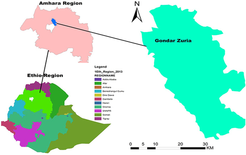
Figure 2 Flowchart of participant’s selection to estimate the risk of stroke among hypertensive patients in UOGCSH, 2012 to 2022.
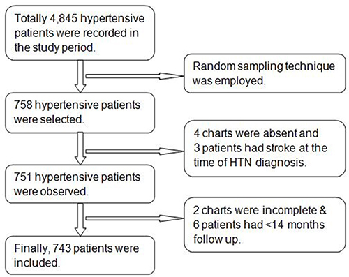
Table 1 Baseline Socio-Demographic and Behavioral Characteristics of Hypertensive Patients at UoGCSH from 2012 to 2022 (n=743)
Table 2 Baseline Clinical Characteristics of Hypertensive Patients at UoGCSH from 2012 to 2022 (n=743)
Table 3 Multivariable Logistic Regression Coefficients of Each Predictor Included in the Final Reduced Model to Predict Stroke Among Hypertensive Patients (n = 743)
Figure 3 The ROC curve represents the probability of risk for stroke among hypertensive patients at UoGCSH, 2012–2022.
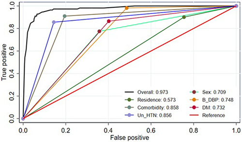
Figure 4 Calibration plot for developed model based on original beta coefficient for stroke prediction model among hypertensive patients at UoGCSH, 2012–2022.
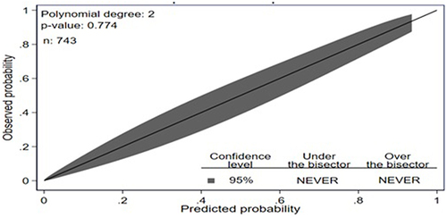
Figure 5 The ROC curve represents the probability of risk of stroke among hypertensive patients after internal validation at UoGCSH, 2012–2022.
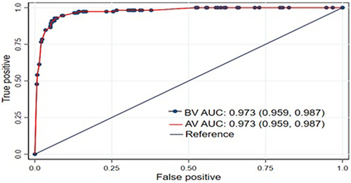
Figure 6 Calibration plot for a risk prediction model of stroke among hypertensive patients after internal validation at UoGCSH, 2012–2022.
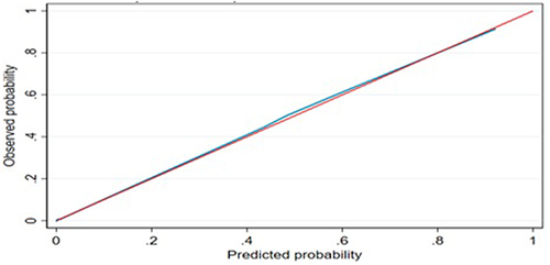
Figure 7 Prediction density plot for developed model using original beta coefficients at UoGCSH, 2012–2022.
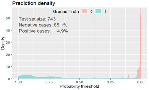
Figure 8 Nomogram for predicting the risk of stroke in hypertensive patients at UoGCSH, 2012–2022.
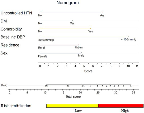
Figure 9 Mobile web-based stroke risk prediction model at UoGCSH, 2012–2022.
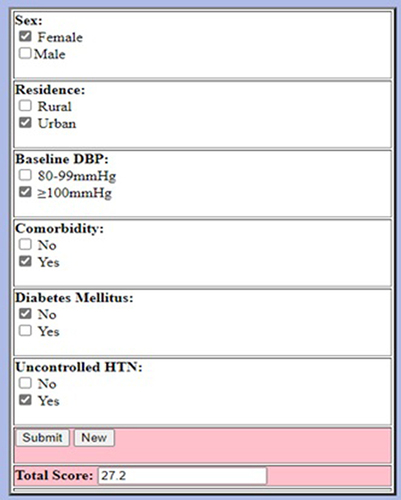
Table 4 Risk Classification of Stroke Among Hypertensive Patients Using a Nomogram (n=743)
Figure 10 Decision curve analysis for the nomogram plotting net benefit of the model against threshold probability at UoGCSH, 2012–2022.
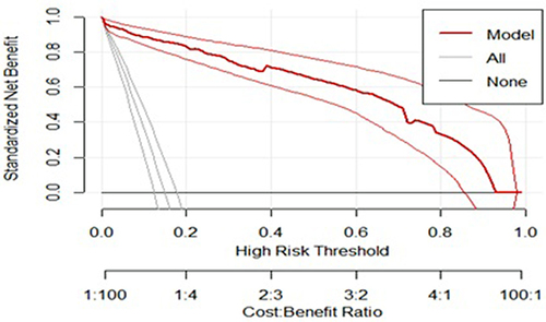
Figure 11 The ANN estimated importance of final selected predictors in classifying stroke at UoGCSH, 2012–2022.
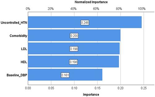
Table 5 Overall Model Performance Evaluation Using the Brier Score for Machine Learning and Multivariable Logistic Regression Model at UoGCSH, 2012–2012
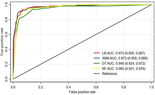
Figure 12 AUROC curves of the machine learning algorithm and multivariable logistic regression at UoGCSH, 2012–2022.