Figures & data
Figure 1. Frequency of voicemail setting year chosen by player. Part of the player experience is choosing a year in which one’s voicemail comes from. This graph demonstrates the frequency of voicemails by year over the game-play period.
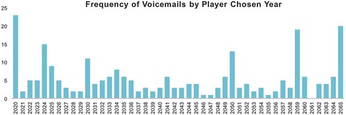
Figure 2. The prevalence of content and response code: complexity, expressed as average complexity z-score, showing the likelihood of each code co-occurring with other codes (top), and prevalence, expressed as the frequency of the code within all voice mails (bottom).
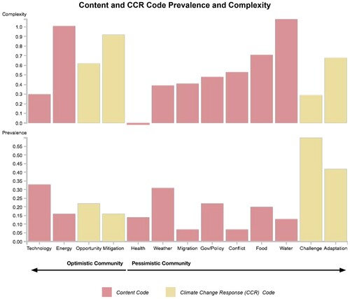
Figure 3. Bar graph showing the prevalence of sentiment codes where 1.00 equals code presence in 100% of voicemails.
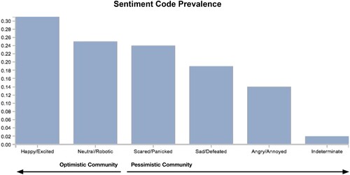
Figure 4. Alluvial diagram showing the relationships between code types and the communities in which they occur most frequently. All codes considered in our analyses are found down the center of the diagram. The thickness of each band indicates relative code prevalence within its code category. The code category each code belongs to is indicated on the left of the diagram, and the community each code falls into is indicated to the right. (*Includes content codes that did not meet intercoder agreement. **Indicates climate change response (CCR) codes that did not have sufficient intercoder reliability to carry out full statistical analysis in other parts of the study but were included here as a complementary pair to other CCR codes.)
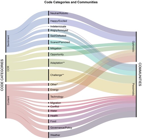
Figure 5. Comparative Analysis of the FutureCoast Codes and 2014 US National Climate Assessment Sectors (Climate Change Science Program (US), Citation2014). (*Includes voicemail content codes/themes that neither had sufficient intercoder reliability nor corresponded to a NCA sector (i.e. Economy, Infrastructure, Industry/Business, and Society). **Ecosystems/Landscapes did not have sufficient intercoder reliability to carry out full statistical analysis in other parts of the study, but was included here to demonstrate an overlap with the NCA sectors.)
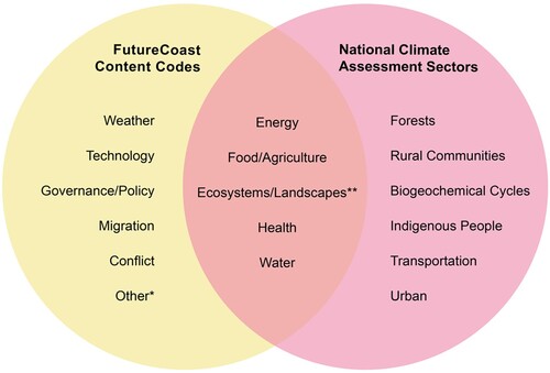
Table 1. Frequency of occurrence based on word searches of the 2014 and 2018 National Climate Assessment reports.
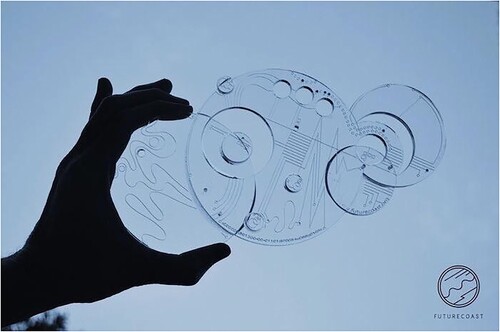
Figure A1. Image of a chronofact, a real-life object that enhanced authenticity of gameplay.