Figures & data
Table 1. Formulae for Worker Fatigue Model.
Figure 1. Polar star graphs showing characteristics associated with (a) workers, (b) tasks, and (c) robots.
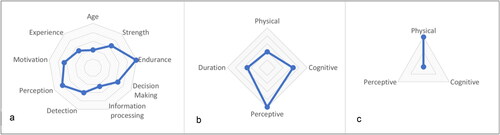
Figure 2. Conceptual model of worker fatigue based on Airbus Orbital Joint Assembly Task.
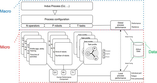
Table 2. Input variables for worker and task characteristics. Note that the robot is associated with a specific task and does not appear as an input variable.
Figure 3. Sample user interface illustrating input variables, visualization of worker fatigue, and output variables.
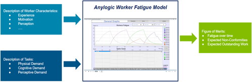
Figure 4. Simulation results showing fatigue levels for a fully manual production line (left) and a robot-assisted production line (right) of the Orbital Joint Assembly process (top), and error prediction due to fatigue (bottom). There is a steady increase of fatigue level for workers during each shift, and a slow decrease at the end of the shift. Super workers experienced fatigue more slowly than the average workers, who in turn experienced fatigue more slowly than basic workers. Gray areas on the Gantt chart represent rest breaks for workers.
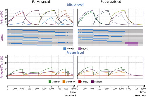
Figure 5. Conceptual overview of DISM platform for multidisciplinary analysis and optimization (Helle et al., Citation2022).
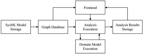
Figure 6. Integration of Worker Fatigue Model with sampling service.
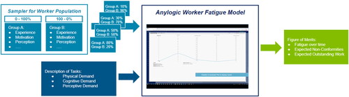
Figure 7. Parametric analysis model. Parameter flow from workforce generator to Worker Fatigue Model.
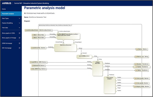
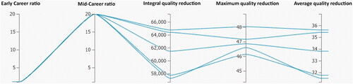
Figure 8. Parallel Coordinate Plot for visualization of the results of several simulation runs with different ratios of "Early Career" and "Mid-Career" workforces as inputs, and quality reduction as output (integral quality, max quality, average quality).
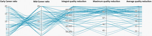
Figure 9. Example of a simulation run with high ratio of Early-Career to Mid-Career Workers (20:1). With this group of workers, reduction of quality is large, as seen on the integral quality scale, max quality scale, and average quality scale.
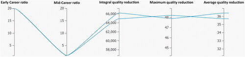
Figure 10. Example of a simulation run with a high ratio of Mid-Career to Early Career Workers (20:1). With this group of workers, the Mid-Career workers help to minimize the quality reduction, as seen on the integral quality scale, max quality scale and average quality scale. With a skill distribution from 0.3 to 0.7 for Mid-Career workers, impact on average quality reduction ranges from 31% to 35.5%.